A living room wall carries more weight than people give it credit for. It sets the tone before anyone even sits down.
Afrocentric living room wall decor ideas can mean a hundred different things, from carved masks and woven baskets to bold geometric murals and warm-toned portraits, and the hardest part is usually knowing where to start when your own wall is still blank.
If you are decorating the whole room from scratch, this step-by-step guide to decorating an Afrocentric living room walks through color, furniture, and texture first, so your wall decor has a foundation to coordinate with.
This roundup pulls from real rooms and fresh concepts alike, showing how gallery walls, statement paintings, textile hangings, and basket clusters actually come together in a space someone lives in every day.
For more focused inspiration on choosing and placing statement pieces, these African wall art ideas show how single paintings and gallery groupings anchor a living room wall.
Some ideas cost nothing but a free afternoon and a few pieces already in a closet. Others call for a bolder move, like a hand-painted mural or a fully upholstered wall.
Renters, owners, small space dwellers- all of it is covered here. Scroll through, save what pulls you in, and build the wall that finally feels like yours.
If your taste leans more eclectic, these Afrohemian decor ideas blend the same African patterns with boho layering for a relaxed, global feel throughout the whole home.
1. Cascade Baskets Beside A Portrait
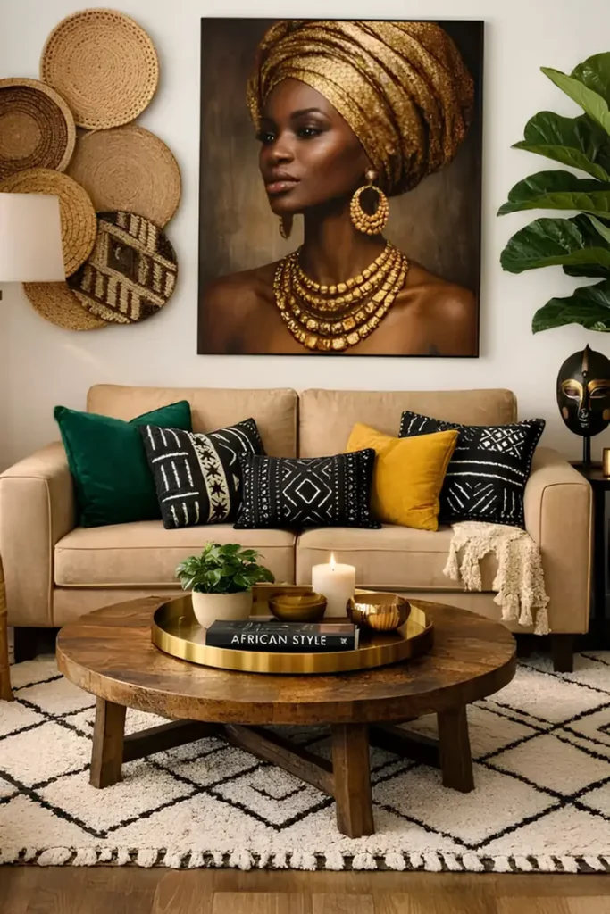
Rather than centering baskets around the artwork, this arrangement lets them fall down one side only, six woven plates stacked in a loose diagonal from the ceiling down toward a floor lamp, while a large gold-toned portrait holds the wall’s other half on its own.
The asymmetry is what keeps it interesting. A perfectly centered basket halo reads as decoration; a cascade running off to one edge reads as something layered in over time.
The portrait’s warm metallic tones, gold headwrap and beaded jewelry, echo the same honey and amber shades running through the woven baskets, so even though the two elements sit in separate zones of the wall, they still feel like they belong to the same room.
- A cascade needs an anchor point; here, a floor lamp, so the baskets have somewhere to visually land instead of trailing off into empty wall.
- Odd numbers read better in a loose stack. Six works because the sizes vary enough to break the count.
- Keep the portrait’s frame slim and dark so it doesn’t compete with the ornate gold detail already inside the painting.
warm neutral wall
honey and amber tones
dark frame accent
2. Ring Framed Art With Woven Baskets
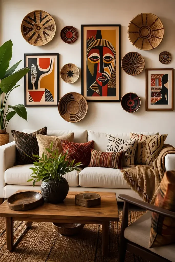
Flat framed pieces alone can look thin against a large wall, so this arrangement rings a central portrait-style canvas with woven baskets in varying sizes, radiating outward like a loose halo.
Circular shapes against the canvas’s straight edges keep the eye moving in a full loop instead of stopping at one rectangle, and the natural fiber texture softens what would otherwise be an all-hard-edged wall.
Basket placement is not random here. Larger baskets sit at the outer corners to anchor the composition, medium ones fill the middle ring, and the smallest discs tuck into gaps near the frames, which is the same large-to-small logic used in any balanced gallery layout.
3. Choose A Sculptural Bead Frame
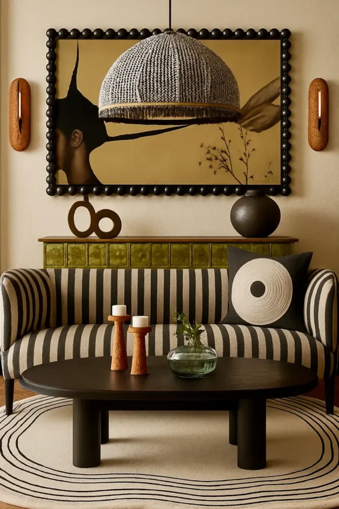
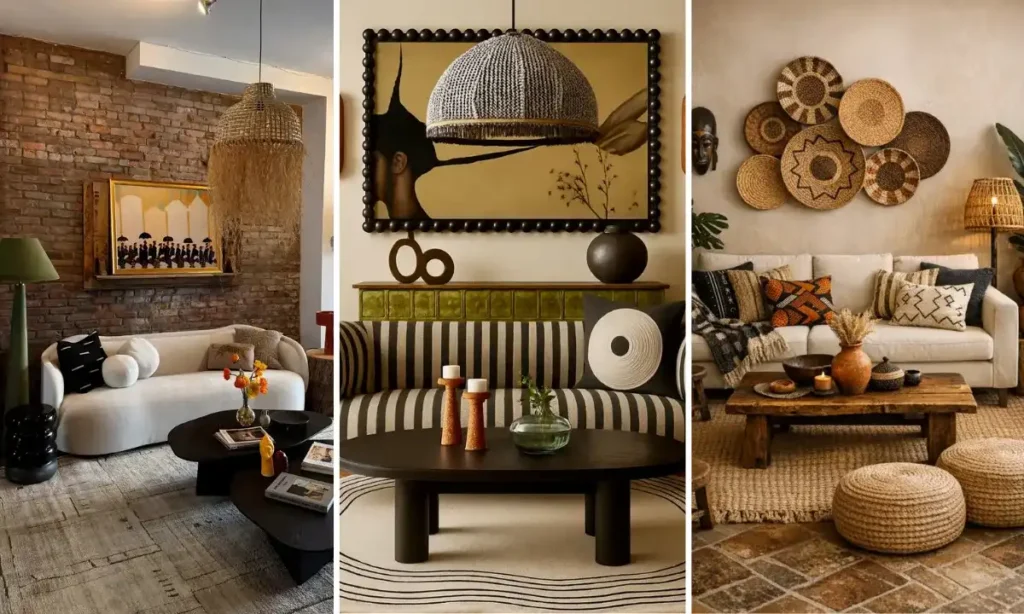
What turns a flat portrait into an object worth walking toward? Here it is: the frame itself, a wide black border made entirely of oversized round beads circling the canvas like a strand of jewelry blown up to architectural scale.
Inside it, a single figure faces away from the camera against a solid ochre ground, simple enough that the frame gets to be the star without a fight for attention.
Standard flat molding would have made this the same painting anyone could buy anywhere. The beaded edge is a specific, sourceable detail: look for picture frames marketed as bobbin, ball, or bead trim, usually in furniture or decor lines rather than standard framing shops, since most mass market frame stores only stock flat or fluted profiles.
4. Let The Art Set The Palette
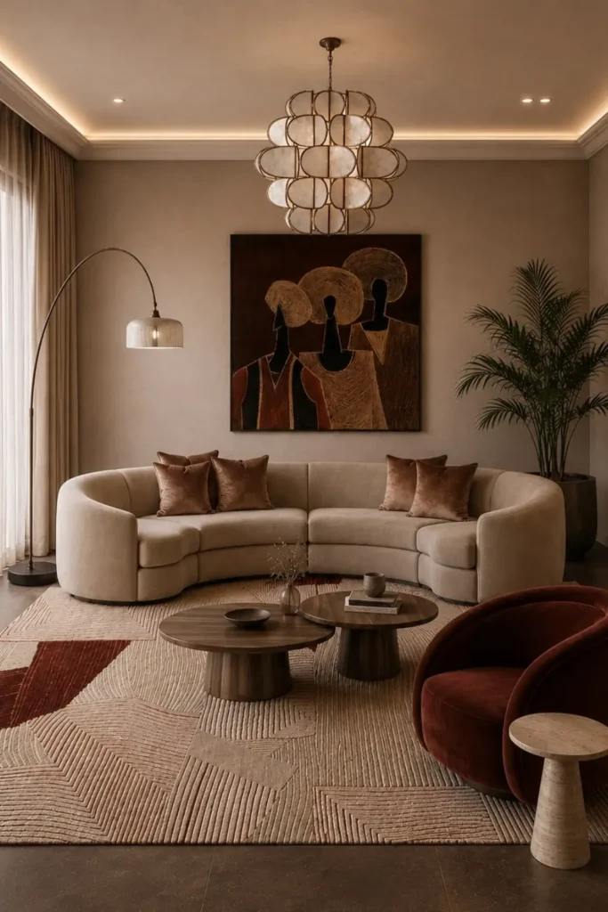
Why does this painting feel like it belongs in the room instead of just hanging on the wall? Because its rust, cream, and black tones were clearly chosen to echo back into the space, showing up again in the rug’s angular patches and in the deep burgundy of the accent chair. A large-scale portrait of three faceless figures under wide circular headdresses sits in a simple, unframed canvas edge, which keeps the focus on color rather than ornamentation.
This is a planning trick, not a coincidence. Pick your art before you pick your rug and upholstery, or the reverse, and let one inform the other. If the painting will hang anywhere near direct window light, expect the pigments to shift over years, so an interior wall away from strong sun keeps those tones true longer.
warm cream and beige base
rust and burnt sienna
near black for depth
5. Pair Portrait With Abstract Art
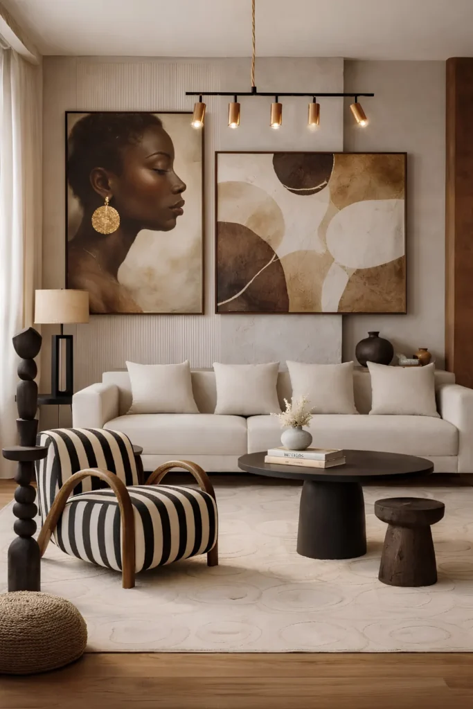
Two very different paintings share one wall without competing: a realistic side profile portrait in warm sepia tones sits beside a large abstract piece built from overlapping circles in the same brown and cream family.
Different subject matter, same color story, and that shared palette is what lets a figurative piece and an abstract one hang side by side without the wall feeling split in two.
Height does some of the balancing too. The portrait sits slightly taller and narrower, the abstract piece slightly wider and lower, so together they form one uneven but pleasing shape rather than two identical rectangles lined up like a matched set.
Brings warmth and a human focal point to anchor the grouping.
Adds movement and softens the wall so it doesn’t feel too literal.
One shared palette across both pieces ties the whole pairing together.
6. Match Frame Width To Sofa
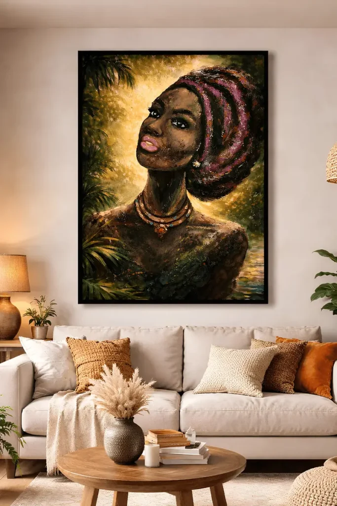
One thing separates a single statement piece that works from one that looks undersized: proportion to the furniture below it.
Here the framed portrait spans roughly two-thirds the width of the sofa, with a slim black frame that stays quiet so the rich color and texture inside it can carry the wall on its own, no second piece needed to balance it out.
- Aim for artwork between half and three-quarters the width of the sofa beneath it, never the full span edge to edge.
- Leave a hand’s width of breathing room between the top of the frame and the ceiling line rather than crowding it upward.
- Keep the frame itself minimal when the art inside is already busy with color and texture, so the two don’t compete.
One honest caution, since this piece leans heavily on warm gold and pink tones: hang it on a wall that gets only indirect light, because strong direct sun will fade painted texture like this faster than a flat print.
7. Scale Baskets Across A Panel
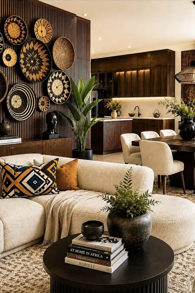
What happens when basket art stops being an accent and becomes the whole wall? This vertical fluted wood panel answers that, packed edge to edge with woven discs in a dozen sizes, patterns, and shades of natural fiber running from black-dyed rings to raw straw tones.
Nothing here is framed or symmetrical. The panel itself, with its ribbed wood texture, gives the cluster a consistent backdrop so the eye reads one rich surface instead of a wall trying to hold too many separate objects.
Going this dense only works because the baskets vary in scale. A few oversized pieces at the top anchor the eye, then progressively smaller ones cascade down and inward, which keeps the whole thing from flattening into a repetitive grid.
Because each disc hangs on its own small nail or hook, one basket coming loose over time is a five-minute fix rather than a full reinstall.
8. Paint A Geometric Mural Wall
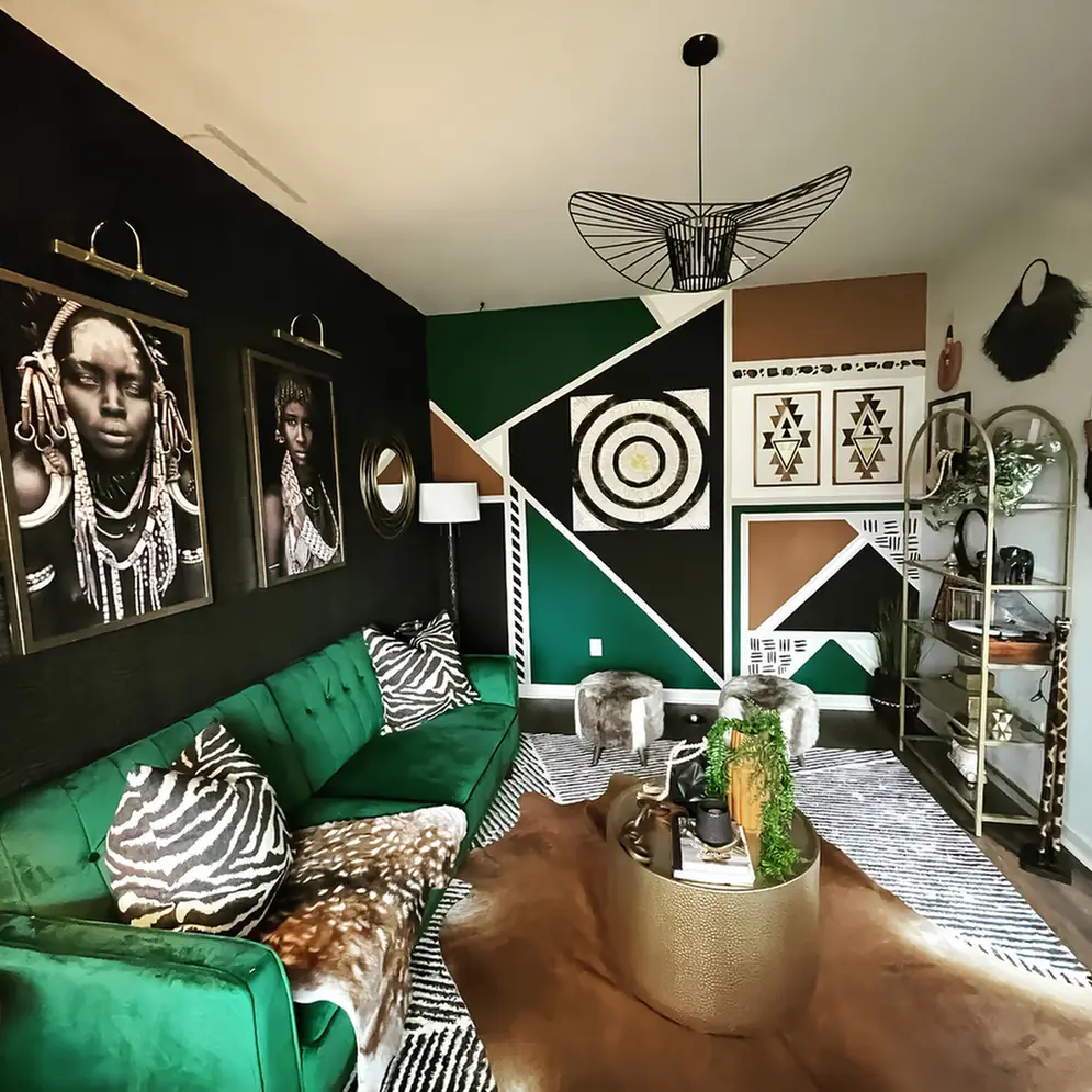
Skip framed art altogether and take the shapes straight to the wall. This room breaks one full wall into large triangles and blocks in forest green, rust, black and white, then layers a smaller mud cloth style pattern with hand-painted triangles and dashes on top near the ceiling line, so the wall itself becomes the artwork instead of holding it.
If you would rather hang actual mud cloth or kente panels instead of painting them, this guide to layering African textiles shows how to build a whole room around fabric walls, rugs, and pillows that share one color story.
The reason it reads as intentional rather than chaotic is scale discipline. The big shapes stay big and simple, while the fine patterned detail is contained to two narrow bands, so the eye has a clear resting point before it hits the busier texture.
One real caution here: this is paint on drywall, which means it is not something you can undo in an afternoon if you move out or change your mind, so it suits an owned space or a long-term rental far more than a short lease.
If you are renting and still want bold wall impact without touching a paintbrush, this guide shows how to hang heavy art, secure textiles, and display wall pieces without losing your security deposit.
Sketch the large shapes first in painter’s tape, stepping back often to check the angles before committing to paint.
Fill the large blocks in two or three flat colors and let them cure fully before adding any detail on top.
Hand paint the small repeating motifs in one narrow band using a fine brush and a steady straightedge as your guide.
9. Three Panel Geometric Wall Art
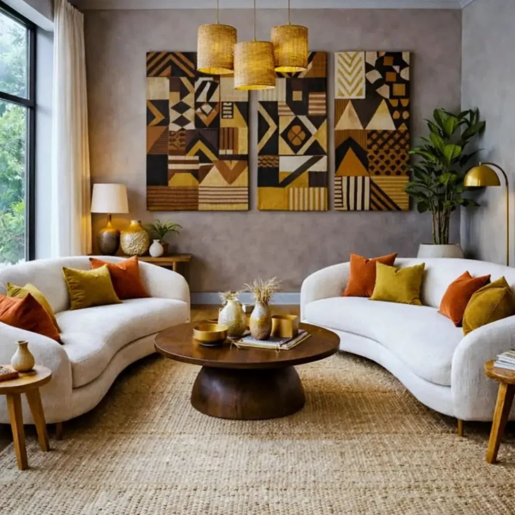
Three canvases split into small geometric fields of ochre, cognac, cream, and near black hang side by side above a low console, each panel reading as its own puzzle until you back up and see the shared color story pull them into one piece.
That is the actual trick here, not the colors themselves but the repetition of the same four tones across three separate compositions, which lets a busy pattern still feel calm on the wall.
A cheaper route to the same effect: buy or make three plain canvases in matching frames, then paint each with a different geometric arrangement using only your chosen four colors, so the unity comes from the palette instead of matching artwork.
Before hanging, measure and mark all three positions on the wall first, since uneven spacing between panels is the one thing that will make an otherwise strong grouping look accidental.
10. Bright Painting Surrounded By Masks
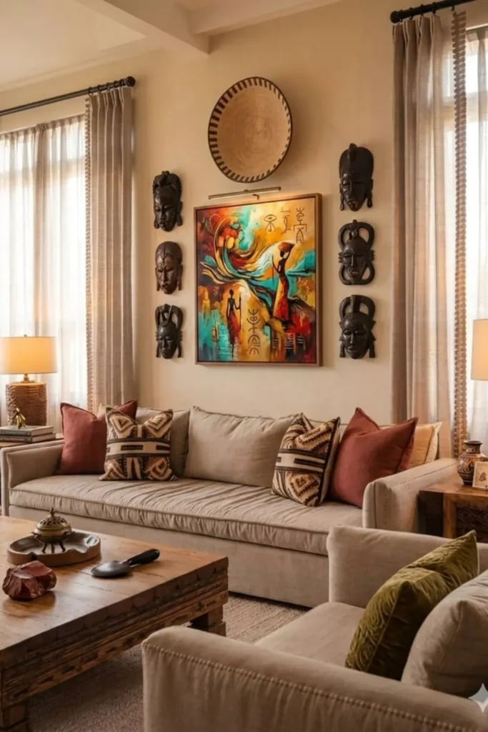
Color contrast carries the whole wall here. A single vivid abstract painting in teal, coral and gold sits dead center, boxed in on both sides by three carved wooden masks stacked in a column, with one round woven plate crowning the top like a headpiece. Every mask reads dark and matte, which makes the painting’s saturated color practically glow between them.
What most people do with a bold, colorful piece is give it a plain wall and let it stand alone. What works better is framing it with something quiet and textured instead; since the masks do not fight the color, they just set it off. Space the two mask columns evenly before hanging the centerpiece, or the whole grouping will read lopsided no matter how good the painting is.
Dark matte masks flanking a bright painting make the color the loudest thing on the wall, without adding a single extra hue.
11. Upholster One Wall In Mudcloth
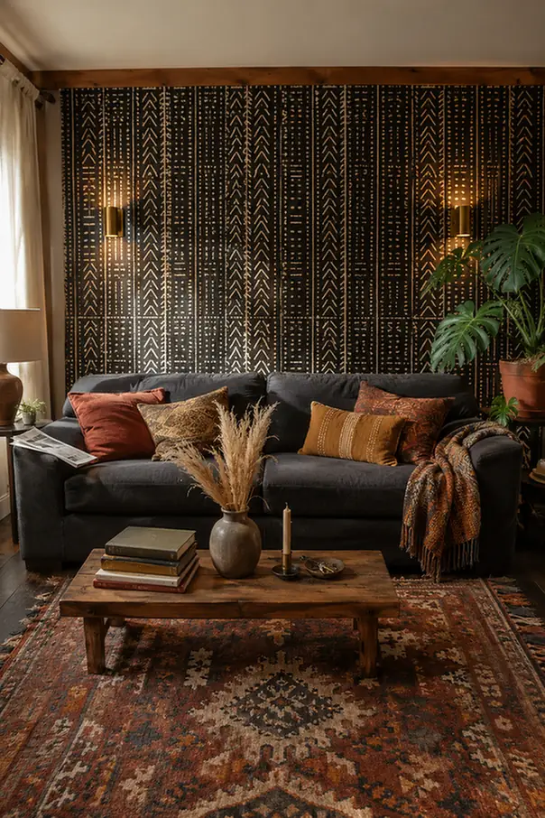
Fabric wraps this wall the way it would a headboard, stretched taut over thin padding across roughly two-thirds of the space behind the sofa, printed in bold black and cream mudcloth-style geometry.
There is no frame edge to speak of, since the pattern simply runs from floor to a stopping line near the ceiling, treating the whole wall as one soft, tactile surface instead of a hard backdrop holding separate pieces.
A small brass sconce mounted on each side keeps the wall from reading flat, throwing warm uplight across the raised texture of the padding and catching the pattern’s contrast at an angle.
This kind of treatment takes a weekend, and real upholstery skill or a willingness to hire it out, and it holds up well against everyday bumps, though a fabric wall does need an occasional vacuum brush pass to keep dust from settling into the weave.
12. Build A Mixed Media Gallery Wall
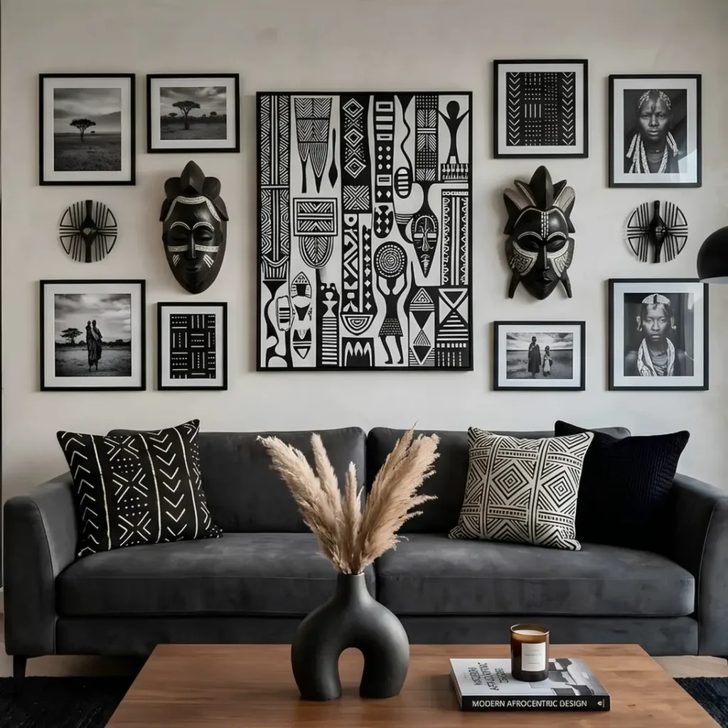
Photography, graphic pattern art, and a pair of carved masks share one wall here, arranged in a loose grid with the largest patterned canvas anchored dead center.
Small circular wall discs and a mix of frame sizes fill in around it, so the eye has plenty to explore without any single element getting lost.
The real planning happens before anything goes up. Lay every piece out on the floor first, mixing flat-framed photos with dimensional objects like the masks so the finished wall has actual depth instead of reading as one flat surface.
Wall anchors matter here too, since carved wood masks carry real weight and a single picture hook will not hold one safely over time.
| Zone | Job | Anchor piece |
|---|---|---|
| Center | draws the first look | large graphic pattern canvas |
| Flanking sides | add dimension and contrast | carved wall masks |
| Outer edges | fill the frame without competing | smaller framed photography |
13. Cluster Baskets With No Centerpiece
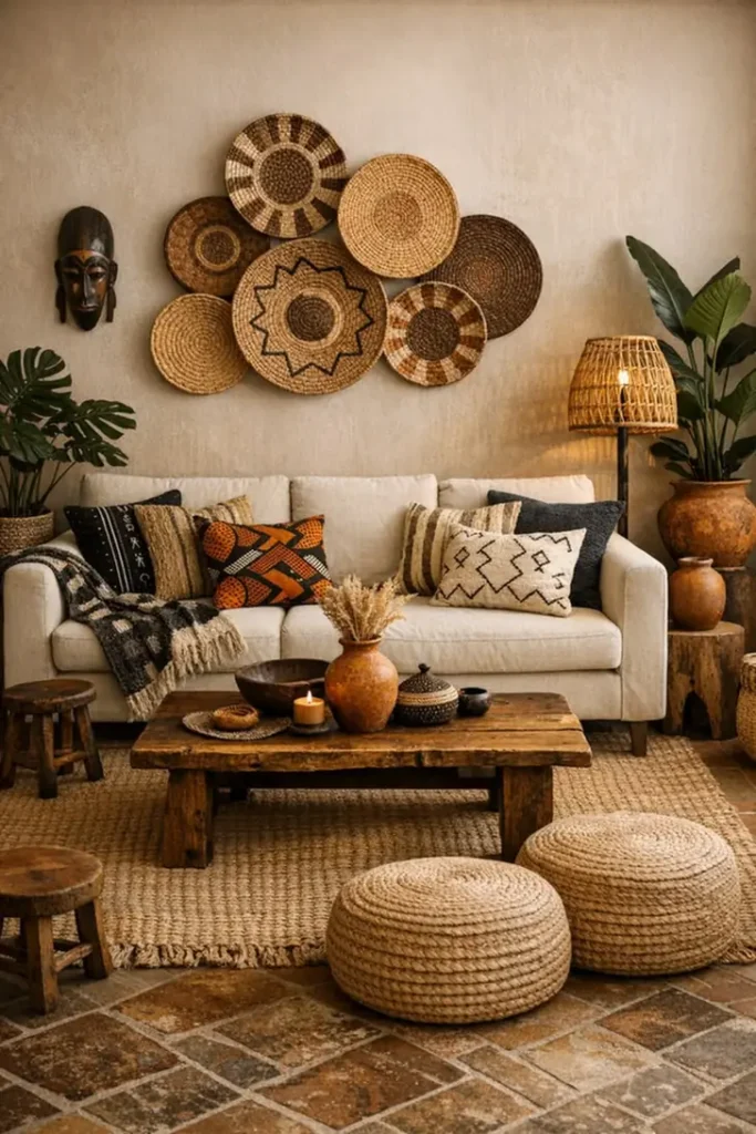
No painting, no photo, no textile anchoring this wall, just seven woven plates pushed close enough that their edges touch and overlap, forming one asymmetric cloud shape instead of a grid.
A single carved mask sits off to the side, entirely separate from the cluster, proving the basket grouping does not need a focal point at its center to hold together.
This is the version for a wall that already has enough going on below it: a patterned sofa, a loaded coffee table, floor poufs. Adding a large painting on top would tip the room into too much.
Overlapping the baskets so tightly that gaps disappear gives the wall real presence without adding another competing image.
- Push pieces close enough to overlap slightly rather than leaving even spacing between each one.
- Let the outer edge of the cluster stay irregular instead of trimming it into a clean circle or square.
- Keep any separate wall piece, like a mask, a visible distance away so it reads as its own moment, not part of the grouping.
A wall can hold its own weight without a single centerpiece.
14. Let A Frameless Canvas Fill The Space
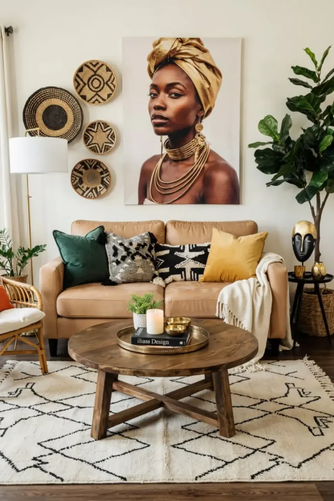
Skip the frame entirely, and this large portrait canvas gains a few extra inches of pure image on every side, which reads more contemporary against a plain wall than the same photo boxed in wood or metal.
Beside it, four small woven plates stack in one tight vertical column rather than spreading loosely, functioning almost like a sidebar rather than a scattered grouping.
That column only works because it stays narrow. Four baskets in a straight, close stack read as a deliberate design element, but the same four spaced farther apart would start to look like leftover pieces with nowhere else to go.
Keep the gap between each basket smaller than the basket’s own diameter, and the column holds together as one visual unit even without a frame around it.
15. Flank A Woven Disc With Masks
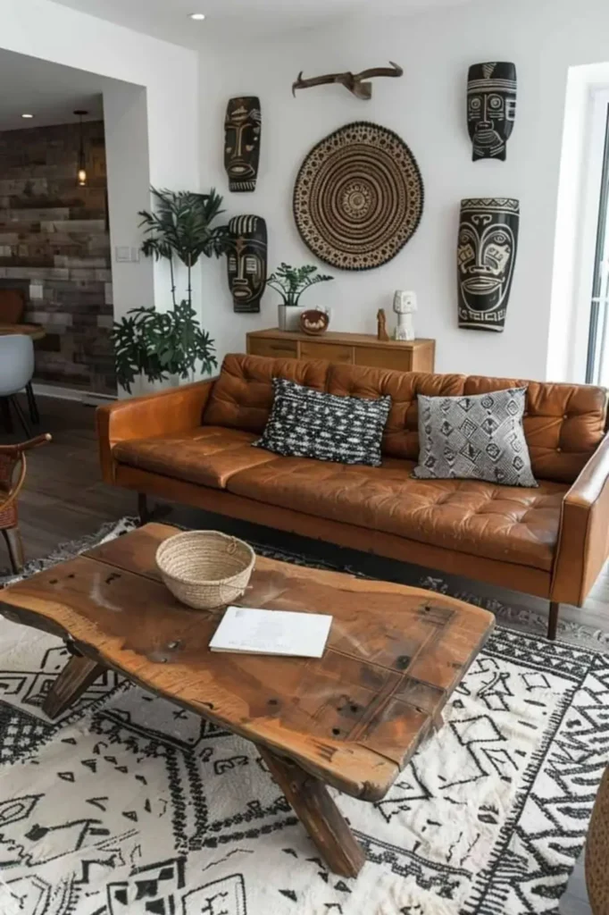
No framed art at all in this arrangement, just dimensional pieces working together. A round woven wall disc sits at the visual center, flanked symmetrically by two masks on each side, with a small set of antlers mounted above to break the circle’s roundness with something angular.
The whole cluster stays off center on the wall, shifted right to leave room for a tall plant on the left, which keeps the grouping from feeling like it was measured with a ruler.
Symmetry does the heavy lifting on the mask pairing, but the antlers and the plant both push back against it just enough that the wall reads as collected over time rather than bought as a set.
- Already common in most homes: a round woven basket lid or plate, easy to source secondhand.
- Worth seeking out: a genuine pair of matching carved masks, since mismatched sizes will throw off the symmetry.
- Skip searching for: real antlers if that feels off, since a resin or wood alternative reads the same from across the room.
A round woven plate or basket lid.
A small potted plant for one side.
A matching pair of carved masks.
A small decorative antler or wall hook shape.
16. One Statement Portrait Framed In Wood
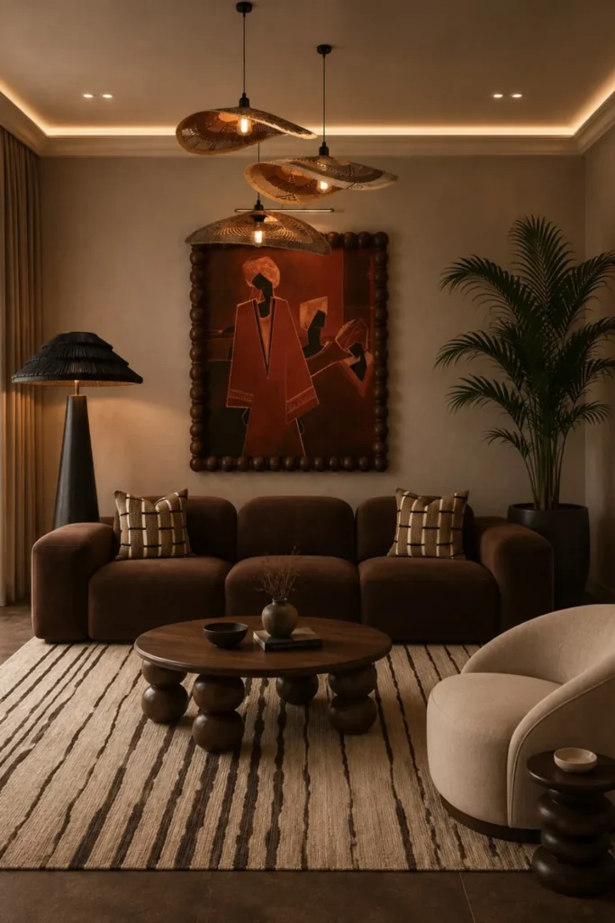
Instead of grouping several pieces, this room commits to a single large portrait, and the payoff comes from the frame as much as the art.
A thick border of rounded, dark wood beads wraps the canvas like a wide wooden ribbon, giving a flat print real physical presence against a deep, moody wall color. That heavy carved edge is doing the job that three or four smaller frames usually split between them.
What most people do is add more art to fill a big wall. What works better here is going the other direction: one piece, sized generously, in a frame substantial enough to hold its own against dark paint and low lighting.
The bead detailing also collects dust in its grooves over time, so plan on a soft brush pass every few months rather than a wipe down.
One bold frame beats three small ones
A single oversized statement piece in a heavy frame can anchor a dark wall better than a scattered grouping.
17. Hang A Carved Room Divider
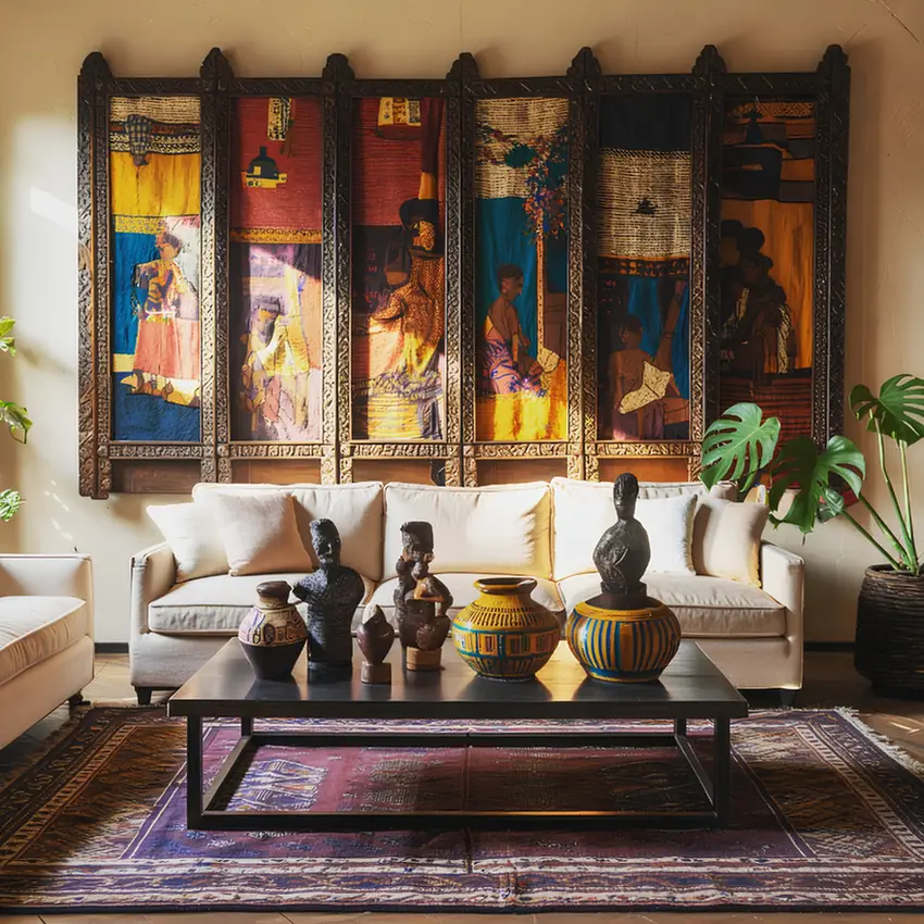
Six narrow fabric panels, each showing a different painted figure and framed inside one continuous piece of dark carved wood, do double duty as a folding screen that never got folded. Instead, it lives flat against the wall like an oversized piece of wall art, and the carved wood border around all six panels is what pulls the busy patterned fabric into a single cohesive object instead of six separate pictures competing for attention.
- The carved wood frame reads as furniture, which gives fabric art a weight canvas alone would not have.
- Each panel can tell its own scene, since the shared border does the unifying work.
- Because it hangs rather than stands, it costs nothing to remove and store flat if you ever redecorate, unlike a painted mural.
18. Prop A Framed Painting On A Ledge
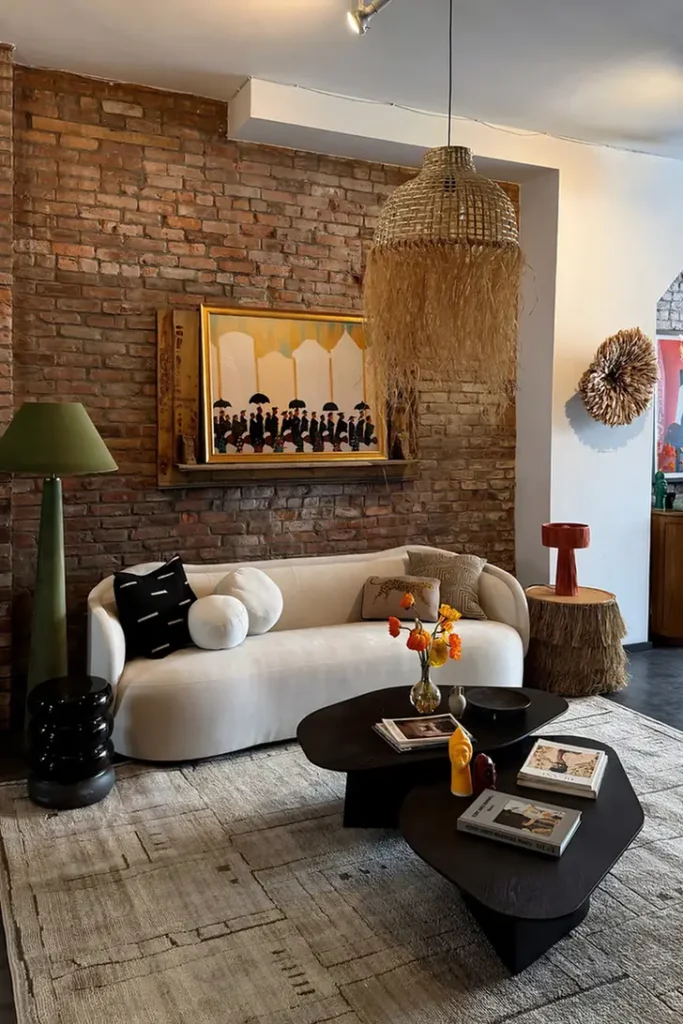
Propped rather than hung, this large gilt-framed painting rests on a narrow wood ledge against raw exposed brick, leaning back just slightly instead of sitting flush.
That lean is the whole idea. It reads as a found object someone brought home and set down, not a piece measured and drilled into place, which suits a room already full of texture and pattern.
The ledge itself does double duty, holding the frame’s weight while giving you a spot to layer small objects in front of the canvas later without covering it entirely.
Because nothing is fastened to the brick, the whole arrangement shifts in seconds, which matters most in a rental where drilling into masonry is rarely allowed.
19. Layer A Woven Textile Between Portraits
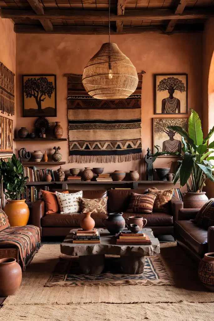
A large fringed textile takes the wall’s center spot instead of a painting, hung flat between two framed portrait prints on either side, with a low open shelf running beneath it holding a mix of terracotta pottery, carved figures, and stacked books.
The woven piece brings pattern and texture at a scale a single painting rarely reaches, and its black and tan stripe work echoes straight down into the pottery glazes sitting on the shelf below.
That shelf is doing more than holding overflow. It extends the wall’s story downward, so the eye travels from hanging textile to framed art to tabletop objects in one continuous sweep instead of stopping cold at the bottom of the frame.
20. Wrap A Corner In Fabric
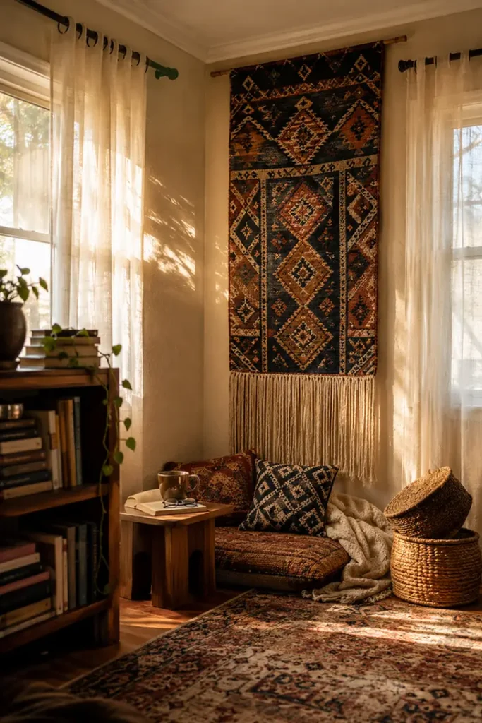
A blank corner between two windows gets solved with a floor-to-ceiling woven textile hung completely flat against the wall, its long fringe brushing the top of a low floor cushion nook tucked beneath it.
Rather than framed art, the piece functions as both decoration and soft room divider, visually separating a small reading corner from the rest of an open living space without adding a single piece of furniture.
Term worth knowing here: a flat hung divider is simply a textile meant for a folding screen, mounted directly to the wall instead of standing on legs. It gives you the visual weight and pattern of a room divider while taking up zero floor space, which matters most in a narrow corner where an actual standing screen would just get bumped into.
A textile originally meant to stand on a folding screen frame, mounted flat to the wall instead so it reads as art rather than furniture.
Use it like this: hang one in a narrow corner to define a reading nook without adding floor clutter.
21. Space Masks Wide Across Plaster
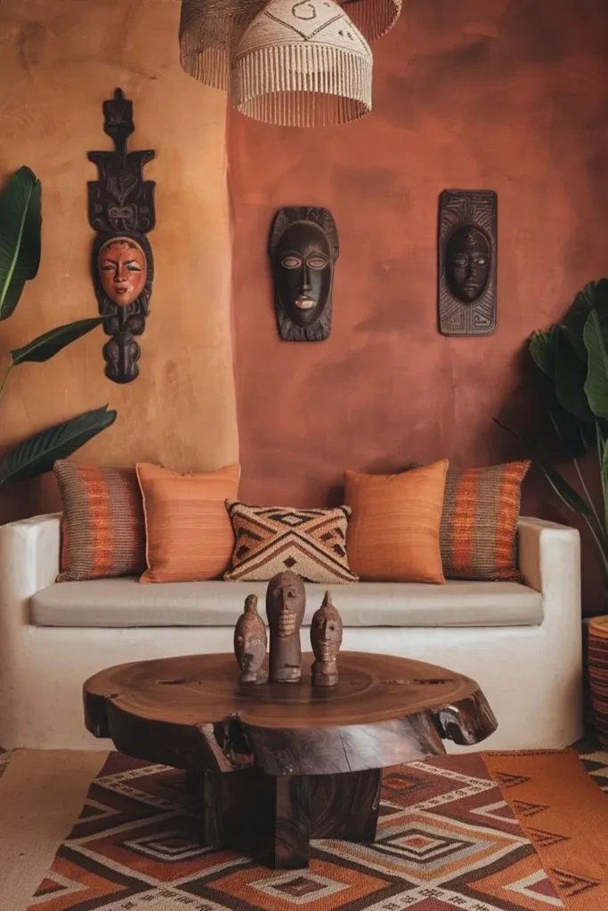
Three carved masks in different heights, shapes, and finishes hang loosely spaced across a wide plaster wall painted in two shifting shades of terracotta and clay.
Nothing lines up in a row or a grid. Each mask sits roughly at its own eye level, and the generous gaps between them let the textured, hand-troweled wall surface function as part of the display instead of empty leftover space.
That plaster texture is doing real work here. A smooth painted wall would need the masks closer together to feel intentional, but a wall with this much visible hand-troweled texture can carry wide gaps because the surface itself already reads as art.
If your walls are flat drywall, tightening the spacing between pieces will read more purposeful than trying to mimic a loose spread like this one.
⚠️ Watch Out
Wide, loose spacing between wall pieces only reads as intentional when the wall itself has real texture. On flat drywall, keep pieces closer together instead.
22. Mix Scales Without Matching Frames
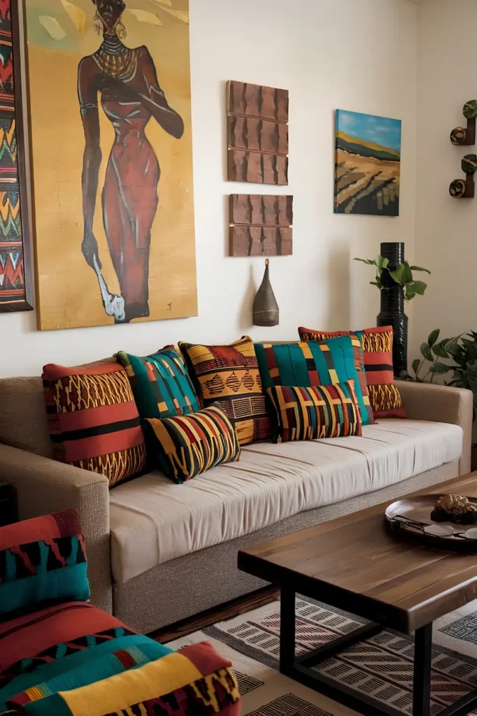
Nothing on this wall matches, and that is the entire point. A tall gold leafed portrait dominates one corner while a small landscape painting sits alone across the room, three carved wood texture panels form their own tight cluster in the middle, and a scatter of tiny stacked objects fills a narrow gap on the far edge. No shared frame style, no consistent spacing, no symmetry at all.
The move most people are afraid to try is letting pieces sit at genuinely different heights and different distances from each other.
Here it works because every piece shares the same warm, earthy color family even though the subjects have nothing in common: a portrait, a landscape, abstract wood texture. That single thread of color is doing the unifying work that matching frames usually do.
Give yourself permission to add one piece at a time over months instead of buying a full set at once. This kind of wall is genuinely built through collecting, and forcing it all at once tends to look staged rather than lived in.
💡 Quick Tip
Let one consistent color family carry an eclectic wall, and the mismatched frames and subjects will still read as a single collection.
23. Mirrored Figures Anchor The Sofa
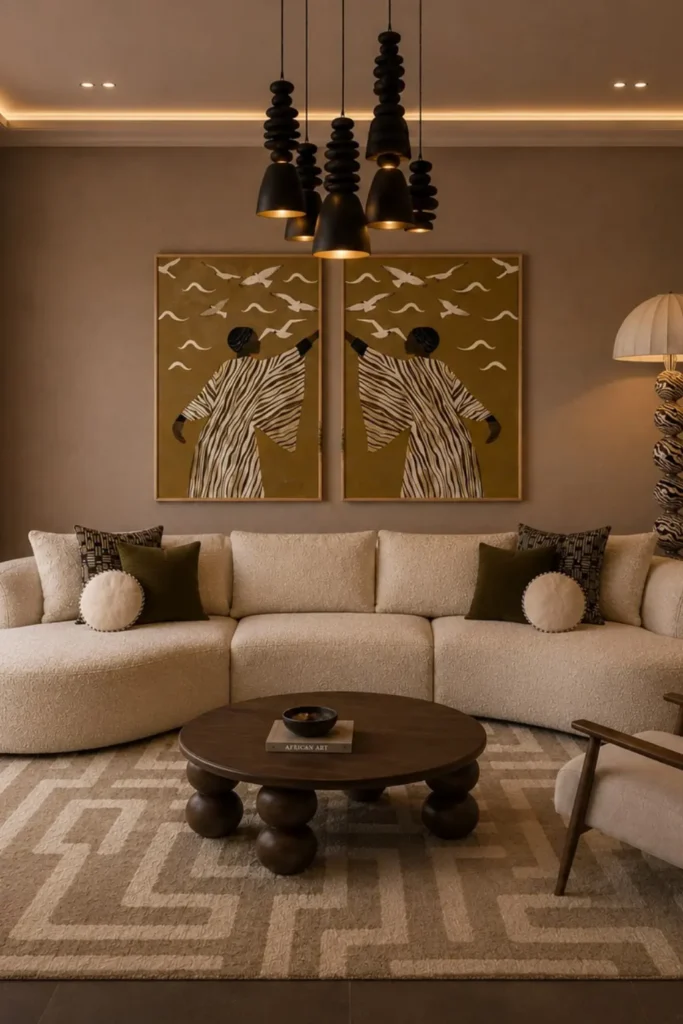
Facing a wide, plain wall above a low sectional, this room uses a two-panel print where the same robed figure appears twice, flipped to face each other, both frames sharing one continuous flock of birds across a solid ochre background.
The mirroring is the actual design move. A single large piece over that much sofa can read flat, but doubling the figure and letting the birds cross both frames turns two separate canvases into one wide scene, which is a trick you can borrow with any pair of matching prints.
Confirm your wall can take the frame weight before hanging, since a piece this size needs real anchors rather than a single nail, and a boxed diptych format only works if both frames land level with each other.
Flipping the same figure across two panels reads as intentional, not repetitive, and gives a wide sofa a focal point strong enough to match its size.
Letting the birds fly across the seam between frames stitches two prints into one continuous image instead of two disconnected ones.
24. Stripe The Wall Like Kente
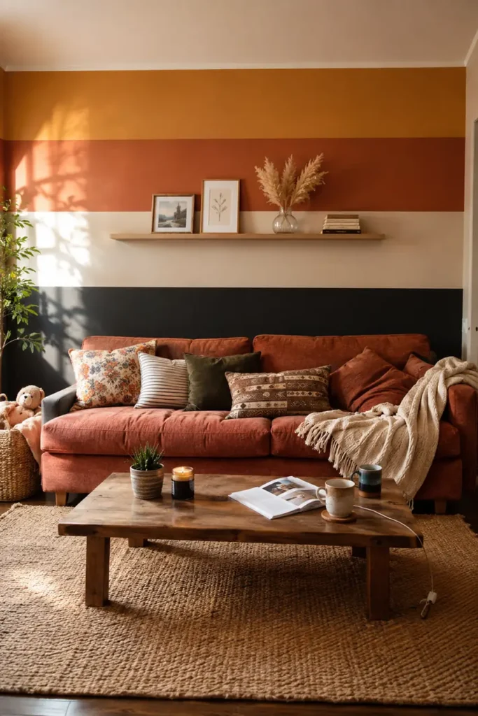
Paint takes over where framed art usually goes, with wide horizontal stripes in ochre, rust, cream, and near black running the full length of the wall behind the sofa, echoing the bold banding of Kente cloth without a single yard of actual fabric.
A slim wood ledge runs along the bottom third, holding a loose row of small frames, a dried flower jar, and a stack of paperbacks that shift every few weeks depending on what is currently sitting around the house.
The ledge is the real trick here. Painting the stripes commits the wall to one bold statement, but the ledge stays flexible, so new photos, a kid’s drawing, or a thrifted find can rotate through without a single extra nail hole.
Renters get the boldest part of this idea, the stripe pattern, in a form that a fresh coat of primer will fully undo at move-out.
25. Lean A Gallery Against The Wall
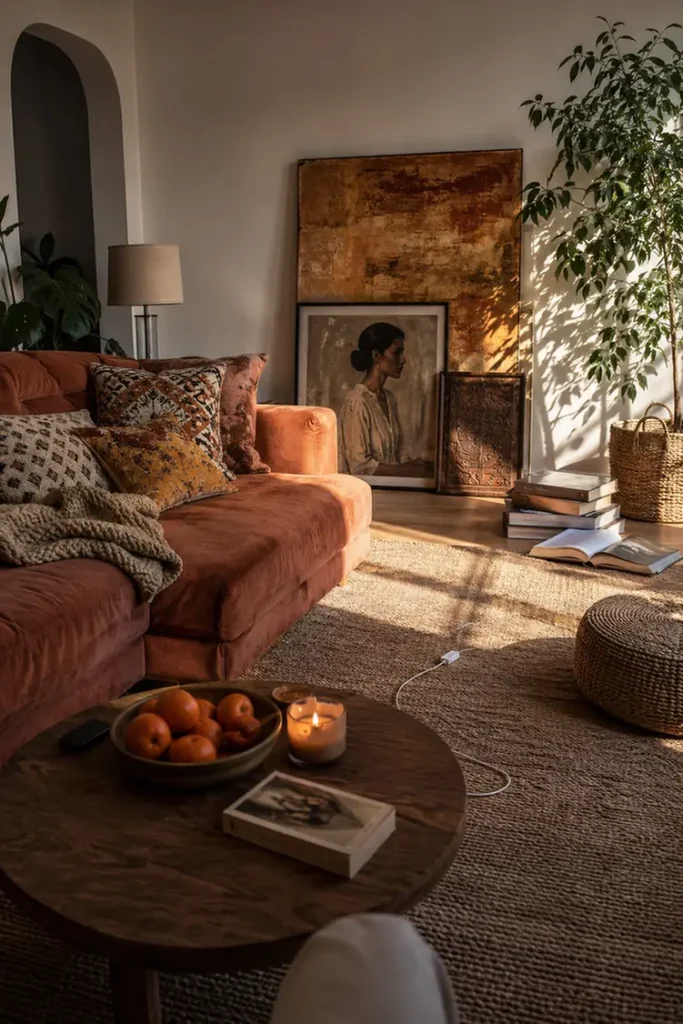
Nobody drilled a single hole for this one. Three pieces of varying size- a large abstract canvas, a mid-sized framed portrait, and a small carved wood panel- lean directly against the baseboard in a loose overlapping stack, front pieces slightly shorter so nothing blocks the one behind it.
It borrows a trick straight from art studios and galleries between shows, where work gets propped rather than hung while a space is still being sorted out.
Because nothing is fastened, the whole arrangement can shift by six inches or swap out entirely on a whim, which matters most for anyone who tends to rearrange every few months instead of settling on one fixed layout.
The one real catch is floor traffic. Keep the stack out of a walking path, since a corner or the dead space beside a sofa arm works far better than anywhere feet actually pass through.
Conclusion
A bold wall does not happen all at once, and it rarely should. Most of the rooms here were built piece by piece, a mask added one month, a basket cluster grown the next.
Pick one idea that fits your space and your budget right now, live with it for a while, then layer in the next. That slower pace is usually what makes a wall feel collected instead of purchased in a single trip.
Save the entries that speak to you and start with the smallest step. Your walls have a story worth telling.