
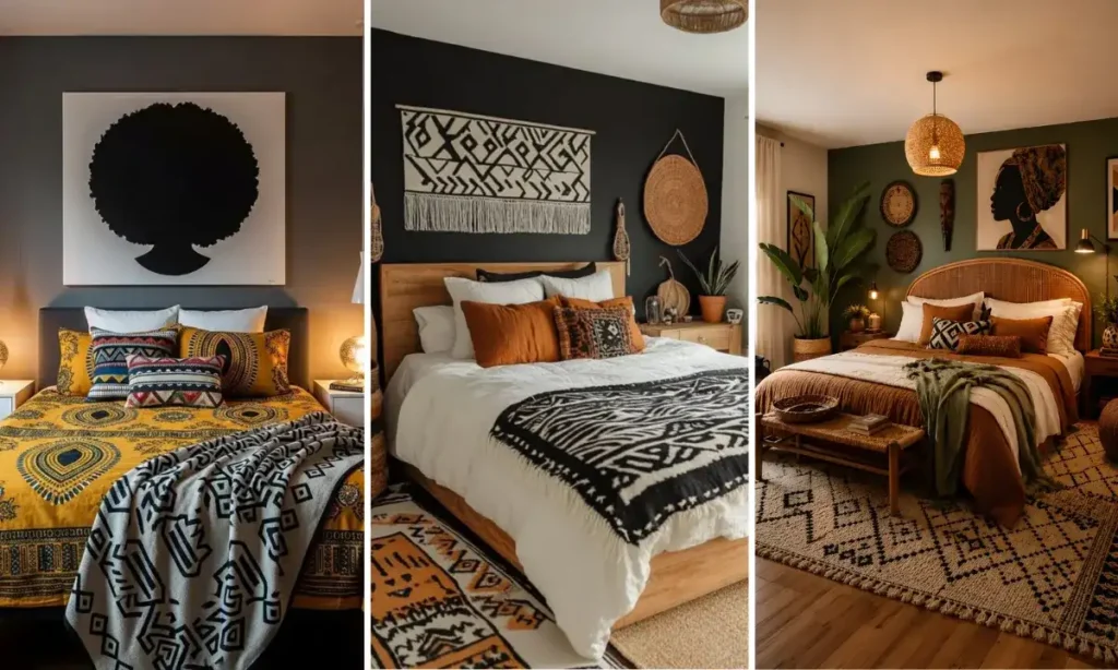
Most bedrooms play it safe, and most bedding ends up forgettable because of it. African print bedding ideas solve that problem by giving a room a real point of view, whether that means one loud mudcloth throw folded at the foot of the bed or a duvet that goes all in on color blocking and pattern.
This roundup pulls from twenty-six real bedrooms, and the range is wide. Some lean into a single statement piece against calm, solid bedding. Others stack pattern on pattern and let a dark wall or a neutral headboard do the work of holding it all together. A few skip prints entirely and rely on saturated color instead.
Whatever your starting point, whether it’s a rental with white walls or a room already full of texture, there’s a version here that fits. Scroll through and find the one that matches how bold you’re actually ready to go.
1. One Print, Full Impact
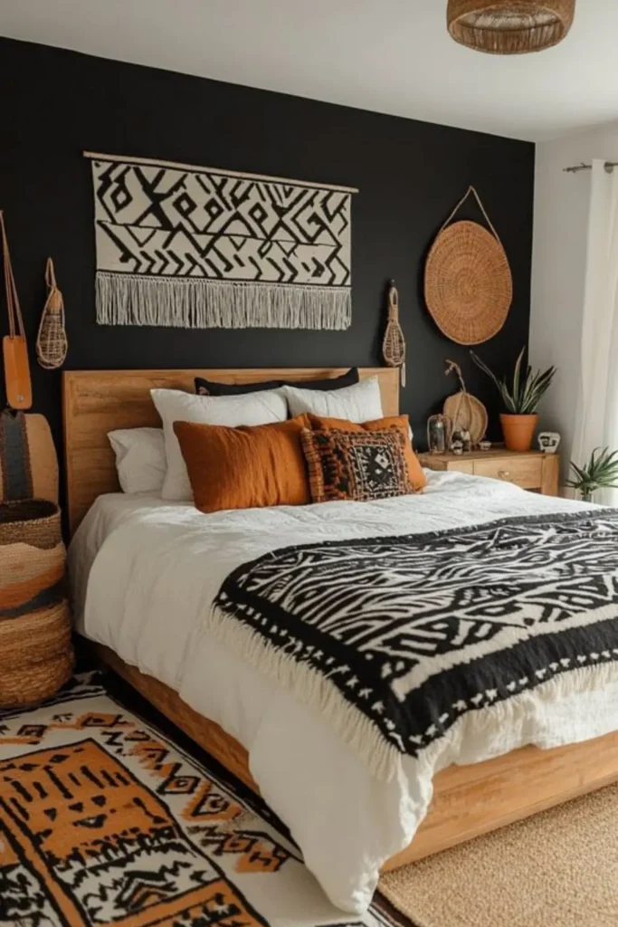
Most bold prints fail because they cover everything at once, but this bed proves one loud throw is plenty. A black and white mudcloth blanket lands only at the foot, folded over plain white bedding, so the eye has one place to land instead of five competing patterns.
Layer in a rust pillow or two. Intentional, not busy, is the whole point. It works because contrast rooms rely on negative space, since white and wood give the mudcloth room to be the whole event.
Anyone renting can pull this off because nothing here touches a wall, and if the pattern ever wears thin, swapping one throw costs far less than replacing a full duvet set.
White bedding and wood give the busy print somewhere quiet to sit, so it reads as bold instead of cluttered.
Only the foot throw carries the pattern, so pillows and sheets stay plain and the print keeps its punch.
2. Layer Two Prints Together

Skip the fear of clashing patterns and put a solid color between them instead. Here, a rust linen duvet sits between mudcloth pillows and a cream and black print throw, so the two loud fabrics never actually touch each other.
Warm lamp light does the rest, since it pulls the amber tones out of both patterns and makes the whole bed glow instead of compete. Wash the throw separately at first, since darker dye can bleed onto lighter cotton, and after a wash or two it settles down.
A small bedside candle finishes the look, but the real trick is the solid layer doing quiet work underneath two busy ones.
3. Let Dark Walls Do Work

Against a charcoal or near-black wall, most people reach for more pattern to fill the space, and it usually backfires into visual noise.
What works better is the opposite: keep the bedding itself in solid rust and cream stripes, then let one graphic black and white pillow carry the entire pattern statement.
The dark wall does the heavy lifting here, since it absorbs light and pushes every warm tone on the bed forward. A single bold pillow reads as intentional decor rather than clutter.
Deep wall colors also hide scuffs and wear better than pale ones, which matters if the space gets daily use.
Dark wall, one loud pillow, nothing else competing.
A single graphic accent reads as bolder against a dark backdrop than five smaller patterns ever could.
4. Drape One Solid Throw
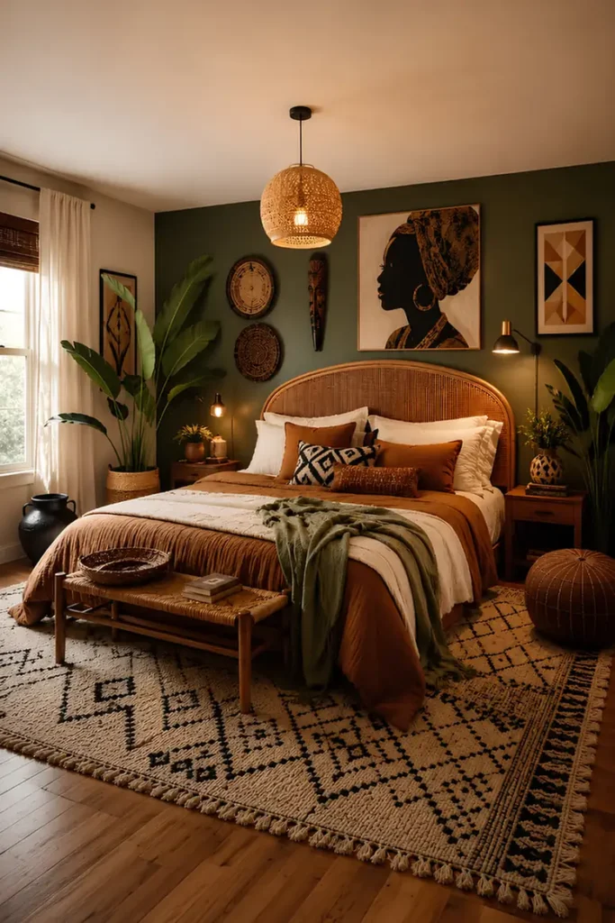
Too much rust and tan starts to blur together after a while, and this room solves it with one move most people skip: a solid olive throw draped loosely across the foot. It breaks up a warm palette without adding a second competing pattern.
The result is a bed that reads layered instead of monochrome, and a throw this size can shift seasonally, swapped for something lighter come summer without touching the rest of the setup.
Rattan and wicker accents nearby also fade with direct sun over time, so keep them a few feet back from the window if the room gets strong afternoon light.
5. Anchor With One Warm Wall
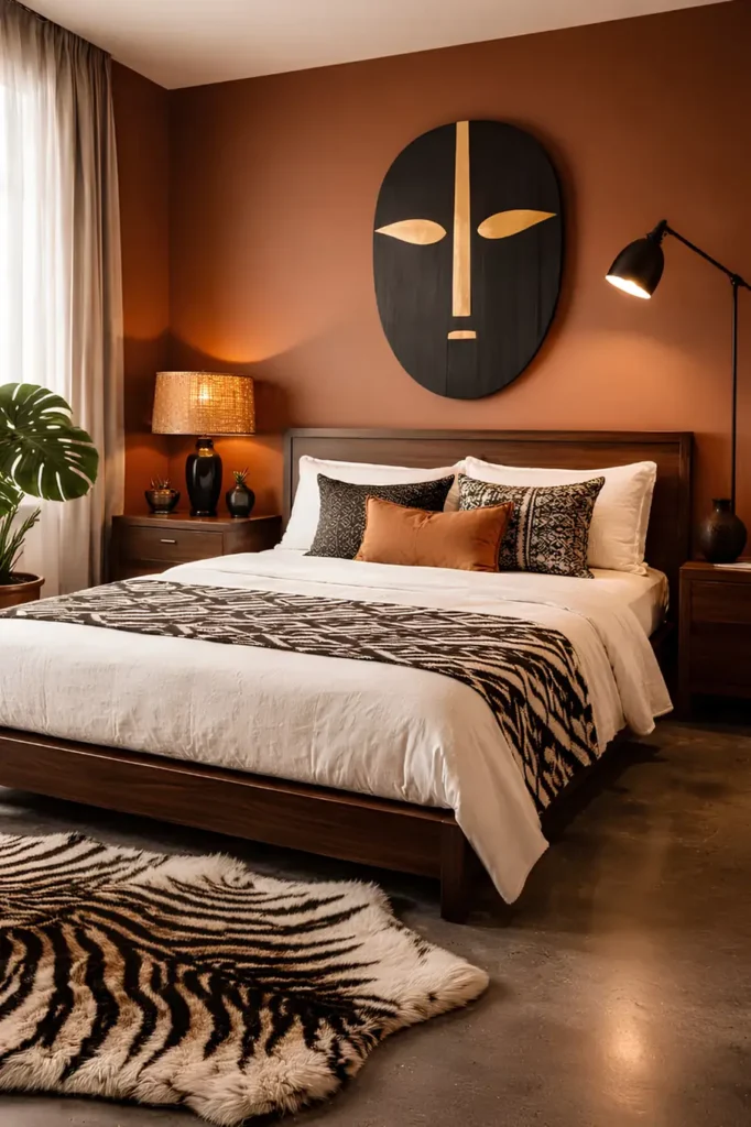
A patterned runner works best when it has exactly one job, and here it only covers the foot of the bed, leaving the rest of the linen bedding solid and calm.
The rust wall behind it does the rest of the visual work, since a saturated wall color reads as bold on its own without needing extra pattern piled on top.
A single orange pillow bridges the wall and the black and white runner so nothing feels disconnected. Wood furniture this dark shows dust more than lighter finishes, so a quick wipe keeps the whole look sharp instead of dulled.
6. Mix Prints Within The Pillow Row
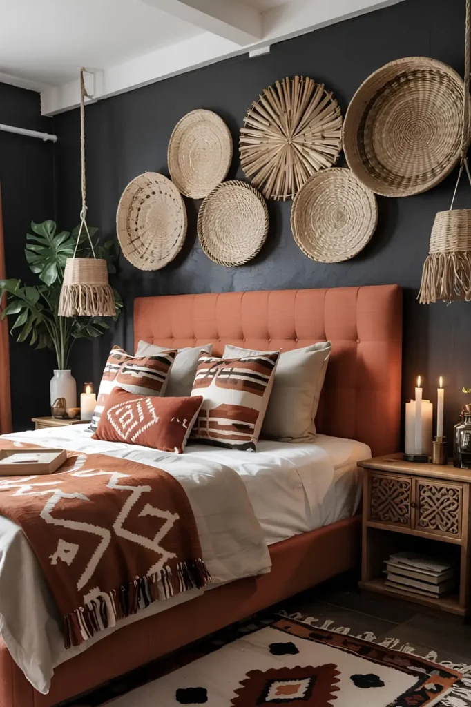
Instead of picking one print and repeating it, this pillow row mixes two different geometric patterns side by side, both leaning brown and cream so they never fight for attention.
A rust upholstered headboard acts as the anchor color that ties both prints together, then plain gray pillows step in behind to give the eye a rest between patterns.
The lesson: mixed prints work when they share a tight color family, not when they share a design. Fabric headboards like this one hold onto dust and pet hair more than wood, so a quick vacuum attachment pass every couple weeks keeps it looking fresh.
7. Stripe The Foot, Keep It Simple

A woven runner with thin rust and cream stripes sits low profile at the foot of the bed, doing subtle pattern work without overwhelming the carved wood frame or the busy layered rug below it.
Rust pillows on top pull double duty, echoing the runner’s color so the whole bed reads coordinated instead of matched exactly. Because the room already carries pattern in the rug and the wall art, the bedding itself stays simpler by comparison.
That balance is the real skill here. Woven textiles like this one snag easily on rings or rough nails, so keep jewelry off the bed when you’re not wearing it.
Recreate this look
8. Trade Neutrals For Jewel Tones

Most African print bedrooms stay in browns and rust, but this one swaps in teal, coral, and mustard instead. The quilt carries all three in one bold graphic pattern.
Solid taupe bedding underneath keeps the quilt from feeling chaotic. It gives the eye one calm surface before the pattern starts.
Velvet pillows in matching jewel tones pull the palette up toward the pillows, so the color story reads top to bottom instead of stopping at the quilt. Deep jewel dyes can fade under strong sun, so keep this bedding out of a west-facing window that gets hard afternoon light.
9. Add Animal Print, Not More Pattern

Leopard print pillows read as African savanna without leaning on geometric prints at all. That’s the swap this room makes.
Two leopard pillows sit against a taupe headboard and gray bedding. Nothing else in the pattern family competes with them.
A striped throw pillow in the middle keeps the animal print from feeling too matchy. One pattern family, kept small, does more than five prints ever could.
Leopard print fades unevenly in strong light faster than solid fabrics do, so rotate these pillows occasionally if they sit near a bright window.
💡 Quick Tip
Keep animal print to one or two pillows max, and let the rest of the bedding stay solid so it reads as an accent, not a theme.
10. Layer Pattern Onto Solid, Then Stop

A rust and black geometric duvet carries almost all the pattern in this room. It stays anchored by two solid cream pillows behind it.
One diamond print pillow adds a second smaller pattern in front. It stays quiet because it uses the same color family as the duvet.
A chunky rust knit throw folds on top. It reads as texture, not pattern, so the eye gets a break before it moves to the next surface.
This is the whole trick: one big pattern, one small pattern, then texture. Any more layers and the bed stops looking curated.
11. Match The Bedding To The Curtains

A kente-inspired duvet in orange, black, and green repeats almost exactly in the curtain fabric across the room. That repetition is the whole design move.
Plain white pillowcases sit underneath the patterned pillow shams. They give the bed a resting point before the full pattern kicks in at the duvet.
Matching bedding to window treatments this closely takes commitment, but it makes a room feel finished rather than assembled piece by piece. Bold printed curtains block more light than sheer ones, so pair them with a sheer layer underneath if the room needs morning light.
| Duvet | Curtains |
|---|---|
| Kente style stripes in orange, black, green. | Repeats the same stripe pattern and palette. |
| Sits low, close to the floor. | Runs floor to ceiling for height. |
12. Cut Black And White With Orange
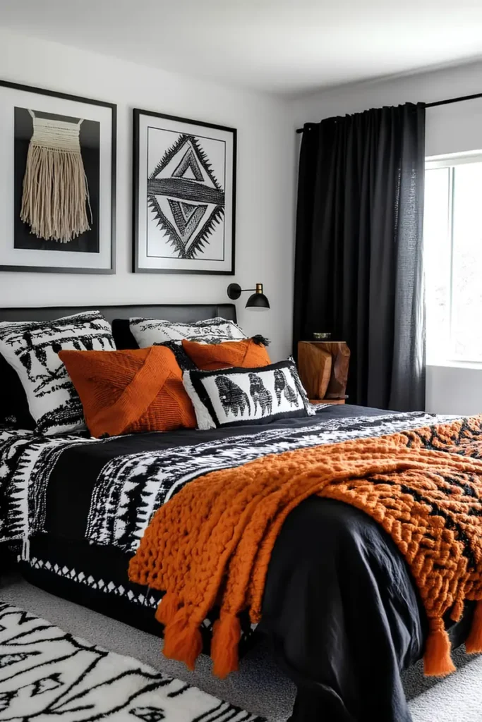
A full black and white printed duvet is a big commitment, and orange is what keeps it from feeling stark. The knit throw and pillows carry all the warmth here.
Chunky knit texture matters as much as the color. A flat orange pillow would sit quietly, but the raised knit gives the throw its own visual weight.
One black solid pillow sits behind the busy print pillow. It gives the pattern somewhere to rest before the eye reaches the headboard.
Bold black and white prints show every wrinkle more than a busy multicolor print would, so plan on a quick smoothing pass each morning if a crisp look matters to you.
A black and white print duvet on its own can feel flat and a little cold.
One chunky orange knit throw warms the whole bed instantly.
13. Add One Teal Pillow For Contrast

Mustard and brown prints dominate this bed, and one teal pillow tucked into the mix is the only thing breaking the warm palette. It’s a small move with a big payoff.
Complementary colors work in tiny doses. A whole teal pillow sham would compete, but this smaller accent pillow just adds a spark.
A solid mustard throw folds loosely at the foot, echoing the yellow wall hanging above. That repetition ties the whole wall and bed together as one scene.
Natural fiber baskets nearby can shed fibers onto bedding over time, so keep woven storage a foot or two back from where sheets and pillows sit.
Keep the accent color to one small pillow.
Pick a true complement, not a close neighbor.
Repeat the throw color from a nearby wall piece.
14. Frame Bold Print With A Canopy

A four-poster frame draped in soft neutral fabric gives this loud geometric print somewhere calmer to sit. The canopy is the real trick here, not the duvet.
Mustard, rust, and green diamonds cover the whole bed, but the pale drapery overhead softens the intensity before it hits the ceiling.
Even the bedposts pick up small printed bands, tying the frame back to the bedding. That repetition keeps a tall piece of furniture from feeling disconnected from the rest.
Sheer canopy fabric collects dust along the top rail faster than people expect, so give it a shake or a light vacuum every month or so.
15. Match The Bedspread To A Wall Textile

A striped woven bedspread in rust, mustard, and charcoal shares the same color story as a circular wall hanging above the bed. That link is what makes the whole wall and bed read as one composition.
Solid white pillowcases sit behind the striped ones, keeping the busiest pattern low on the bed instead of piled up near the headboard.
A red solid pillow adds one pop of pure color into a mostly striped mix. It keeps the look from feeling like one long repeating pattern.
Woven bedspreads with fringe can catch on jewelry or rough hands, so trim any loose threads early before a small snag turns into a bigger pull.
A wall textile with a repeating motif.
Plain white pillowcases.
A striped woven bedspread in matching tones.
One solid pop color pillow.
16. Go All In On Saturated Stripes

Some rooms hold back on color, and this one refuses to. A striped duvet in teal, mustard, and deep red covers the entire bed with zero neutral breaks.
Solid velvet pillows in teal and orange repeat the duvet’s exact colors rather than introducing new ones. That restraint is what keeps a maximalist bed from tipping into visual chaos.
A dark wall behind the bed absorbs the room’s ambient light, which makes every stripe on the duvet look more saturated than it would against a pale wall.
Deep saturated dyes on velvet can rub off onto light furniture, so keep these pillows away from cream upholstery until you’ve confirmed the color is set.
A dark wall lets saturated stripes read as rich instead of loud.
17. Skip Prints, Rely On Color Alone

Not every bold bedroom needs a busy pattern. This bed goes all rust and amber, using shade rather than print to carry the drama.
Solid velvet pillows in three warm tones stack against plain linen shams. Zero prints appear anywhere on the bedding itself.
A single striped pillow tucked mid-stack is the only patterned piece in the whole layout. It reads as a quiet accent rather than a focal point.
This approach suits anyone who loves the palette but finds busy patterns visually tiring at the end of a long day, since a solid bed still feels calm to fall into.
Anyone who wants the palette without visual noise.
Rooms that already carry pattern in the rug or art.
18. Split The Bed With Two Blankets

Navy and rust are true opposites on the color wheel, and this bed splits them right down the middle instead of blending them. One solid throw covers the top half, a second covers the bottom.
The wall hanging above repeats the same navy and rust split in its shapes. That echo is what makes the two color block blankets feel planned rather than random.
Small printed pillows in the same two colors bridge the gap between the blankets and the wall art. Nothing new gets introduced, which keeps a bold combination from spiraling into five different tones.
Nubby woven throws like the rust one shed small fibers early on, so a gentle first wash cuts down on lint before it ends up all over dark bedding.
Navy on top for a cooler, grounded half.
Rust on the bottom for warmth near the feet.
Small printed pillows bridge the two colors together.
19. Block Color The Duvet Itself

Some beds hold pattern only in the pillows and headboard, and this one takes the opposite route. The duvet itself is color blocked in red, gold, and green, no print needed.
A triangle print headboard behind it is loud on its own, so the duvet stays graphic but pattern-free. Two busy elements side by side would cancel each other out.
Solid velvet pillows in the same three colors repeat the duvet’s blocks in smaller doses. That repetition ties the headboard, the pillows, and the duvet into one palette instead of three separate ideas.
Bold flat color duvets show every crease and wrinkle more visibly than a print would, so plan on a smoothing pass each morning to keep the color blocks looking crisp.
Solid velvet pillows in red, gold, and green.
Color blocked duvet in the same three tones.
Graphic triangle print headboard.
20. Patchwork Zigzags In One Family

This duvet mixes several different geometric motifs- zigzags, dots, triangles- all in the same rust and black palette. It works because the shapes vary but the colors never do.
Solid rust and cream pillows sit closest to the headboard. They give the eye a breather before the full patchwork duvet takes over below.
The carved wooden headboard picks up the same warm brown tones as the duvet, so a busy print still feels grounded by the furniture around it.
Multi-pattern duvets like this one hide stains better than solid colors, but they also make small tears harder to spot early, so run a hand over the seams occasionally to catch wear before it spreads.
| Type | Best for | Watch out |
|---|---|---|
| Zigzag panel | bold visual anchor | busiest section |
| Dot panel | softening a hard edge | can read as plain from far |
| Triangle panel | tying shapes together | needs a solid neighbor |
21. Try An Ombre Gradient Instead

Every entry so far uses flat color or hard pattern, and this bed takes a third route: a duvet that fades from deep brown to warm orange in one smooth gradient. No print, no color blocking, just a shift.
Black and white geometric pillows sit on top, giving the gradient duvet something crisp to contrast against. Without them, the smooth fade alone would feel a little flat.
The rust textured wall behind the bed picks up the same fade, so the gradient duvet feels like an extension of the room rather than a separate layer.
Ombre dyed fabric can show fading unevenly with repeated washing, so a gentle cycle and cold water keep the gradient looking smooth for longer.
near the headboard
the transition zone
toward the foot
22. Pair Bold Bedding With Simple Art
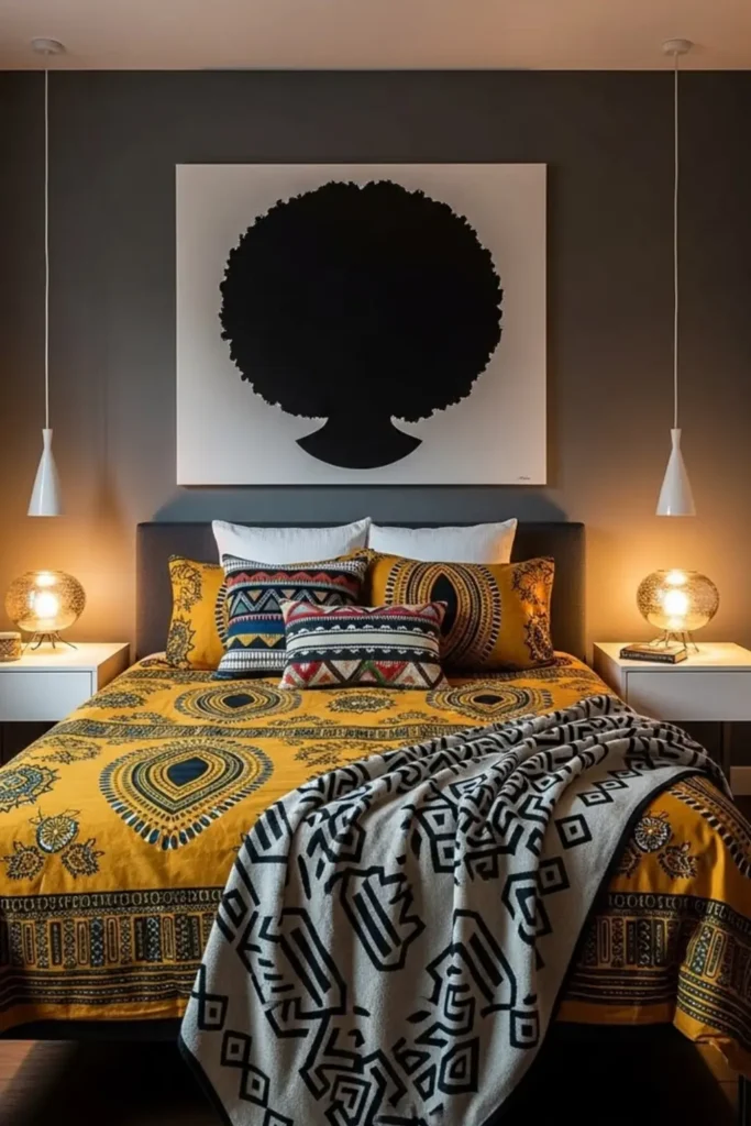
A gray headboard and a graphic silhouette portrait give this loud mustard duvet a modern frame instead of a busy one. The wall art carries zero color, and that restraint is what lets the bedding be the star.
Medallion print duvet in mustard, navy, and cream covers the whole bed, then a black and white geometric throw folds on top for a second, cooler pattern.
Small pendant lamps flank both sides instead of table lamps, freeing up the nightstands and keeping the visual focus low, right where the pattern lives.
Mustard dye can bleed if washed with anything white, so keep this duvet in its own load for the first several washes.
⚠️ Watch Out
Pair one bold print with quiet, monochrome wall art so the bedding has room to be the focal point instead of competing with it.
23. Add A Metallic Kente Stripe

Gold satin pillows and a metallic striped runner bring shine into an otherwise all black bedroom. That reflective surface is what separates this bed from a plain black and white one.
Solid black pillows anchor the base of the pile, then the striped gold accent runs across the front edge, catching light every time someone walks past the bed.
A gold sunburst mirror above repeats the same metallic finish, so the shine on the bed doesn’t feel like an isolated detail.
Satin and metallic fabrics snag more easily than cotton, so keep sharp jewelry and rough denim away from these pillows if you want the sheen to last.
Metallic gold accents against pure black turn a simple bed into the room’s obvious focal point.
24. Let A Neutral Headboard Take A Break
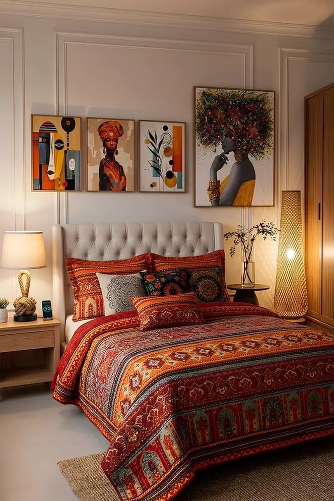
An upholstered cream headboard is the one calm surface in this whole room, and it earns its keep by giving a densely patterned bedspread somewhere to rest visually.
Layered medallion prints in red, teal, and gold cover nearly the entire bed. That density works precisely because nothing above it competes for attention.
A single gray pillow sits mid-stack, breaking up the color long enough for the eye to reset before it moves back into the pattern.
Densely printed cotton like this holds onto odors more than a solid weave, so an occasional airing out or a light steam keeps it smelling as fresh as it looks.
25. Match The Rug To The Throw
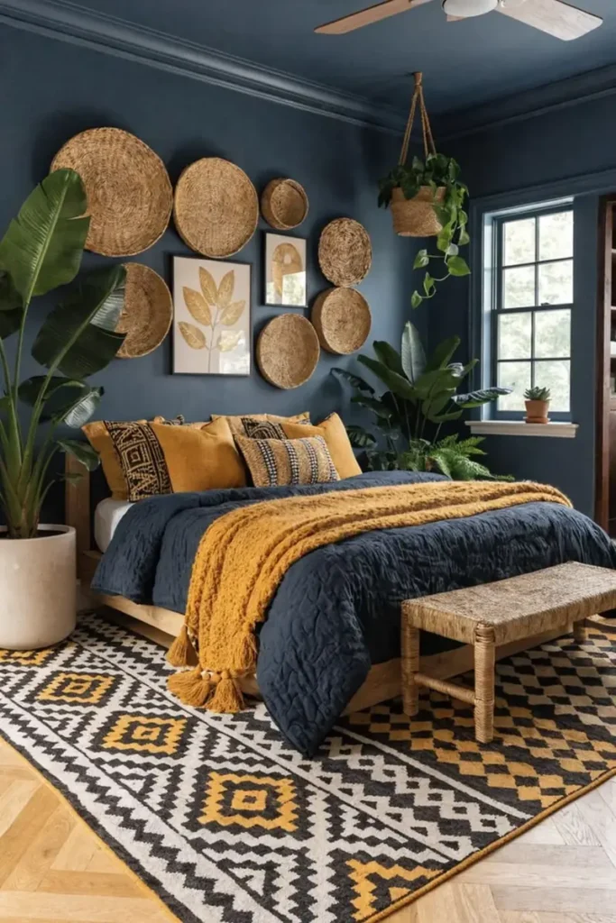
Navy and mustard repeat between the rug and the throw here, but the duvet itself stays a plain solid navy. That restraint keeps two busy patterns from ever meeting.
A chunky mustard throw folds diagonally across the foot, echoing the geometric rug below it without literally matching it. Same colors, different pattern scale.
Woven basket wall art picks up the same warm tone, tying the whole wall into the bed’s color story from above instead of beside it.
Chunky knit throws pill faster in spots that see friction, like where pets curl up, so a fabric shaver every few weeks keeps the texture looking new.
26. Try A Symmetrical Patchwork Grid
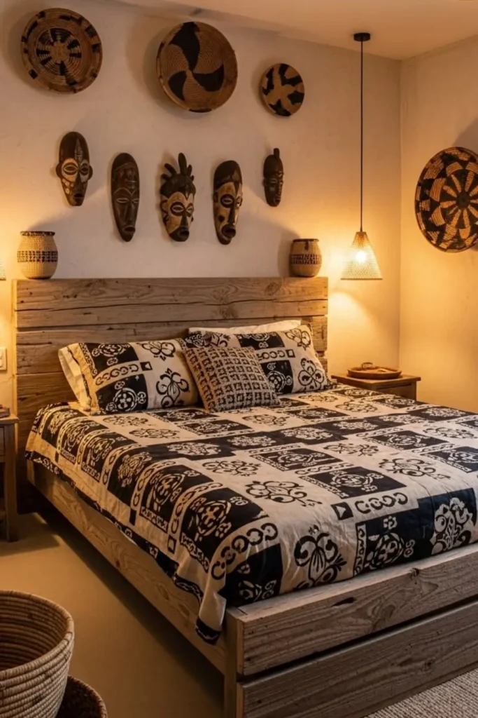
Most patterned bedding on this list uses one repeating motif, but this quilt is a true patchwork grid: each square carries a different mudcloth style symbol, all in matching black and cream.
A raw wood plank headboard grounds the busiest print on the list so far. Rough, unfinished wood reads as sturdy rather than fussy, which keeps a dense grid pattern from feeling overwhelming.
Carved masks above the bed repeat the same black and cream palette, so the wall and the quilt read as one continuous story instead of two separate design choices.
Patchwork quilts with many small motifs take longer to iron smooth than a single large print, so budget extra time if a crisp, unwrinkled look matters before guests arrive.
Conclusion
Bold doesn’t have to mean chaotic. The bedrooms above show that one confident print, paired with solid color and a little restraint, usually reads stronger than five patterns competing for attention.
Start small if you need to. One throw, one pillow, one wall hanging in the same color family as your bedding can shift a whole room.
If you try any of these looks, save your favorite for later and come back to it when you’re ready to commit to the full version. Your bedroom should feel like a place you actually want to walk into at the end of the day.
Bold rooms come from one confident choice, not five competing ones.