Renting comes with a long list of things you cannot do. No painting the walls, no drilling into brick, no ripping out that landlord-beige carpet.
What it does not come with is a rule against color, and that is where most first apartments go wrong. People wait to decorate until they buy a place, so the space they live in every day stays half finished and forgettable.
These colorful first apartment decor ideas skip that wait entirely. A backlit gallery wall, a scalloped floor mirror, a sofa that carries a whole room’s palette on its own, none of it needs a single hole in drywall.
Some of these ideas come straight from real rooms people have actually pulled together on a renter’s budget, and some are fresh concepts built to fill in whatever those rooms did not cover, from a painted interior door to a layered rug trick for studios with no walls to speak of.
Whatever your lease allows, there is a version here that works, and every single one comes back down at move-out without costing a cent of the deposit.
1. Backlit Retro Print Gallery Wall
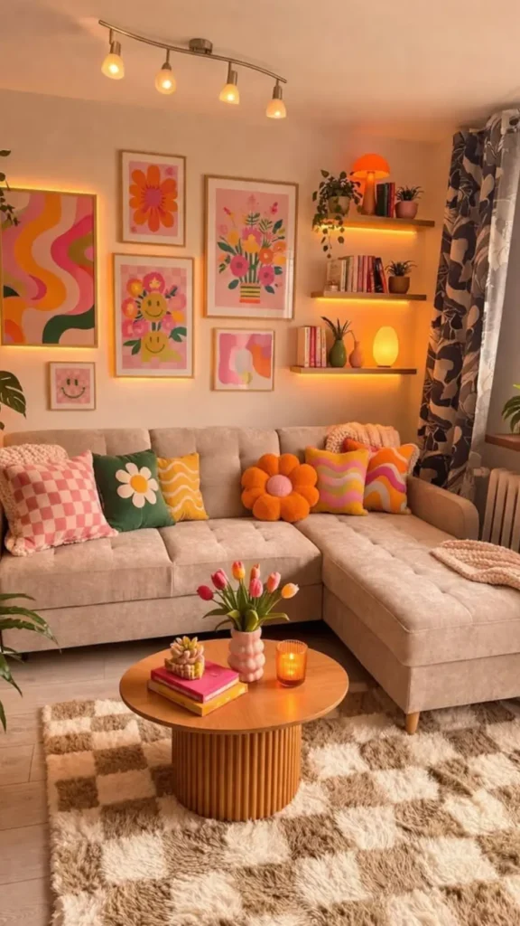
Five mismatched art prints climb this wall in a loose grid, swirls next to smiley faces next to checkerboard flowers, and none of it would work without the trick tying it together.
A warm LED strip runs behind the frames and open shelves, turning flat prints into a glowing focal point the second the sun goes down. A few honest notes on what makes it read as cohesive instead of cluttered:
- Every frame stays the same slim black style, even though the art inside is loud
- Colors repeat across the pillows, rug, and prints (pink, orange, green), so the eye keeps connecting the dots
- Open shelving between frames breaks up the grid and holds plants and books instead of more art
- The backlight does the heavy lifting, one warm strip, and the whole wall feels intentional
Renters can pull this off with removable frame clips and a plug-in LED strip, no drilling required.
2. Corduroy Sofa as Color Anchor
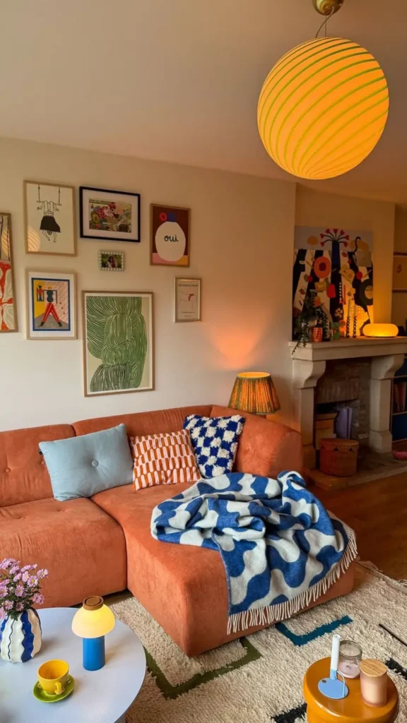
Skip the color explosion above the sofa for a second and look at the sofa itself.
A burnt orange corduroy sectional carries almost the whole room, and everything else, jewel-tone throw pillows, a blue graphic blanket, mismatched art in every size and frame style, gets to be loud because the couch stays one solid, confident color.
Here is how to borrow the trick in a rental.
Pick one bold, saturated piece of furniture, or a slipcover in that color.
Let the walls stay neutral so the furniture does the talking.
Add pattern through pillows and throws instead of paint.
Mix frame sizes and styles on the gallery wall since the sofa already holds it together.
A paper lantern pendant in matching orange and green stripes ties the ceiling into the same story without a single nail in drywall.
3. Curvy Mirror Anchors Pink Bedroom
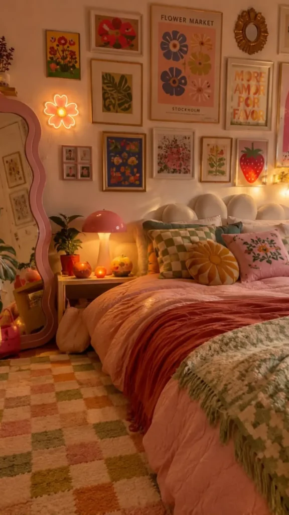
A scalloped pink floor mirror does more work here than any single piece of wall art.
It leans in the corner, catches the room’s warm light, and gives the whole space a soft, rounded edge that plays against all those hard picture frames stacked above the bed.
The neon flower sconce next to it repeats the pink and adds a little glow that makes the corner feel finished instead of empty. Three small things worth copying:
- A floor mirror with a shaped frame instead of a plain rectangle
- One neon or LED accent shape near the mirror, not centered on the wall
- A checkerboard rug in soft, muted tones instead of stark black and white
None of it involves paint or a single wall anchor, which matters when the lease says no holes.
4. Multi-Color Sofa in One Row
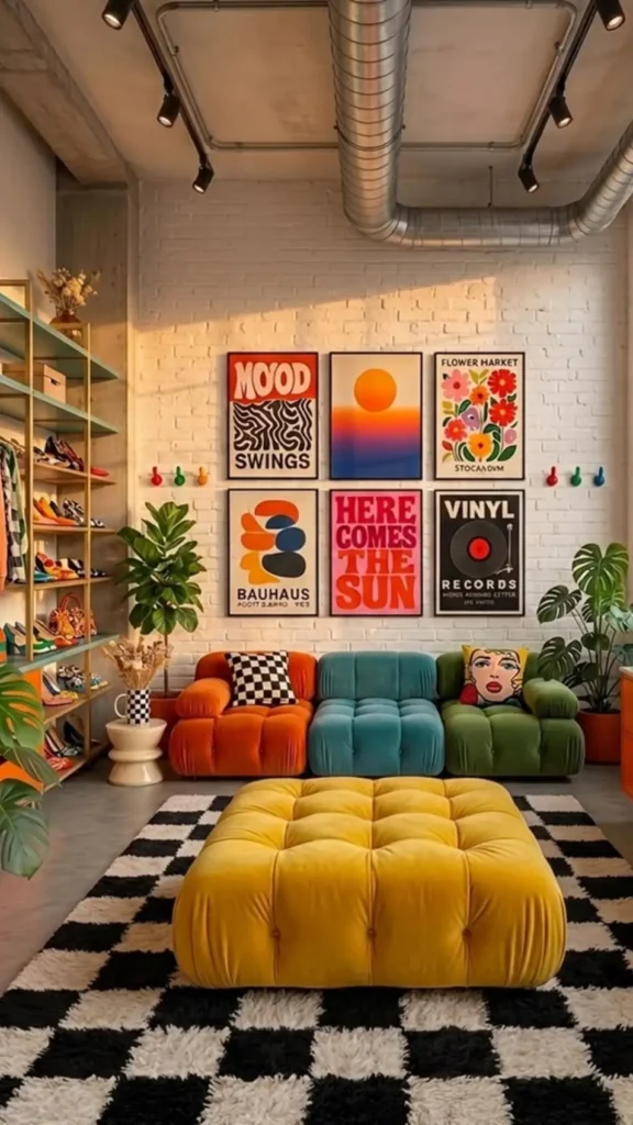
Forget matching. This sofa is three separate colors, burnt orange, teal, and olive, all the same tufted style lined up in a single row like a color block sculpture.
It sounds risky on paper, but it works because the shapes stay identical and the rug and the rest of the room lean into bold, graphic patterns instead of trying to calm things down.
Heads Up: This only works if every section is the same silhouette and fabric texture. Mixing colors and shapes at once reads as clutter instead of a statement.
A row of colorful hooks near the art wall holds bags and scarves in view, which is its own small win for a renter short on closet space. The graphic poster grid above leans into bold text and mid-century shapes rather than photography, another easy way to layer more color without touching the walls.
⚠️ Watch Out
Keep the silhouette and fabric identical across every colored section, or the mismatch reads as clutter instead of a design choice.
5. Fringe Macrame Above Rattan Bed
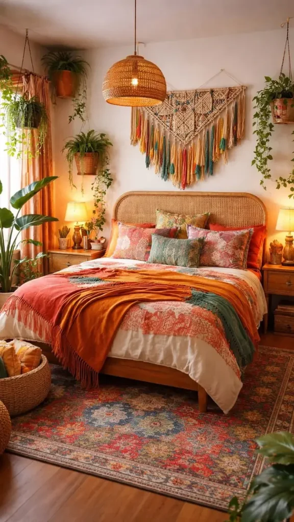
Above the rattan headboard hangs a triangular macrame piece with dip-dyed tassels in rust, teal, and mustard, and it does something a flat-framed print cannot.
The fringe moves, it casts a soft shadow from the woven pendant light nearby, and it pulls every color already in the throws and pillows up onto the wall without adding a single frame.
Layered textiles do the rest of the work, pattern on pattern in warm terracotta, teal, and cream, so the room feels collected rather than matched.
Recreate this look
Renters get a strong focal point with two nails, sometimes just one hook.
6. Neon Sign as Wall Art
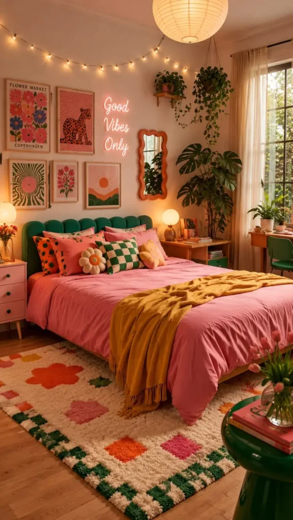
A pink neon “Good Vibes Only” sign hangs between framed prints instead of off to the side, treated exactly like another piece of art.
String lights loop along the ceiling line above it, a paper lantern glows overhead, and the green velvet headboard grounds all that pink and orange bedding so the room reads bold instead of overwhelming. The trick is restraint in one place to allow chaos everywhere else.
Quick Tip
- Choose one neutral anchor color, here it is green, and repeat it once or twice (headboard, rug border, side table)
- Let the neon sign sit inside the gallery wall grid, not above or below it
- Layer string lights as an ambient glow, not the main light source
- Keep the rug pattern busy since the walls are already full
A neon sign inside the gallery grid reads as art, not decoration, and it lets loud colors everywhere else feel planned instead of accidental.
7. Sculptural Wood Coffee Table
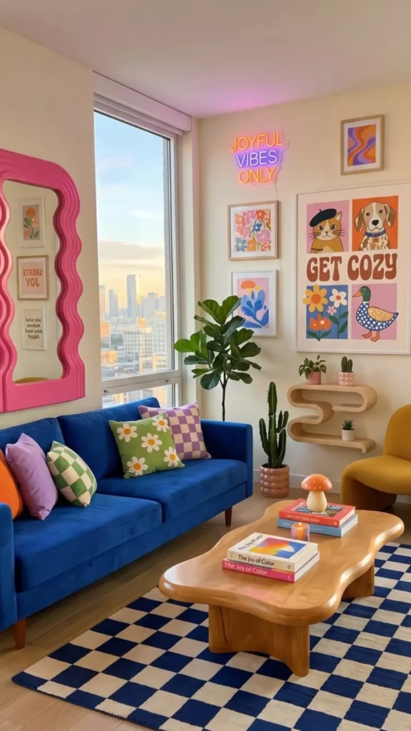
The blue velvet sofa and pink wavy mirror grab attention first, but the real standout is low to the ground: a solid wood coffee table carved into soft, organic curves instead of straight edges.
It picks up the same wave pattern as the mirror frame and the cloud-shaped floating shelf beside the yellow chair, so three totally different pieces end up speaking the same shape language without matching in color at all.
A comparison of the two ways to add a shape-repeat trick like this:
| Straight Furniture | Curved Furniture |
|---|---|
| Reads as standard, blends in. | Becomes a focal point on its own. |
| Easy to find secondhand. | Worth the splurge on one hero piece. |
Pair one curved piece with a checkerboard rug in the same color family and the whole layout feels designed instead of assembled.
8. Removable Wallpaper Reading Nook
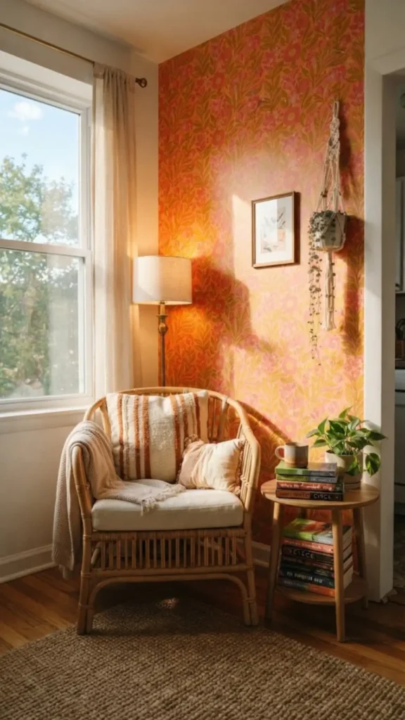
A single accent wall wrapped in bold botanical peel-and-stick paper turns an empty corner into a reading nook without a drop of paint.
The pattern mixes deep coral and mustard leaves on a cream base, and a rattan chair with one striped cushion sits right in front of it so the wallpaper reads as a backdrop instead of overwhelming the space.
Layer in a small side table with a stack of paperbacks and a warm task lamp, and the whole corner feels planned even though it took an afternoon.
- Peel-and-stick paper on one wall only, never the full room
- One chair in a solid color to let the pattern lead
- A lamp with warm light instead of overhead lighting
- Removes cleanly at move-out, security deposit stays safe
9. Colored Glass Bud Vases on a Sill
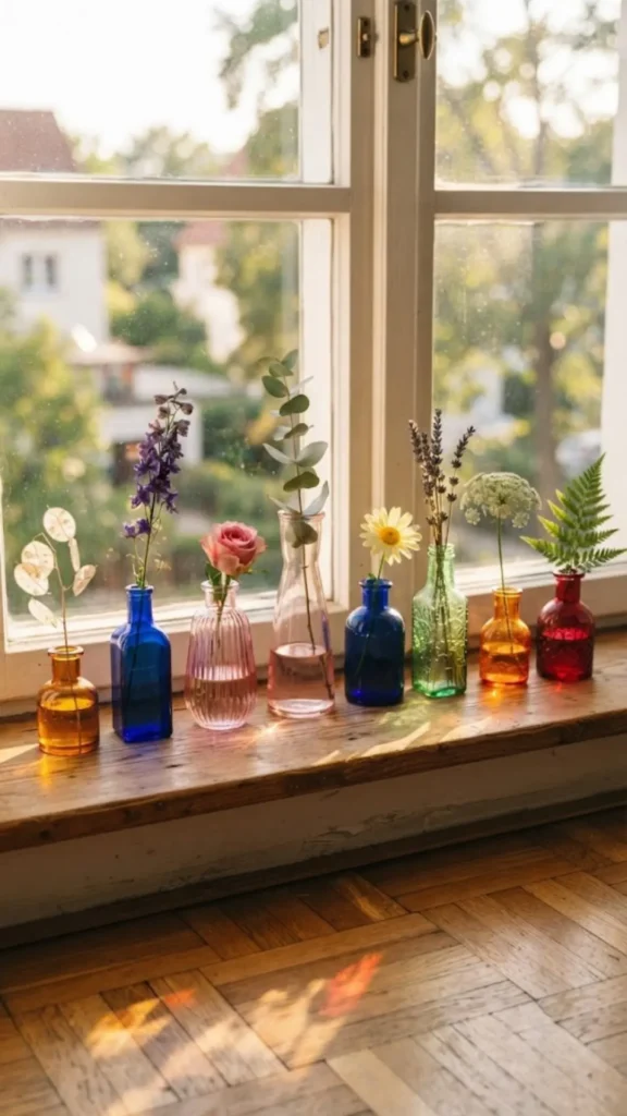
Late afternoon sun hits a row of amber, pink, and cobalt glass bud vases lined up on a windowsill, and the light throws small pools of color across the ledge and onto the floor below. Each vase holds one or two stems, nothing fussy, so the collection reads as intentional rather than cluttered.
Good To Know
- 📌 Thrifted or mismatched glassware works better than a matching set; it looks collected over time
- 📌 South- or west-facing windows catch the most color at golden hour
- 📌 Group in odd numbers, five or seven vases, for a fuller look without crowding
A twenty-dollar thrift store haul can fill an entire shelf.
📌 Good To Know
Mismatched thrifted glass in odd numbers, five to seven pieces, catches more light and looks more collected than a matching set.
10. Pegboard Wall with Woven Baskets
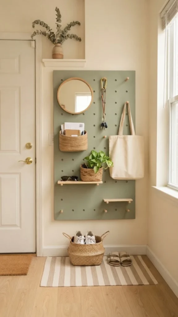
Skip the plain entryway shelf. A large pegboard painted a soft sage holds a mix of small woven baskets, hooks, and a round mirror, turning a boring wall into storage that also looks like art.
Keys go in one basket, mail in another, and sunglasses hang on a repurposed wooden peg, so nothing sits out on a counter.
Paint or buy a pegboard in a color that pops against your wall.
Add hooks at different heights for bags, keys, and jackets.
Mix in two or three small woven baskets for loose items.
Leave open pegboard space so the wall does not feel packed.
Every piece unscrews at move-out, no wall damage left behind.
11. Bold Curtain as Studio Room Divider
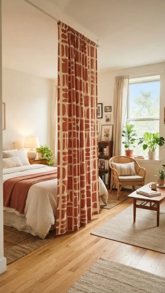
A floor-to-ceiling curtain in a big block print pattern, terracotta and cream, hangs from a tension rod to split a studio apartment’s sleep area from the living space.
It moves out of the way in seconds for cleaning or hosting, and it adds pattern and privacy at the same time, something a solid room divider screen rarely pulls off in a small footprint.
Do this versus skip this:
Pick a pattern bold enough to read as a design choice.
Use a tension rod, zero drilling required.
A plain white sheet, it reads as unfinished.
Floor track systems that need landlord approval.
The same curtain works as a closet cover if there is no closet door.
12. Mismatched Ceramics on Open Shelving
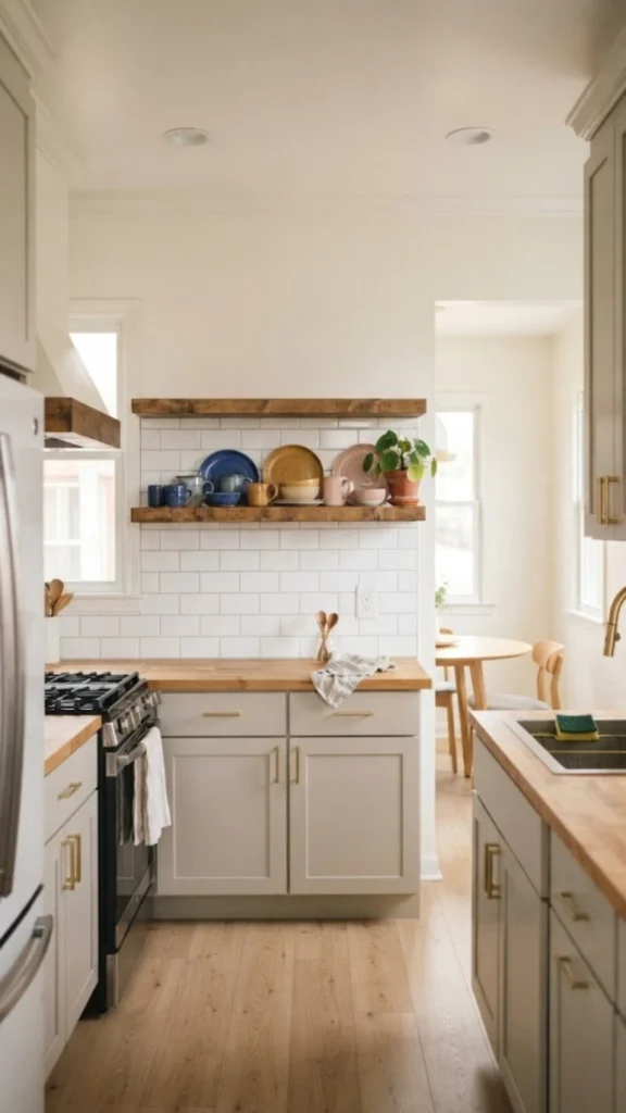
Before and after a rental kitchen makeover show how far a little color goes without touching a single cabinet. The before is a bare wood shelf with plain white mugs.
The after swaps in mismatched ceramic mugs, plates, and small bowls in cobalt, ochre, and blush, arranged by color instead of by set, so even secondhand finds look curated.
- Group by color family, not by matching pattern
- Leave gaps between pieces so each one stands out
- Add one plant or small vase on the shelf for a break from dishware
The whole swap costs less than one new cabinet door.
Bare wood open shelf with plain white mugs and stacked plates.
Mismatched cobalt, ochre, and blush ceramics grouped by color with a small plant tucked in.
13. Painted Front Door as Color Statement
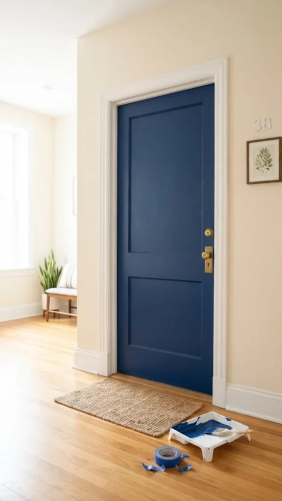
The one thing a rental almost always allows: swapping the interior side of a front door for a bold painted color, no landlord approval needed since it faces inward.
A deep cobalt door against cream walls turns the entry itself into a focal point before a single piece of furniture goes in.
Quick Tip
- Check the lease for interior paint clauses; most allow it since it reverses easily
- Pick a saturated color that contrasts with the wall, not a near match
- Add a brass or colorful doorknob to finish the look
- Repaint back to white before move-out in under an hour
A can of paint and painter’s tape is the entire budget here.
A painted door reverses in an hour but makes the whole entry feel designed the second someone walks in.
14. Layered Rugs for a Zoned Studio
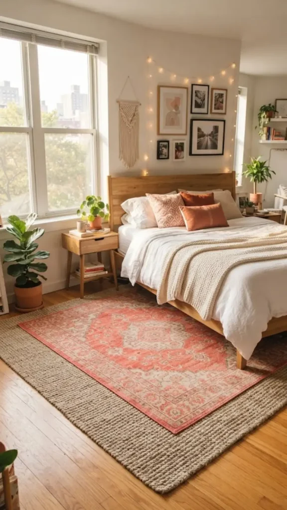
Two rugs stacked instead of one solve a studio’s biggest problem: no walls to separate the sleeping corner from everything else.
A large jute rug covers most of the floor, and a smaller, brighter patterned rug in coral and cream sits on top under the bed, visually marking that zone as its own room within a room.
- Base layer: neutral jute or sisal, covers the full footprint
- Top layer: smaller, patterned, placed under the bed or seating area only
- Keep the top rug pattern loud since the base stays quiet
- Works especially well in studios with no natural room breaks
Two secondhand rugs almost always beat one expensive new one.
15. Tension Rod Curtain Skirting a Bed Frame
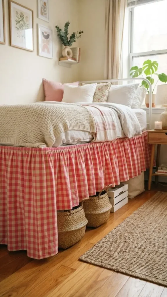
A budget metal bed frame gets fully hidden behind a gathered fabric skirt in a bright gingham print, hung from a tension rod tucked under the mattress edge.
It adds instant softness and color to a plain frame without a single tool, and it doubles as hidden storage since bins slide underneath, out of sight.
Do this versus skip this:
Use a lightweight cotton or gingham for easy gathering.
Tuck the rod under the mattress, no frame attachment.
Heavy fabric that sags or pulls the rod down.
Hot glue or staples directly on a rented frame.
The same trick works on a desk or console table with exposed legs.
Conclusion
Fifteen ideas in, the pattern is clear: color does not need permission from a landlord, just a little creativity about where it goes.
Whether that means a wall of thrifted glass vases catching the sunset or a single bold sofa doing the heavy lifting for an entire room, the goal is the same. Make the space feel like yours, not like a placeholder until the next move.
Pin the ones that fit your rental rules, save the rest for later, and start with whichever idea you can pull off this weekend.