
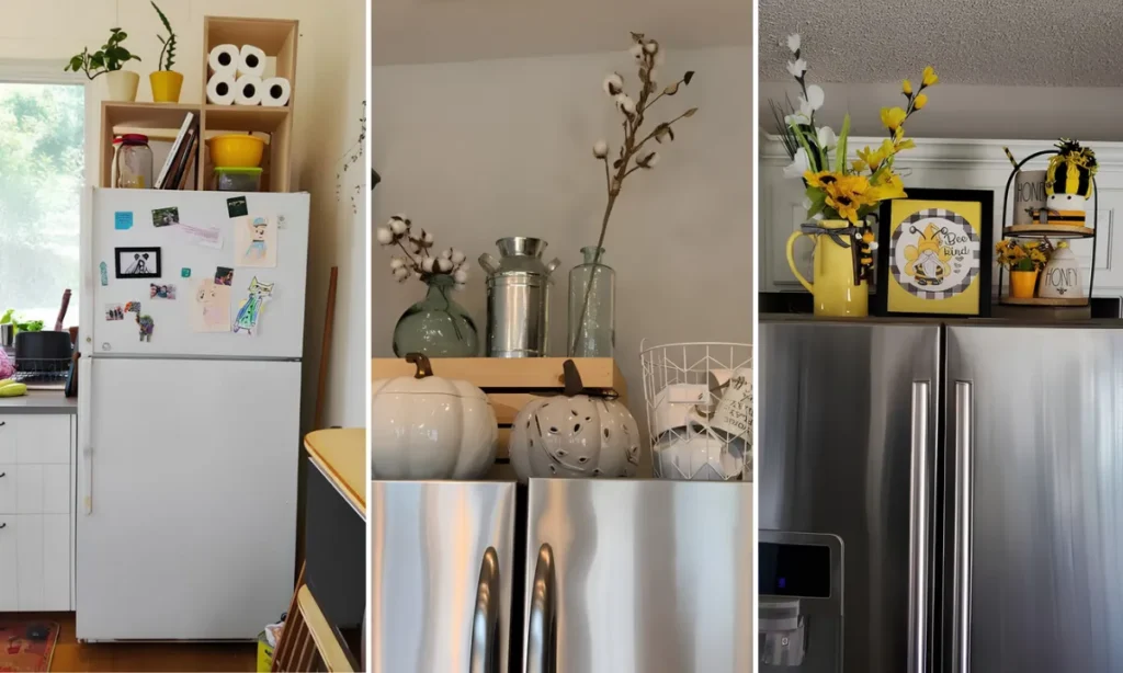
That awkward space above the fridge doesn’t have to sit empty, or worse, collect dust and stray boxes.
It can actually be one of the most fun spots in the whole kitchen to decorate.
These 26 top-of-the-fridge decor ideas cover everything from quick five-minute wins to fuller styled vignettes. Some use real photos of actual kitchens. Others are fresh ideas built just for this list.
You’ll find crates, baskets, lanterns, florals, and even a few pieces that quietly double as storage. Renters get options too, since almost nothing here needs a drill.
Pick two or three that match your own cabinets and colors, and that dead zone above the fridge finally starts pulling its weight.
1. One Color Unifies Mismatched Decor
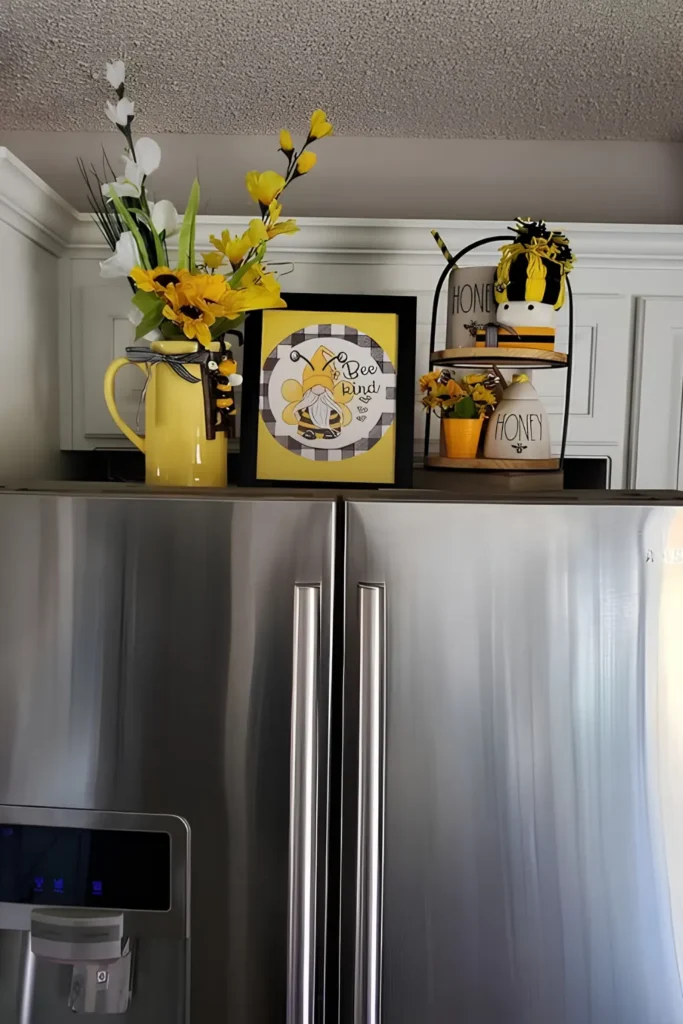
These pieces don’t match. They still look pulled together.
The trick is one repeating color that shows up in every single item, no matter how different the piece.
Look for it in:
- A ceramic pitcher or vase
- A framed print or sign
- A small potted accent
- One tray or stand nearby
Everything else can be white, black, wood, or steel. That neutral base is what makes the accent color pop instead of getting lost.
Swap the pieces every season and the color rule still holds, so nothing above the fridge ever looks unplanned.
whites, woods, steel
the color in every piece
black or a dark trim
2. Lean A Round Board Back
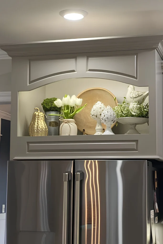
A recessed niche does half the styling work already. It frames everything inside it like a display case.
Skip the urge to fill every inch. Height variation carries it: something tall stays in back, something round and flat leans against the wall, small shapes fill the front.
That wood board isn’t just a charger anymore. Propped upright, it works as low-effort wall art, and it keeps dust off the shelf behind it since nothing’s mounted there.
greenery and tulips
the bird and topiary pair
one small solid accent
3. A Crate Anchors Loose Pieces
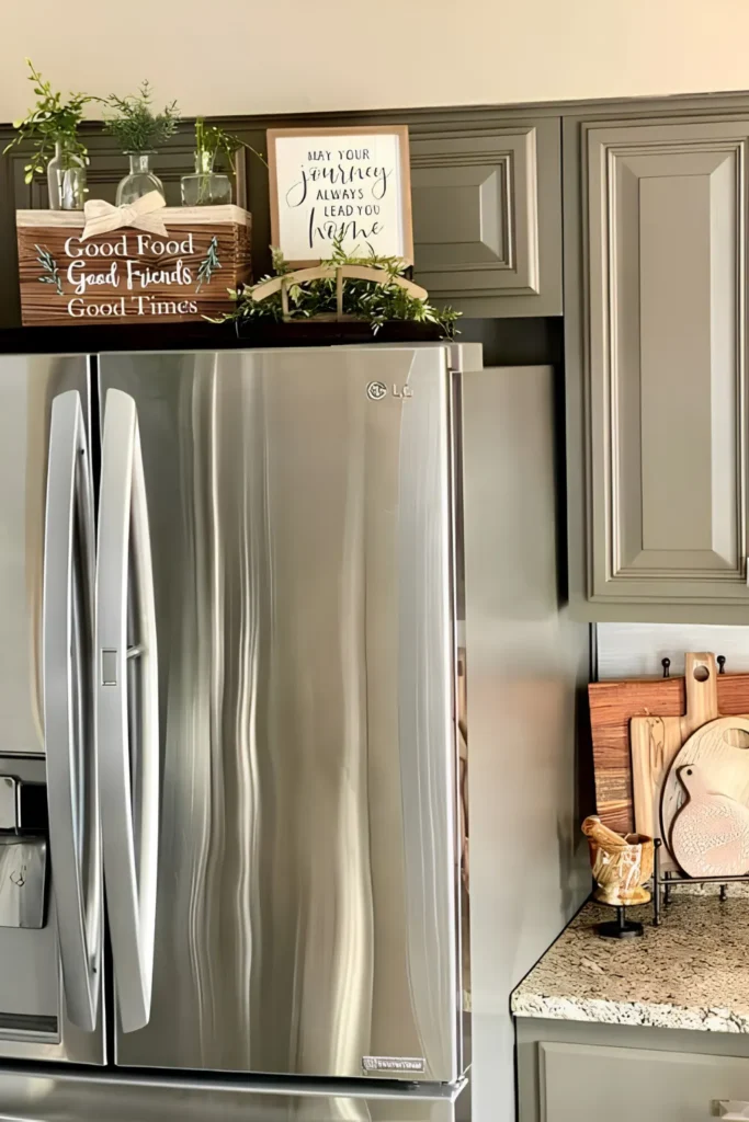
Three small pieces on their own can look like clutter waiting to slide off.
Set them inside one wood crate instead, and the eye reads them as a single grouping instead of three separate accidents.
- The crate carries the printed message, so nothing else in the group needs to say anything
- The bud vases add height without needing any real floral skill
- One low basket of greenery in front keeps the base from feeling empty
Swap what’s in the vases each season and the crate itself never has to change.
4. Books And Mugs Build Character
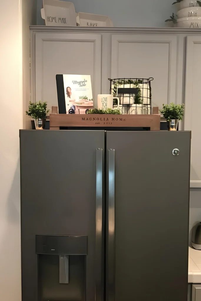
What turns a paperback and a coffee mug into decor instead of clutter?
Grouping by story, not by object type.
Here everything nods to one idea: a kitchen that gets used, loved, and lived in. The wire basket adds a raw, unfinished texture right next to all that smooth painted wood, which keeps the whole thing from feeling too matchy.
Two identical planters bookend the grouping on either side, and that small bit of symmetry is what stops it from tipping visually toward one edge.
Nothing here is mounted or glued down, so the whole setup packs into one box on move-out day.
A favorite mug.
Two small potted plants.
A wood crate with lettering.
A small wire basket.
5. Height Comes From Tall Branches
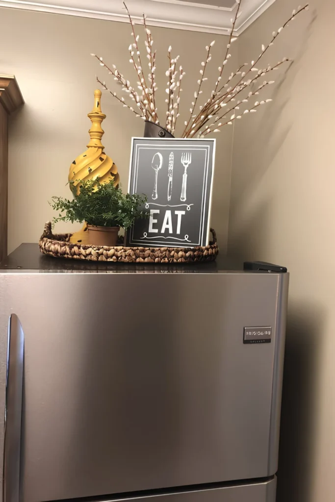
A basket display doesn’t need a rulebook. It needs one tall thing breaking the ceiling line above it.
Here, that’s a bundle of branches leaning out of a dark pitcher, reaching well above everything else on the tray.
- Height comes first, from the branches
- Personality comes next, from the printed sign
- Softness comes last, from the fern spilling over the woven edge
The branches never need water either, so this is one grouping that survives past whichever season it started in.
Let one piece stand twice as tall as the rest.
It gives the eye somewhere to land first.
6. Vintage Labels Fake Farmhouse History
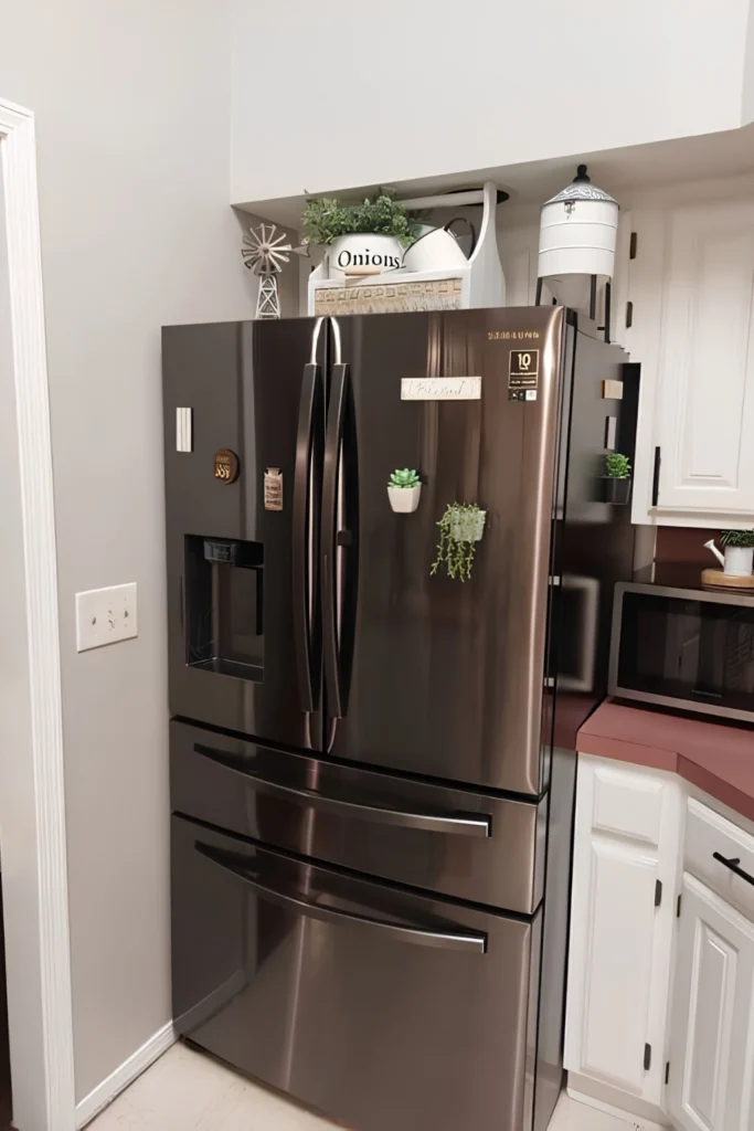
A crate stamped “Onions” doesn’t have to hold a single onion.
Lettering like that is what sells the farmhouse feel, not what’s actually inside the container.
Pair it with a tall dispenser shape and a small windmill accent, and the whole grouping reads like it was gathered over years, not bought in one trip. Nothing here needs refilling, which is the real trick.
Label words that read farmhouse
7. Reuse The Same Riser Base
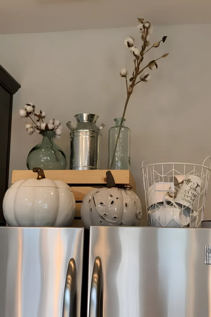
Swapping the whole top of the fridge every season gets old fast.
Keep the wood crate and the glass jars as a permanent base. Only change what fills them.
- Cotton stems for a neutral, quiet look
- Two ceramic pumpkins for fall warmth
- A wire basket of mugs for everyday charm
Three pieces move in and out. The skeleton never has to change.
8. Mirror Two Plants For Symmetry
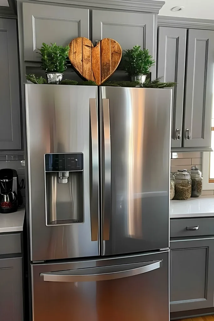
Symmetry is the fastest way to make a small display look designed.
Two identical potted plants anchor either side. One flat, chunky centerpiece fills the gap between them.
The plants don’t have to be real. Faux skips the light problem this spot usually has, since there’s rarely a window anywhere near the top of a fridge. Swap the center piece and the whole formula still holds.
9. Texture Does The Heavy Lifting
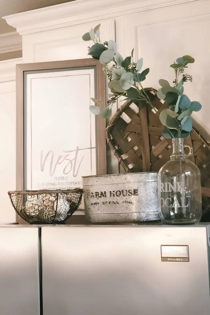
Why does a display built from all-neutral pieces still feel rich instead of flat?
Texture is doing the work color usually does.
- Woven basket for something rough
- Wire egg basket for something open
- Galvanized bin for something worn
- Glass jug for something that catches light
Four textures, one restrained palette, and the eye never gets bored.
Round baskets stacked near each other create rhythm without matching.
Metal cools the grouping down while woven pieces warm it back up.
10. Your Framed Photo Adds Meaning
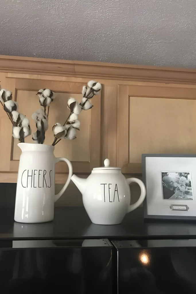
Labeled pieces like “Cheers” and “Tea” could feel like generic shelf filler on their own.
One small framed photo next to them changes that completely.
The word pieces stop reading like random purchases. They start reading like part of a real story, because now they’re sitting next to something that actually means something. Keep the frame modest so it doesn’t outsize the pitcher beside it.
The pieces worth keeping are the ones that mean something.
11. Stack Crates Into Open Shelving
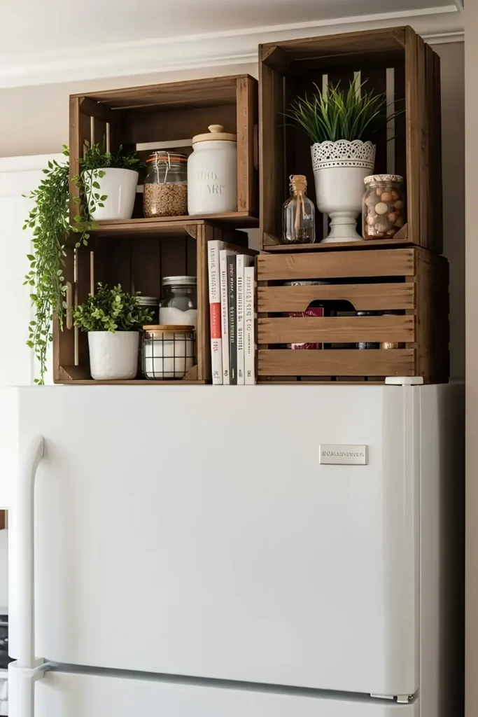
Stacked crates read as furniture, not storage bins.
Three or four crates in different sizes build a whole shelf system, and the only cost is the crates themselves.
Mix in a trailing plant, a couple of glass jars, and a stack of cookbooks leaned instead of standing upright. That variation in height is what keeps it from looking like a display case.
One thing to watch: crates need to sit flush and level, or the top one looks like it could slide.
Books leaned, not stacked flat.
Jars and a trailing plant.
The widest, heaviest crate anchors it.
12. Let Figurines Bookend The Centerpiece
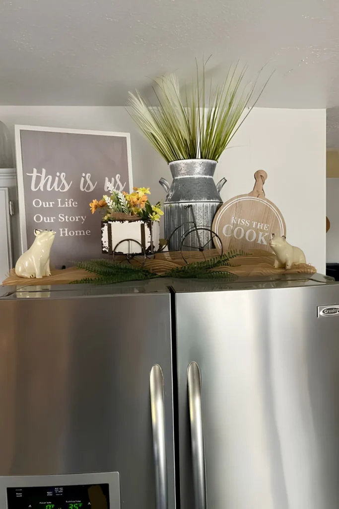
Two matching figurines can pull a busy centerpiece together.
Set one on each end of a wood board runner, and everything piled between them reads as one composed scene instead of a pile.
The wood board is quietly doing the real work. It defines the edges of the vignette without needing an actual tray underneath it.
| Zone | Job | Anchor piece |
|---|---|---|
| Left end | balance | a figurine |
| Center | the story | the tallest piece |
| Right end | balance | the matching figurine |
13. Quirky Finds Deserve Their Corner
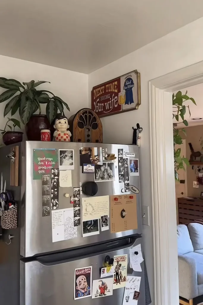
Not every fridge top has to whisper.
This one collects genuinely odd pieces, a vintage radio, a retro sign, a character figure, and lets them share space without apologizing for clashing.
One trailing plant is the only thing here doing the usual decor job. Everything else is personality, collected over time rather than bought as a matching set.
14. Frosted Greenery Announces The Season
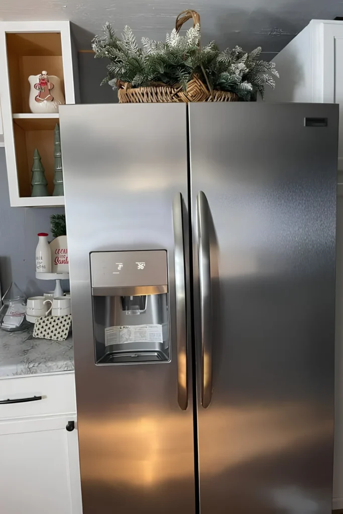
Sometimes one basket is the whole update.
A single arrangement of frosted greenery in a woven basket swaps a plain fridge top into a winter one in under a minute.
No sign needed. No matching pieces required. The frost-dusted tips do the seasonal signaling entirely on their own.
One good basket can carry a whole season.
Save the multi-piece setups for spring.
15. Hide Function Behind Pretty Storage
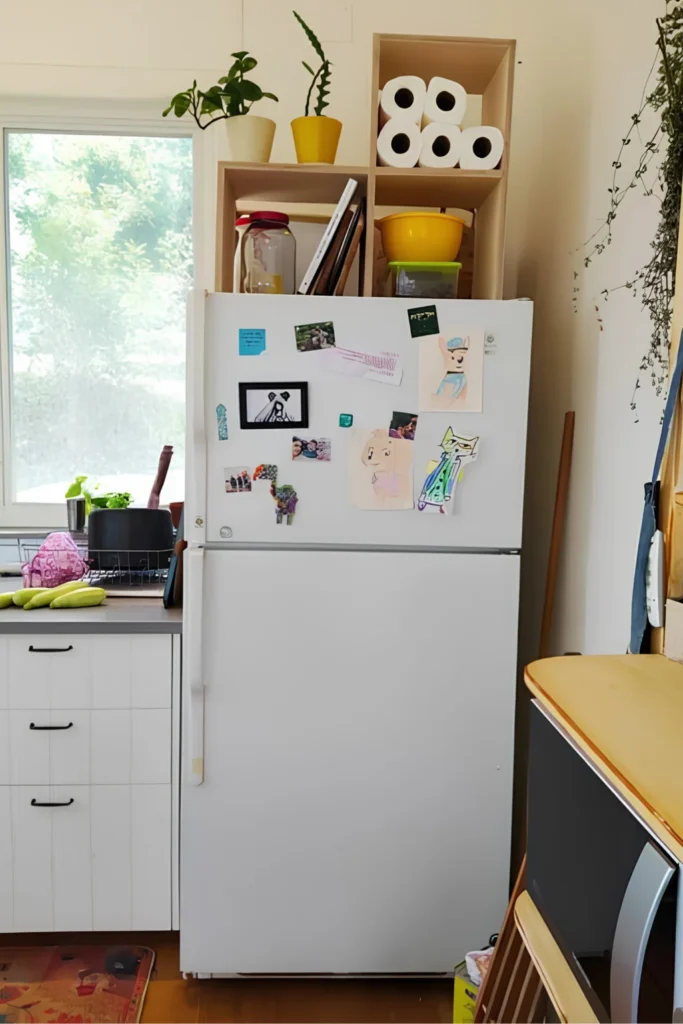
The top of a fridge can hold more than decor.
This open cubby tucks paper towels and extra rolls behind two small potted plants, so the practical stuff hides behind something worth looking at.
Nothing here needs to be pretty on its own. The plants out front are already doing that job for the whole shelf.
16. Pair Blooms With A Quote
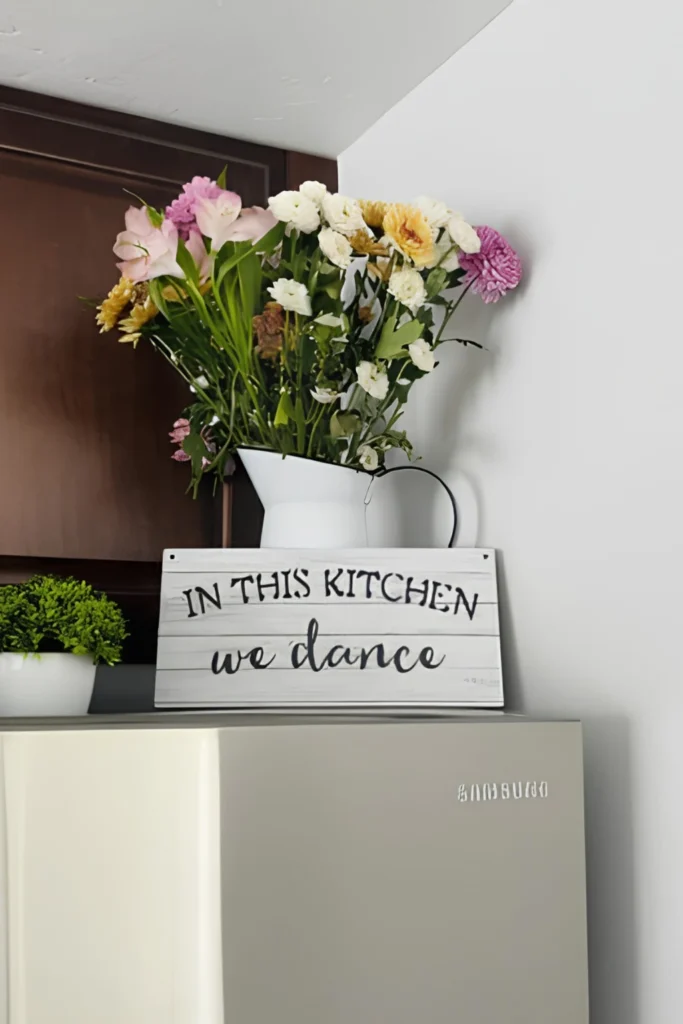
A pitcher of fresh-cut flowers already earns its spot on its own. Prop a small wood sign in front of it, though, and the vignette suddenly says something too.
Keep the sign’s message short. One line, maybe two, is plenty. Anything longer competes with the blooms instead of framing them.
Let the sign say what the flowers can’t.
17. Prop Frames Into A Vignette
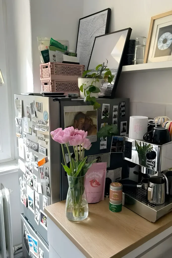
Photo frames don’t need a wall to earn their spot. Lean two or three against the corner instead, tallest one at the back, and let a small plant soften the front edge.
- No mounting required
- No nail holes to patch later
- Easy to swap when a new print shows up
Rearranging the whole thing takes about thirty seconds.
18. Lanterns Add Height And Glow
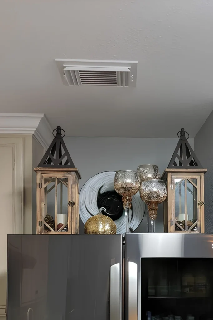
Two lanterns can turn any flat surface into something that feels like an entryway. Set one on each side, and everything placed between them reads as one curated grouping.
Mixed metals are doing quiet work here too. Warm wood lanterns, a mercury glass plate, and crackled glass goblets all sit together without fighting, because they share the same undertone of bronze and gold.
19. Repeat One Bloom Three Times
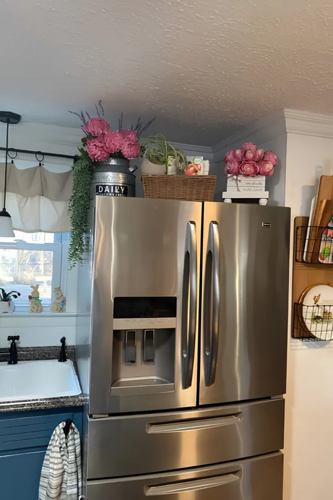
One flower color, repeated across three completely different containers, is the whole secret here.
Pink peonies fill a galvanized dairy churn. More pink shows up in a basket of mixed greenery, and again in a small crate off to the side. Three different vessels, one thread tying them together.
Nothing else in the grouping needs to match. The color is doing that job on its own.
wicker, metal, wood
one pink across 3 spots
a dark churn label
20. Twin Baskets Corral The Extras
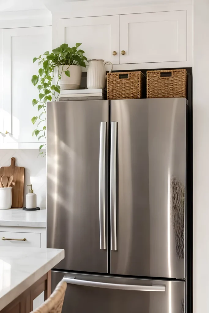
Storage doesn’t have to look like storage. Two matching woven baskets sit flush against the cabinet, holding whatever overflow the kitchen produces, and they still read as decor from across the room.
A trailing plant and a simple white pitcher balance the other side, so the whole top stays visually even without looking planned.
21. A Plate Doubles As Framed Art
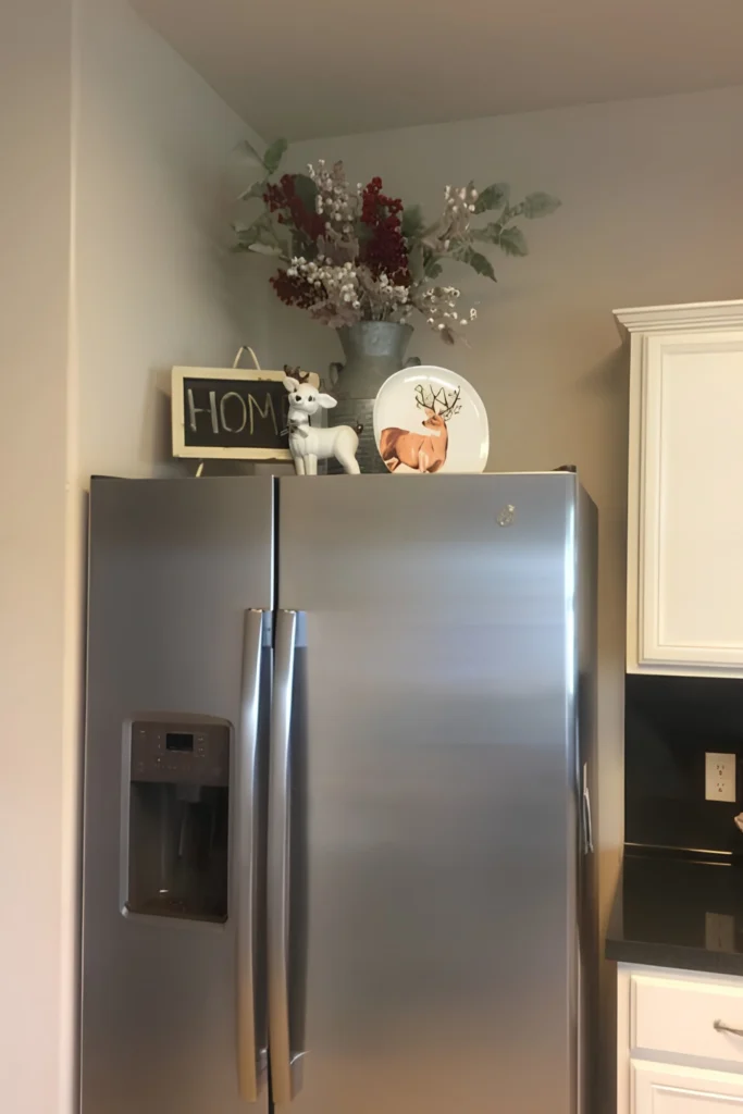
That decorative plate isn’t sitting on a stand. It’s leaned flat against the vase like a piece of art, and it works because the plate’s pattern actually says something.
A deer motif here. A holiday scene there. Whatever fits the season.
Pair it with a small chalkboard sign spelling out one word, and the whole grouping reads like a curated shelf instead of a random collection of finds.
22. Blend One Useful Item In
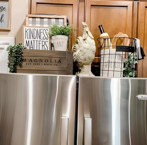
Most people either keep the top of the fridge purely decorative, or purely functional. Rarely both.
Here a wire utensil caddy sits right next to a farmhouse statue and a lettered crate, and it doesn’t look out of place at all. It looks intentional.
That’s the move: let one genuinely useful item join the display, as long as its shape and material match everything around it.
Signs, statues, greenery.
Nothing to grab and use.
A caddy of wooden spoons.
Grabbed weekly, styled daily.
23. Let The Display Reach Down Too
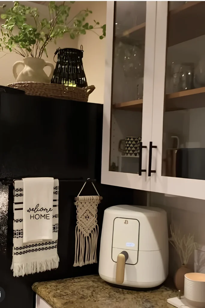
Why stop the decor at the top edge of the fridge?
A bar mounted just below the overhang holds a printed towel and a small woven hanging, so the eye travels from the vase up top all the way down to the handle level.
It also solves a real problem. A towel bar there means dish towels stop living balled up on the counter.
📌 Good To Know
Check that the fridge side is magnetic or has room for an adhesive hook before committing to this one.
24. Zone A Blank Wall By Task
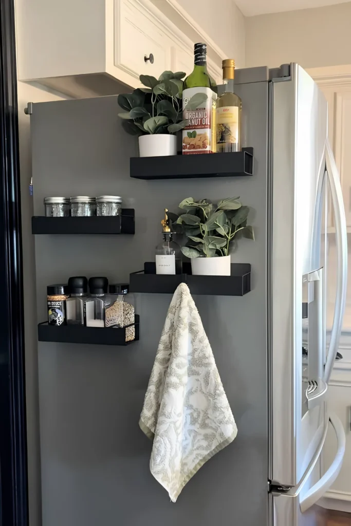
A wall floating shelf system next to the fridge turns unused vertical space into an actual working pantry.
Three stacked shelves, each with one job:
- Top: cooking oils and one trailing plant
- Middle: soap dispenser and greenery
- Bottom: spice jars and pantry staples
A hook underneath holds the dish towel, so nothing has to compete for counter space below.
| Shelf | Job | Anchor piece |
|---|---|---|
| Top | cooking staples | oil bottles |
| Middle | everyday reach | soap dispenser |
| Bottom | seasoning storage | spice jars |
25. Tuck Boards Into A Basket
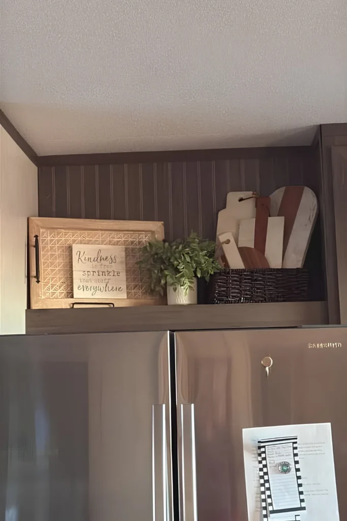
Cutting boards rarely have a real home. They lean wherever there’s room, usually somewhere annoying.
A dark woven basket solves that. Stand three or four boards inside it, mixed shapes and finishes, and it reads as styled instead of stored.
A leaned tray sign in front finishes the grouping without hiding the boards behind it.
26. Spell It Out In Letters
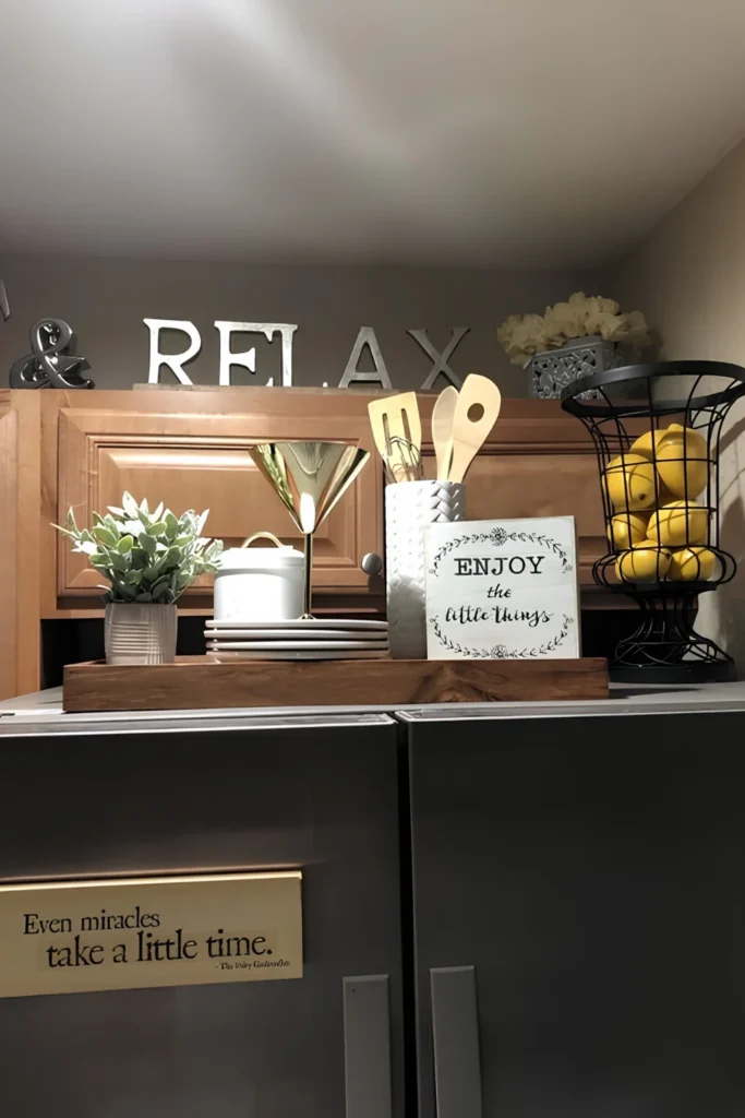
Large freestanding letters are one of the easiest ways to fill wide, flat space above a cabinet.
One word says everything. No sign, no framed print, no extra explaining needed.
Style the tray below with real dimension: a stack of plates, a wire basket of fruit, a small sign that echoes the same mood as the letters above.
Big letters carry the whole mood on their own.
Conclusion
That’s 26 ways to turn wasted space into one of the best-looking corners of the kitchen.
Some ideas take an afternoon. Others take five minutes and whatever’s already in a kitchen drawer.
Start small if the whole thing feels like a lot. One tray, one plant, one sign is plenty to begin.
Save this for whenever the fridge decor bug hits, and pin your favorite idea so it’s easy to find again later.
The best fridge-top styling starts with one small tray and whatever you already own.