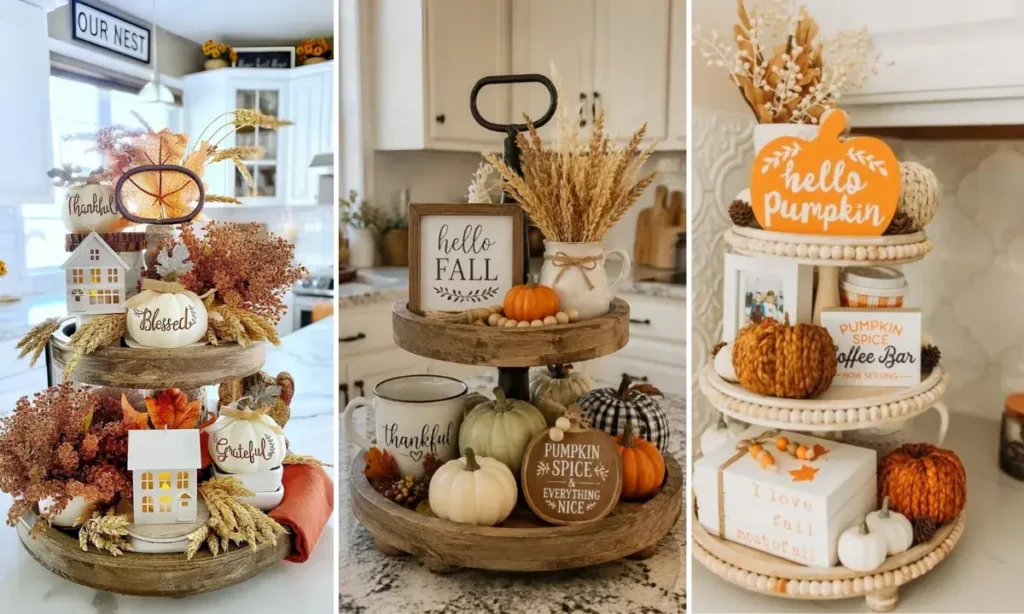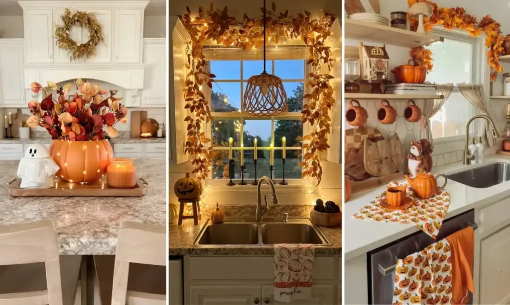
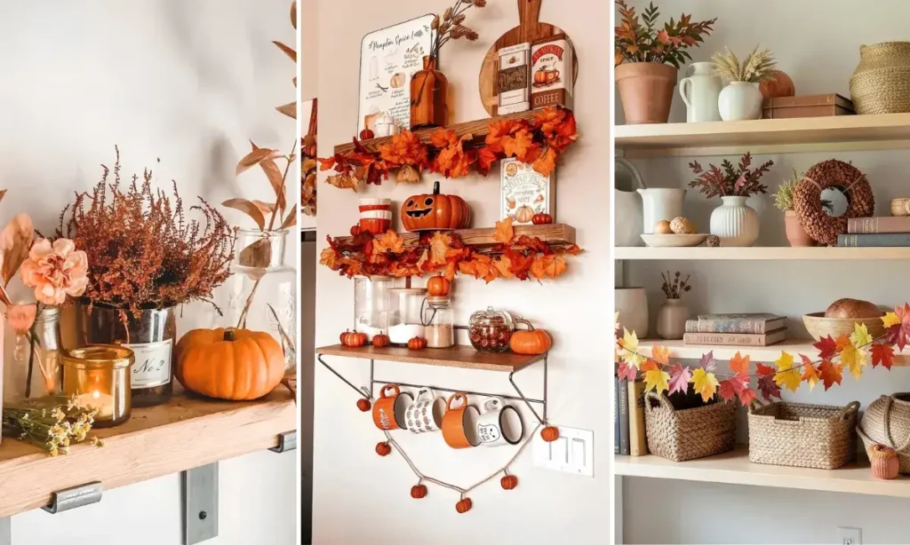
Most fall shelf decor collapses into the same three moves. Orange pumpkins, some leaves, a cozy sign.
These 23 fall shelf decor ideas go further than that.
They pull from real shelves, hutches, floating ledges, built-ins, and open shelving units. Farmhouse pieces sit next to moody dark interiors. Minimalist black and white displays sit next to shelves piled high with real pumpkins.
What ties them together isn’t a single style. It’s the small decisions.
A ribbon tied around books. A garland woven through instead of draped flat. One navy pumpkin dropped into a sea of orange for contrast.
Some of these ideas cost nothing but rearranging what you already own. Others lean into real, seasonal pumpkins that only last a few weeks. A few work in a rental with zero permanent changes.
Whatever your shelves look like right now, there’s a version of fall styling here that fits them.
1. Basket Backdrop For Leaning Signs
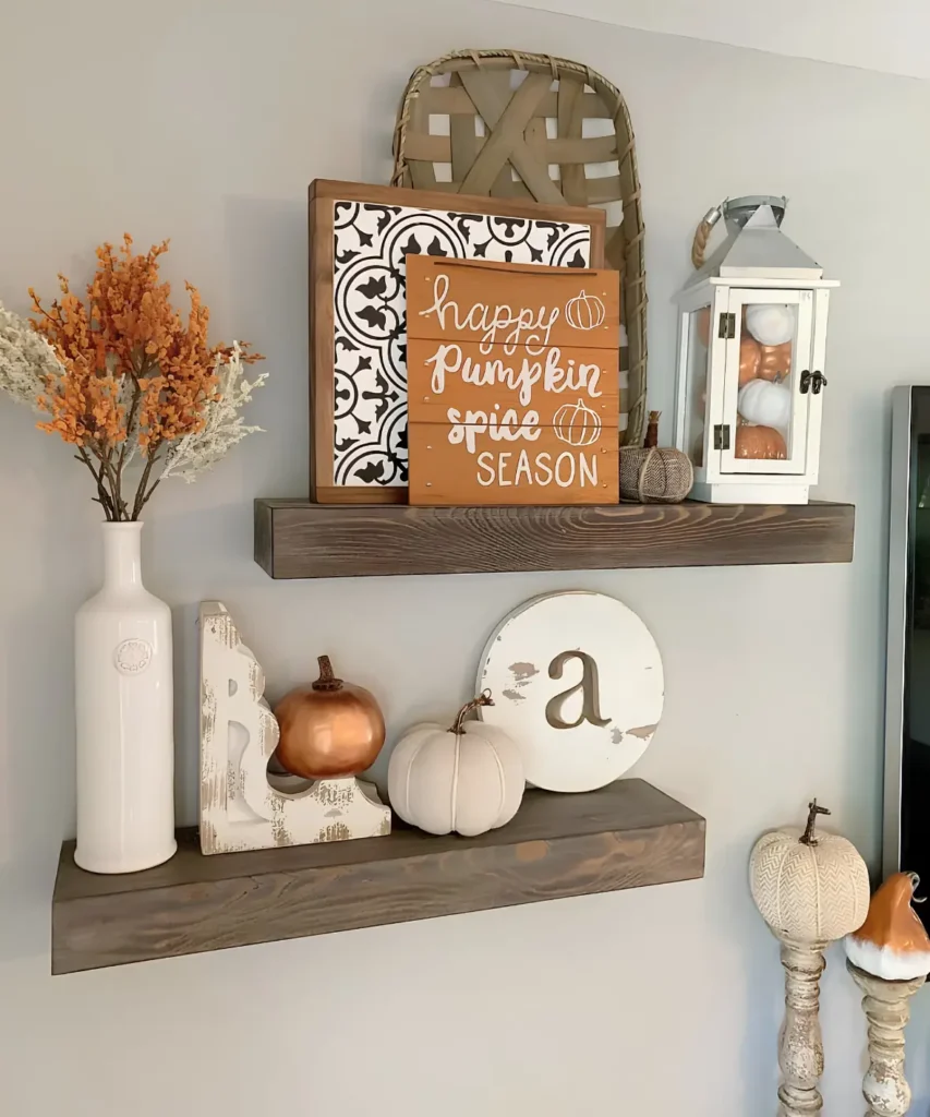
That tall woven basket isn’t nailed flat to the wall. It leans behind two propped signs, tallest to shortest, so the eye reads depth instead of a flat backdrop.
No hardware. No holes. A renter can build this exact layer and take it down without patching anything.
The order matters: basket first, patterned sign next, the pumpkin spice sign last and lowest, each one a little shorter than what’s behind it.
Swap the signs for a mirror or framed print later, and the same leaning stack still works.
2. Garland Draped Along Shelf Edge
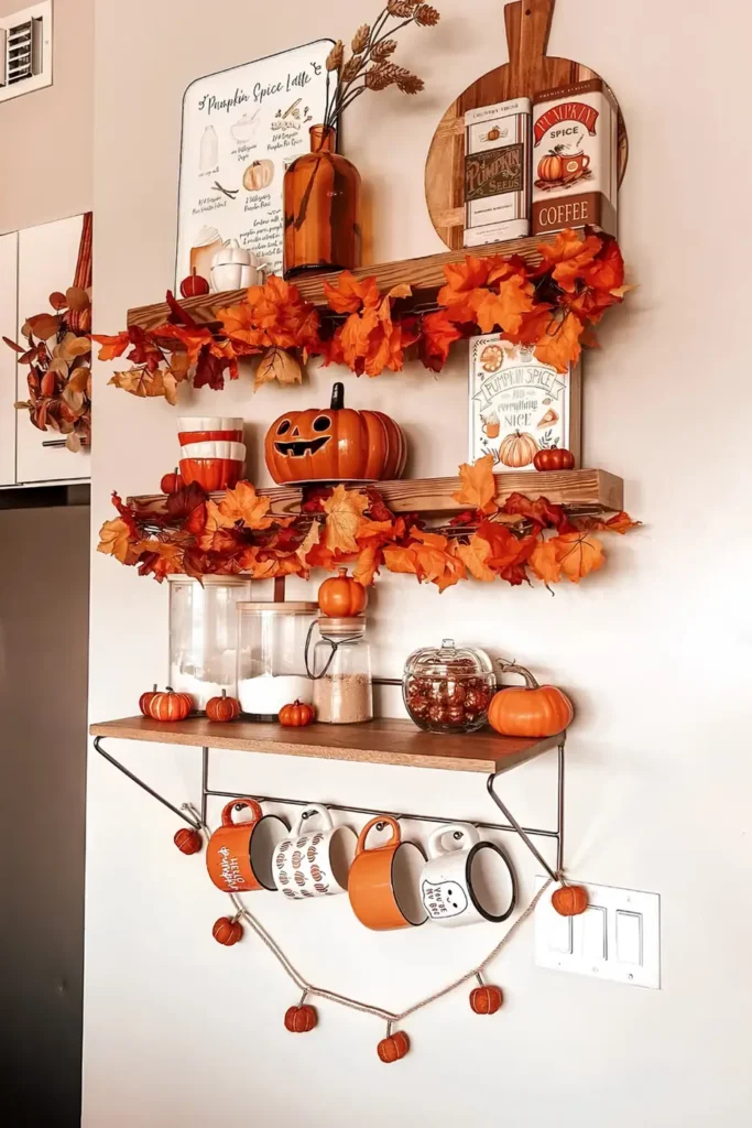
Two shelves that would normally read as separate pieces get tied into one continuous display here. The trick is simple: let the leaf garland drape over the front lip instead of sitting flat on top.
That drop hides the bare wood edge and pulls the eye down from shelf to shelf like a single flowing line.
A few things make this work:
- Garland spills past the edge by a few inches, not just laid flush
- Each shelf gets its own drape, so the eye keeps moving downward
Keep the trailing ends a few inches back from anything you actually reach for daily. A mug knocked against a dangling leaf is how these come loose.
The drape covers the plain wood lip so the shelf reads as decor, not hardware.
Repeating the drape on each shelf links separate levels into one flowing display.
3. Each Shelf Gets One Job
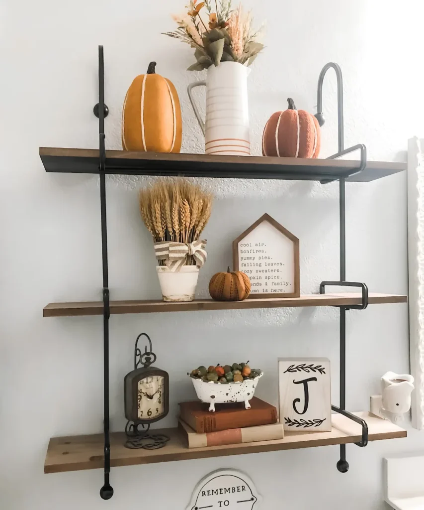
Most fall shelf styling repeats the same theme shelf to shelf. This one splits the job instead.
The top shelf handles color, a pumpkin pair and a dried arrangement in warm gold and rust. The middle shelf carries the words, a wheat bundle wrapped in ribbon next to a framed autumn quote. The bottom shelf stays personal, a small clock, two stacked books, a single monogram block.
Three shelves, three separate moods, one wall that never feels repetitive. Since nothing on one shelf depends on matching the shelf above it, a piece can move or get replaced without throwing off the rest.
| Shelf | Job | Anchor piece |
|---|---|---|
| Top | bring the color | pumpkin pair and pitcher |
| Middle | carry the words | wheat bundle and framed sign |
| Bottom | stay personal | clock and stacked books |
4. Weave One Garland Through Everything
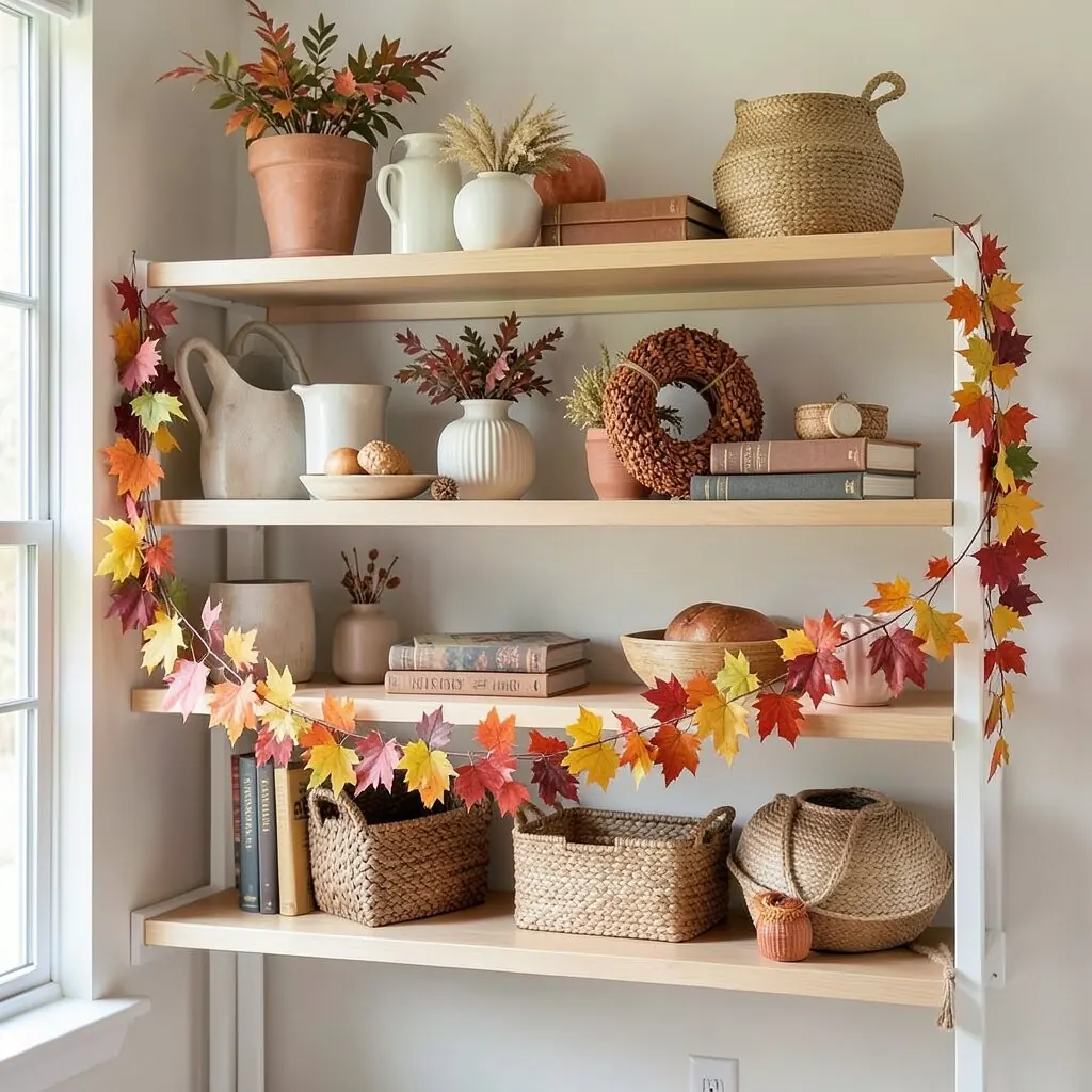
Thread the garland behind the top shelf, in front of the middle one, and behind the bottom again. That over under path is what turns three separate shelves into a single frame instead of three unrelated ones.
Let a few feet spill past the bottom shelf and coil loosely below it. The extra length reads as intentional, not left over from a garland that was too long.
One caution worth knowing: garland with a wire core holds this weave far better than a floppy fabric strand, which sags out of place within a day or two.
Garland passes behind the shelf edge.
Garland crosses in front of the shelf.
Garland tucks behind, then spills past the edge.
5. Fall Accents Without The Overload
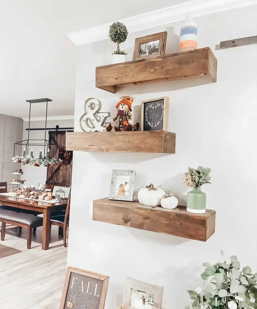
Want fall on the shelves without pumpkins taking over? Keep the personal stuff in place, photo frames, a small topiary, a hand thrown vase, and let one or two small pieces carry the whole season.
A soft scarecrow, a metal ampersand, and two mini white pumpkins do that job here. Everything else on the shelves stays neutral all year.
This restraint holds up best in a hallway or dining nook, where the wall already has a lot going on and a heavier display would compete instead of add.
Hallways and dining nooks with existing wall detail.
Anyone who does not want to store bins of pumpkins each year.
A blank statement wall that wants a bigger seasonal moment.
Collectors who want every pumpkin they own on display at once.
6. Books Lift The Star Piece
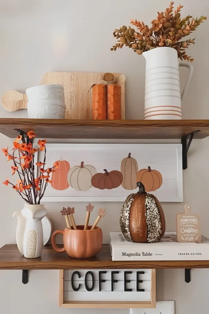
That sequined pumpkin doesn’t sit flush with everything else. It sits on two stacked coffee table books, raised just enough to become the shelf’s focal point.
Two things make this work:
- The books add height without needing a riser or stand you’d have to buy
- A hardcover with visible text (Magnolia Table, in this case) reads as intentional styling, not a stack you forgot to shelve
Pick a book with a spine color that already lives in your fall palette, so the plinth blends instead of standing out on its own.
Raise your best piece two inches above the rest.
A small height difference is what makes the eye land there first.
7. Let White Pumpkins Repeat Everywhere
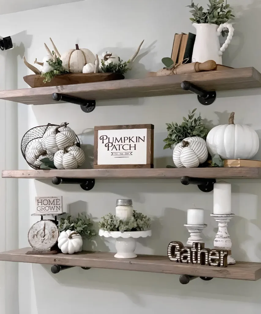
Three totally different shelf groupings live here. A dough bowl on top, a wire basket in the middle, a vintage scale on the bottom.
They read as one collection because a white pumpkin shows up on every single shelf. Same soft cream tone, same tactile ridged shape, just a different container each time.
The rest of the palette stays neutral on purpose. Wood tones, grey stone, a little sage green. Nothing fights the pumpkin for attention.
One repeated shape ties three unrelated shelves into a single collection.
8. Continue The Look Onto Furniture
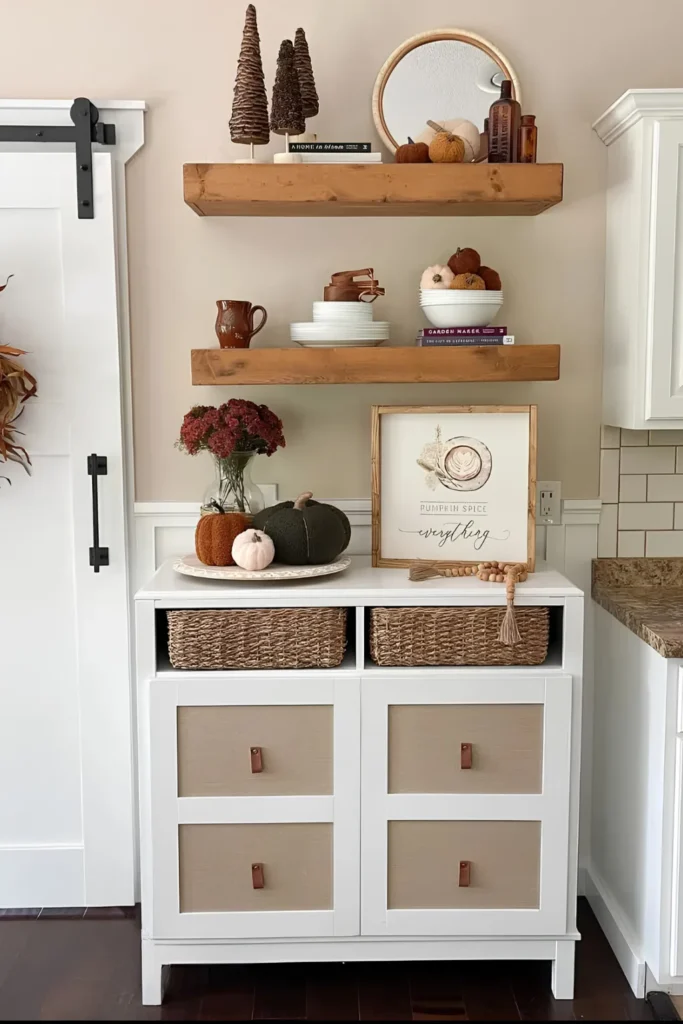
Most fall shelf displays stop at the shelf’s edge. This one doesn’t.
The problem with a floating shelf alone is that it can feel stranded above an empty wall. The fix here is simple. The cabinet directly underneath gets its own small vignette, a vase of mums, a pair of pumpkins, a framed sign, styled at the same visual weight as the shelves above it.
The result reads as one tall, deliberate corner instead of a shelf and a random piece of furniture that happen to share a wall.
Try this in any nook where a dresser, console, or cabinet sits under open shelving. The floor level grouping does not need to match the shelf decor exactly, just the same color story.
The shelf feels stranded above bare furniture.
Style the surface underneath at the same weight.
One continuous corner instead of two disconnected pieces.
9. A Gourd Shape Reads Fall Alone
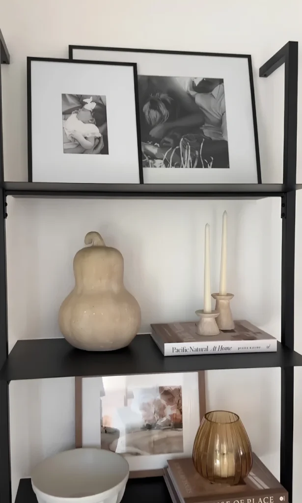
No orange in sight. No literal pumpkin. Just one pale, curved ceramic vessel with a long pinched neck, shaped like a gourd stretched tall.
The silhouette alone does the seasonal work. Anyone glancing at that shelf reads autumn instantly, even in a completely black and white, minimalist room.
Look for this when you shop: a rounded base, a narrower top, and a slightly uneven, hand formed edge. Machine perfect ceramics lose that organic gourd feeling fast.
10. One Navy Pumpkin For Contrast
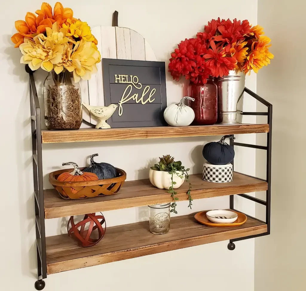
Every shelf styled entirely in orange starts to look predictable fast. This one breaks that pattern with a single navy pumpkin, set on top of a small gingham box beside its warmer cousins.
That one cool tone against a sea of orange and red mums does more work than another matching pumpkin ever could:
- It gives the eye somewhere new to land
- It keeps the whole shelf from reading as one flat color block
Use navy sparingly, one piece per shelf at most. Add a second and the contrast trick disappears into just another color.
11. Tuck Pumpkins Into Vintage China
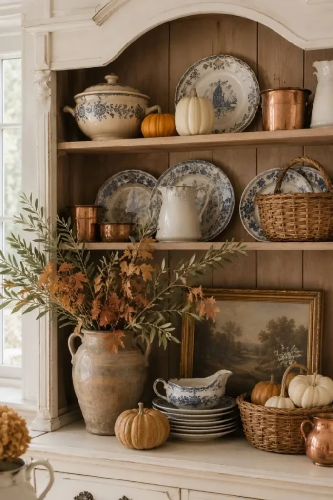
Skip the separate pumpkin display. This hutch tucks small white and orange gourds directly onto the same shelves as blue and white transferware and worn copper cups.
Nothing new was bought to make this work. The pumpkins simply nest in the gaps a collection already leaves.
Two things keep it from looking cluttered:
- Pumpkins stay small, never bigger than the plates around them
- Copper repeats at least twice, so the metal reads as a plan, not an accident
If a cat treats open shelves like a jungle gym, keep the smallest gourds toward the back where a swatted tail can’t send them over the edge.
12. Novelty Signs Add Personality
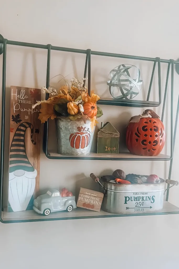
Nothing on this shelf is expensive or rare. A galvanized bucket. A ceramic truck. A cutout pumpkin lantern.
What carries the whole look is the signage. A gnome branded “hello there pumpkin,” a tiny house stamped “love,” a tin sign reading “farm fresh pumpkins 25 cents.” Playful, specific, a little silly on purpose.
Swap in signs with your own family’s inside jokes and the same formula still works. The objects around them barely matter once the words are doing the talking.
13. Mirror Both Sides Of Built-ins
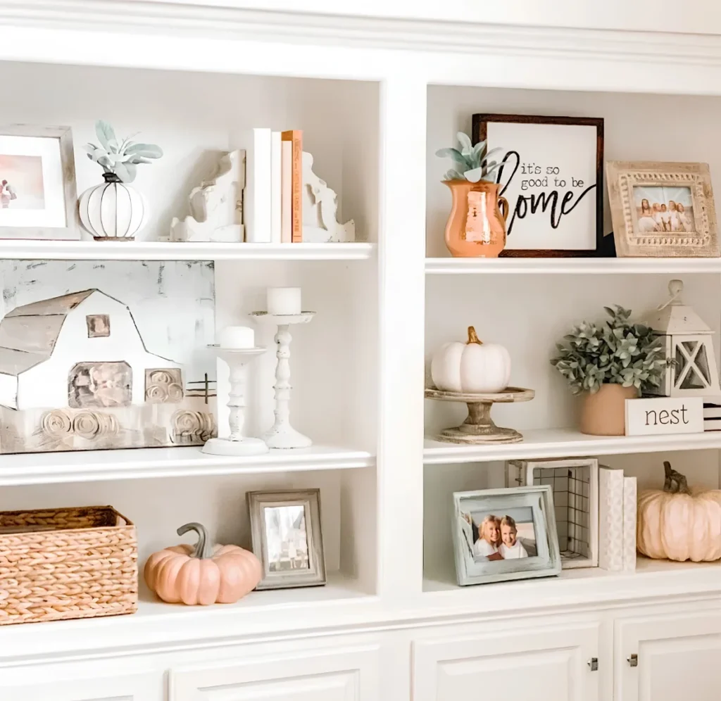
Two separate bookcases, one shared plan. Each side gets a frame, a plant, a pumpkin, and a sign, placed at nearly the same height as its twin across the room.
The pumpkins are what shift. A ridged white gourd shaped vase sits on the left. A soft blush pumpkin sits on the right. Same silhouette, different finish, so the pair reads as a set without being identical.
With bookend style objects sitting near the shelf edge, keep the heaviest piece toward the back on any shelf young kids can reach.
Ridged gourd vase, framed photo, bookend pair.
Blush pumpkin, matching frame, same shelf height.
Reads as one balanced wall, not two shelves.
14. Paint The Cabinet Interior Dark
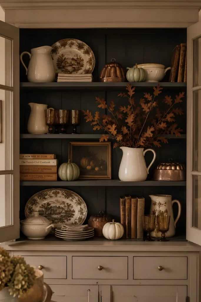
A pale sage pumpkin against a plain white shelf back barely registers. Against a deep navy panel, it’s the first thing the eye catches.
That’s the whole trick here. The back of this hutch is painted a moody charcoal navy, and every pale or metallic object in front of it, the copper molds, the cream pitcher, the sage gourd, suddenly reads as a highlight instead of just another item.
To try it:
- Paint or line the interior back panel in a deep tone, navy, charcoal, or bottle green
- Keep the objects in front pale, metallic, or muted so they contrast
Confirm a rental built-in’s lease allows painting before committing, since this isn’t a finish you can peel off in a weekend.
⚠️ Watch Out
Confirm your lease allows painting built-in interiors before you commit to a dark backdrop.
15. Keep Halloween Accents Removable Only
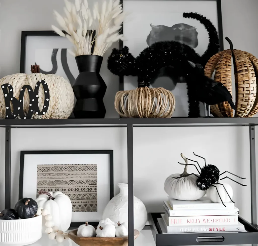
Wicker pumpkins. White ceramic pumpkins. A stack of neutral design books. None of that is specific to Halloween, and none of it needs to come down on November 1st.
The only pieces doing spooky work are the black cat, the spider, and a “boo” cutout, three small additions layered onto a base that already works for fall on its own.
Pull those three pieces and the shelf slides right back into plain autumn styling. Nothing else has to change.
A neutral base plus three removable Halloween accents means one shelf works from September through Thanksgiving.
16. Match Accents To The Wall
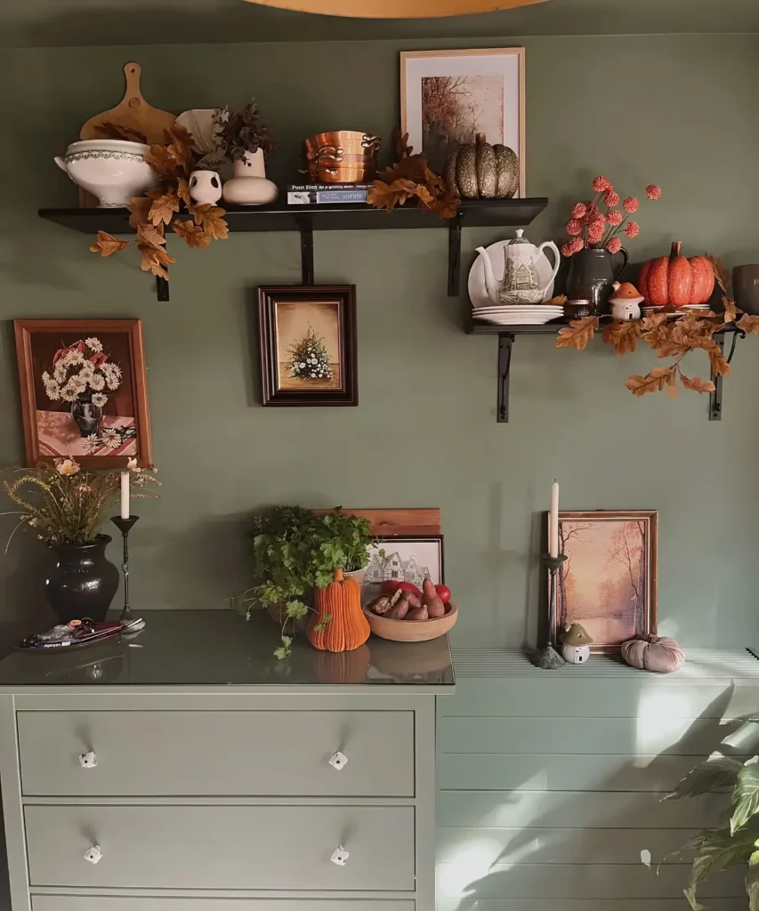
This wall doesn’t fight its shelf decor. It works with it.
Sage green paint sets the base. Every accent leans warm against it, rust colored oak leaves, copper pots, a weathered pumpkin in olive gold.
Green against rust sits almost opposite on the color wheel, which is exactly why the pairing reads as intentional instead of accidental.
Photograph your own wall color before shopping for fall pieces. Warm tones against a cool wall photograph far richer than warm layered on warm.
the wall color
the main accent tone
the deepest touch
17. Hang A Wreath Inside Cabinetry
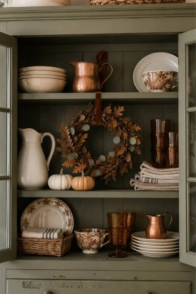
A wreath usually goes on a door. Here it hangs mid-shelf instead, looped over a hook set right into the cabinet’s back panel.
That one move turns a plain interior into a backdrop with real depth.
A few reasons this pairs so well with closed cabinetry:
- Glass doors keep dust off dried leaves
- A muted interior makes the wreath’s warm tones pop harder
Only try this in a cabinet with a solid wood back. Hollow pegboard backing won’t hold a hook without extra hardware.
A wreath doesn’t need a door. It just needs somewhere to hang.
18. Layer Letters Between Decor Pieces
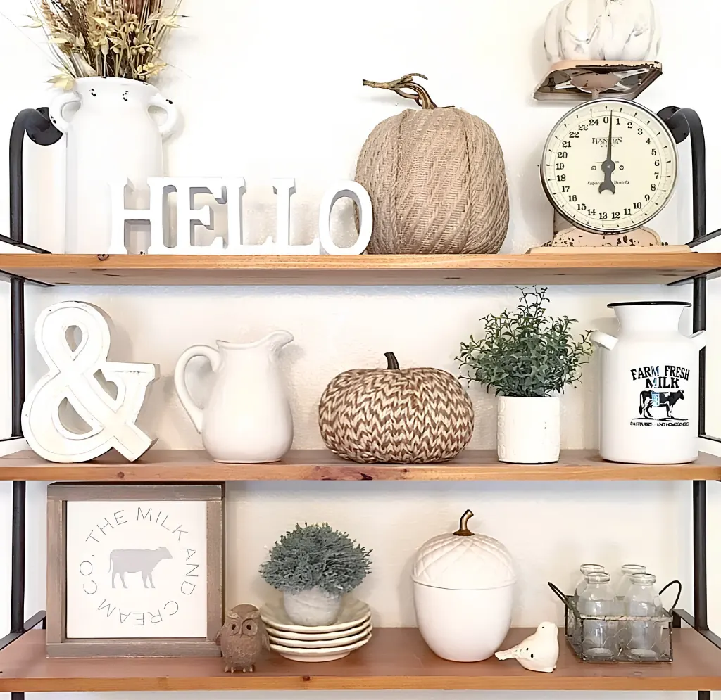
Solid wood letters do double duty here. HELLO across the top shelf. An ampersand on the one below it. Together they read almost like a sentence stretched across three shelves.
That typography breaks up what would otherwise be a wall of round pumpkin shapes with something linear and graphic instead.
Keep letter sets to one or two per display. A whole alphabet’s worth turns charming into cluttered fast, and the pumpkins around them lose their own moment.
19. Fill Shelves With Real Pumpkins
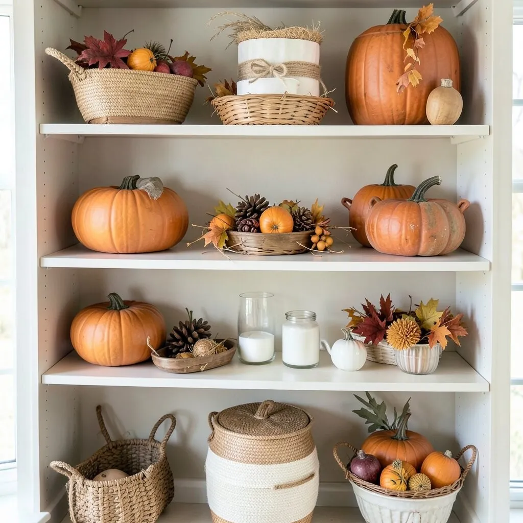
No vases here. No frames. Just pumpkins, stacked shelf by shelf from the biggest one down to a handful of minis in baskets.
The size gradient does the styling work that props usually handle.
Two things worth knowing before you build this:
- Real pumpkins soften within a few weeks indoors, so plan to swap them partway through the season
- A cool spot away from direct heat buys extra time before they start to give
This is the cheapest version of a fall shelf you’ll find. One trip to a pumpkin patch covers the whole thing.
20. Drape Beads Through A Bowl
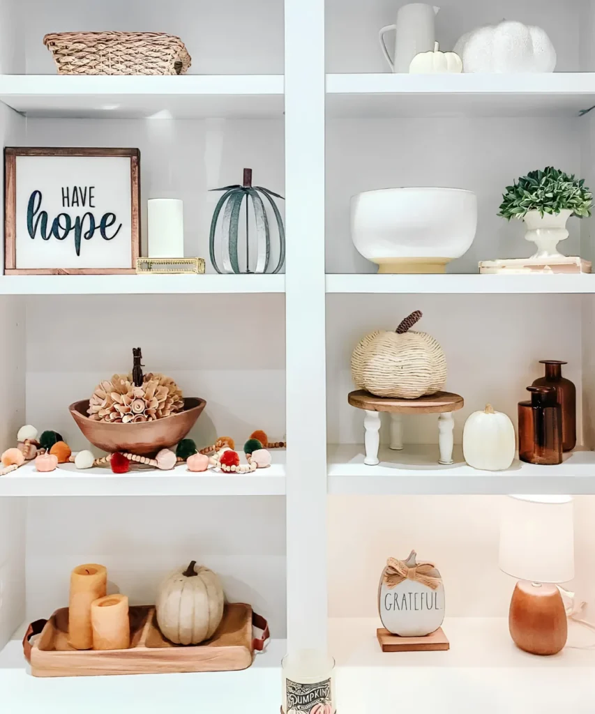
A dough bowl piled with paper flowers gets one more layer here, a long strand of wood beads and tiny felt pumpkins draped loosely across the rim and down one side.
It’s an unexpected pairing. Beaded garlands usually wrap a tree or a mantel, not a bowl centerpiece.
Letting a few pompoms spill onto the shelf itself, rather than staying contained inside the bowl, is what keeps the whole thing from looking too neat.
21. Tie A Velvet Bow On Books
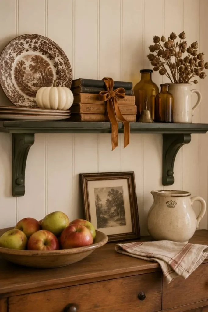
A plain stack of hardcovers reads like storage. Add one loop of ribbon and it reads like styling.
Here, a rust colored velvet bow ties around three books and lets its tails hang loose over the shelf edge. That single detail pulls a lot of weight:
- It gives the eye a soft, textured contrast against hard book spines
- It turns a functional stack into the shelf’s quiet focal point
- It costs almost nothing if you already own ribbon
Velvet holds a bow shape far better than satin, which tends to slip loose within a day.
A plain stack of books, functional but forgettable.
One velvet bow turns the stack into the shelf’s anchor.
22. Let Candles Warm The Shelf
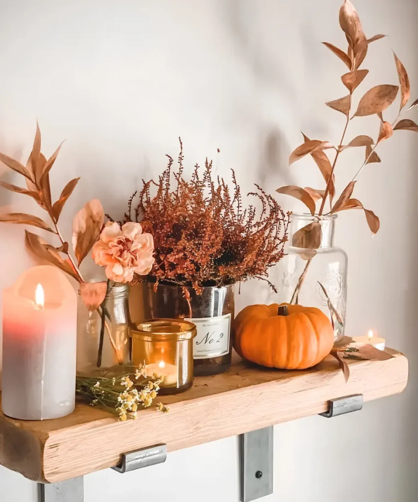
Dried florals give this shelf its shape. Lit candles give it its glow.
A tall pillar, a small glass tumbler, and a tealight sit scattered between the stems rather than lined up in a row. That scatter is what makes it feel unstyled, like the candles simply landed where they were needed.
Warm light against copper toned leaves does something a photo of the same shelf unlit never quite manages. It reads inviting instead of just decorated.
⚠️ Watch Out
Keep the flame a few inches clear of dried stems. Dried florals catch faster than fresh ones.
23. Repeat One Frame Style Everywhere
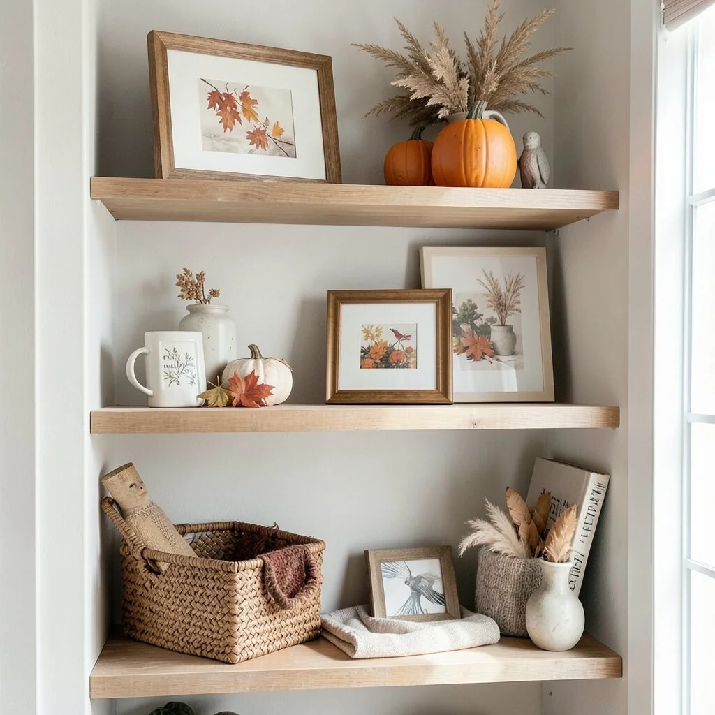
Three separate wall niches, one shared rule. Every frame here uses the same light wood tone and the same slim border, whether it holds pressed leaves, a bird sketch, or a watercolor branch.
That single repeated detail is doing more than any single object could. It tells the eye these three shelves belong to one plan, even though the art inside each frame is completely different.
Try it yourself: pick one frame finish before you start collecting art, then let every piece you add match it.
One frame finish, used three times, is what ties the whole wall together.
Conclusion
Fall shelf styling doesn’t need a full haul or a matching set from one store.
The strongest displays in this list came from small, specific choices. A repeated frame finish. A pumpkin shape borrowed instead of bought. One shelf doing color, another doing words.
Start with whatever you already have on hand. A vase, a stack of books, a single dried branch. Layer from there.
Save the ideas that fit your space, and come back to this list each fall when the shelves need a refresh.