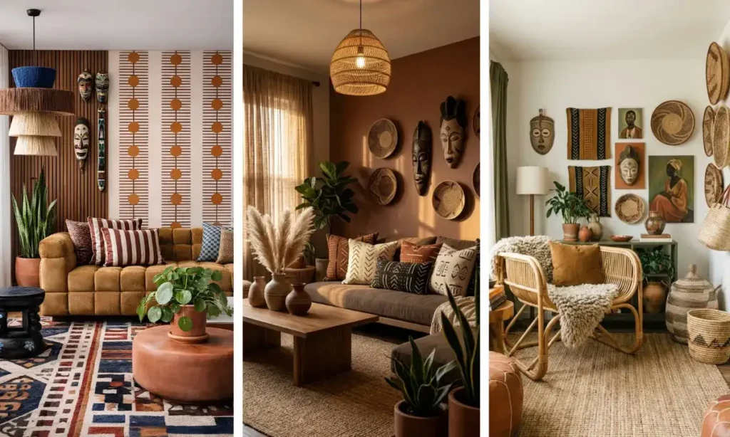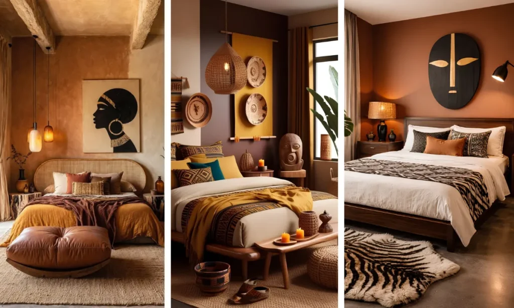
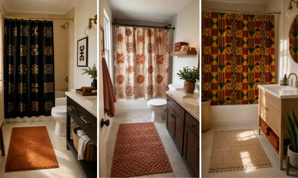
Most bathrooms default to white, gray, or beige, and after a while that starts to feel more sterile than calm.
A shower curtain is one of the few big surfaces in a bathroom you can change in an afternoon, and African prints give it a completely different look than the plain liner most people default to.
These African print shower curtain ideas pull from Kente, mudcloth, Ankara, and other textile traditions, each with its own color language and pattern scale.
Some are bold enough to anchor a plain white bathroom on their own. Others work as a quieter layer next to wood tones and woven textures you may already have.
This list walks through 15 specific styles, what kind of bathroom each one fits best, and how to pair towels, rugs, and small decor around it so the curtain looks intentional instead of random.
No renovation, no new tile, just one fabric swap that changes how the whole room feels.
1. Adinkra Symbol Print Curtain
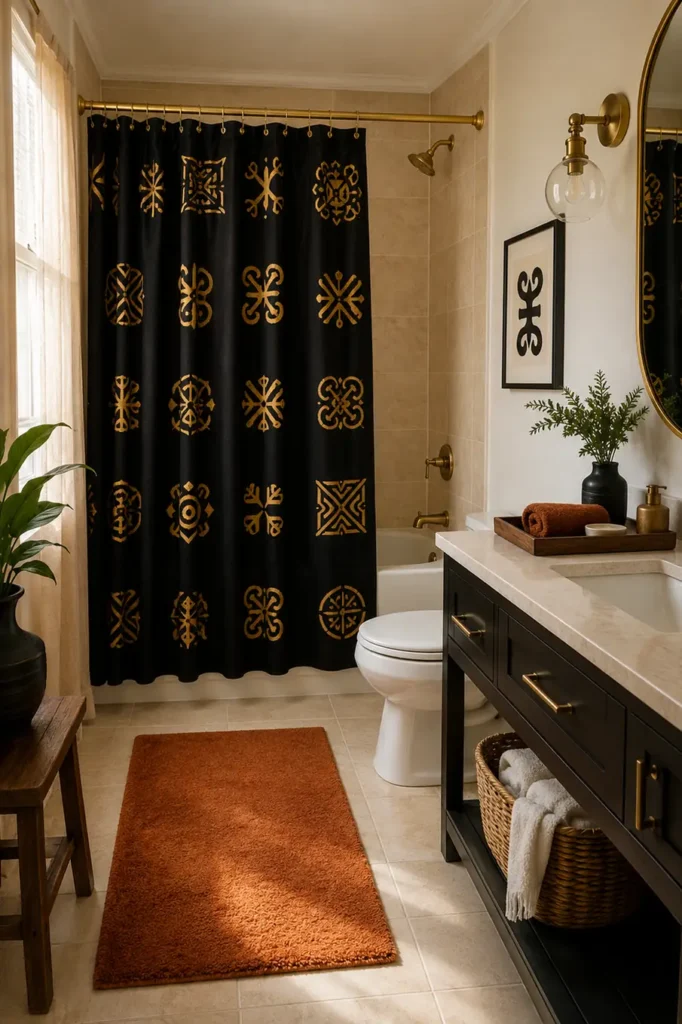
Adinkra symbols come from Ghanaian tradition, each one carrying a specific meaning, like strength, unity, or wisdom. On a shower curtain, these symbols usually appear scattered across a solid background in black, gold, or deep red.
Here is how to make the meaning actually land in the room instead of getting lost as a background pattern.
Pick a print where symbols are large enough to read from across the room, not shrunk into a busy repeat.
Keep the wall behind it plain so the symbols stay the focus, not competing with tile pattern.
Add one small framed print or card nearby naming what a symbol or two means, so guests notice it is intentional.
2. Wax Print Small Bathrooms
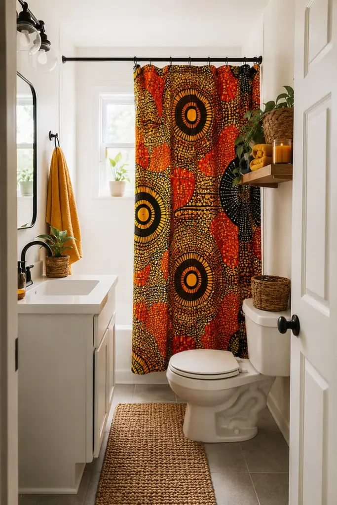
Small bathrooms get nervous about bold patterns, worried it will shrink the room further. Wax print, with its bright but evenly distributed pattern, tends to do the opposite when a few conditions are met.
Before you commit, check for
3. Mudcloth Pattern For Neutrals
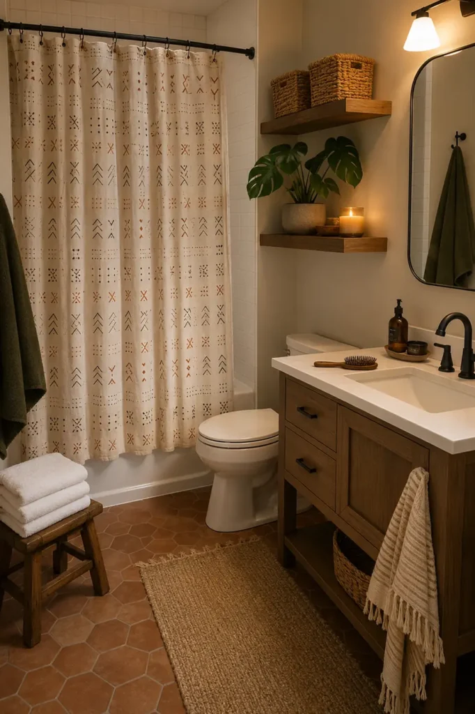
A lot of people think busy patterns will clash with a neutral bathroom. Mudcloth is the exception. Its earthy off-white background and small hand-drawn symbols in rust or charcoal read more like texture than pattern from across the room.
It works especially well in bathrooms with a wood vanity or wicker baskets already in place, since the print picks up on those same warm, handmade tones instead of fighting them.
💡 Quick Tip
Wash the liner separately in cool water before the first use so the earthy dye tones stay true and don’t bleed onto your towels.
4. Kente Print Statement Curtain
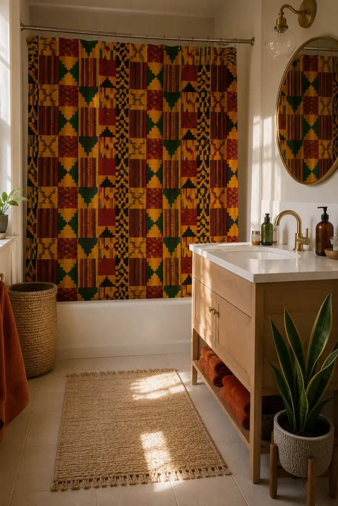
Bold blocks of gold, red, and forest green stacked in a woven grid pattern. That is what a Kente print shower curtain brings into a plain white or beige bathroom, and it does not need anything else to feel finished.
Hang it against a cream tiled wall or a simple white tub surround and the pattern does all the talking.
Keep the rest of the room quiet: white towels, a plain bath mat, maybe one small basket. The curtain becomes the one loud thing in the room, and that is exactly the point.
5. Bold Florals Warm Up Rooms
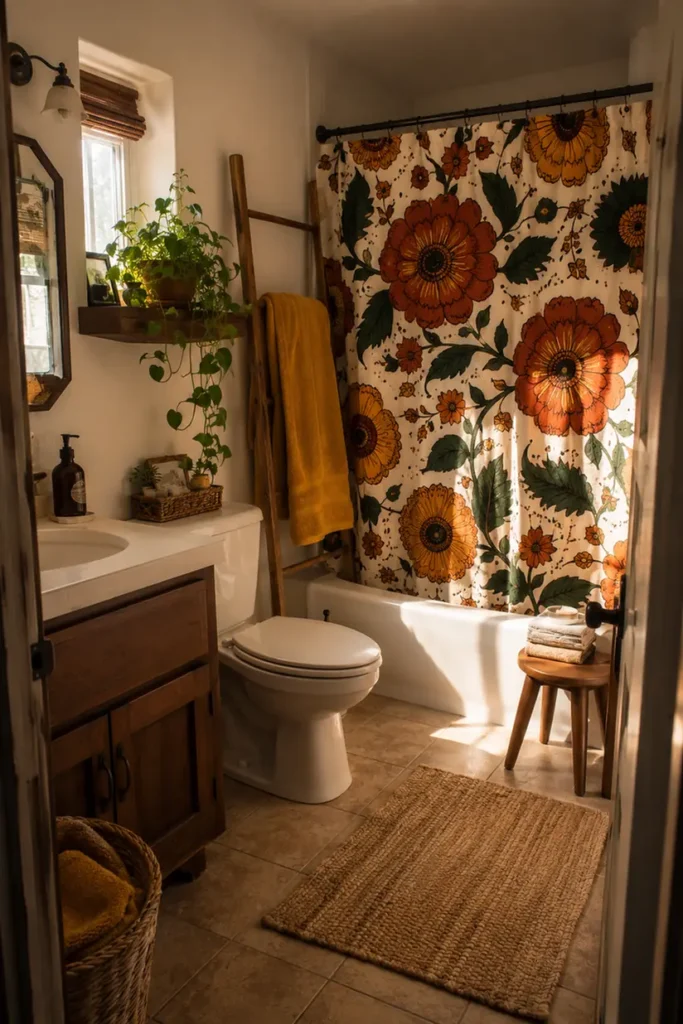
A shower curtain with big Ankara-style florals does something small curtains cannot. It fills the eye immediately, so even a bathroom with plain tile and basic fixtures stops feeling like an afterthought.
The trick is choosing one dominant color from the print, mustard, rust, or deep green, and repeating it once somewhere else in the room. That single echo is what makes the pattern look chosen, not random.
Pick one color from the print and repeat it once. That is what turns a bold curtain into a designed room.
6. Ndebele Geometric Curtain Design
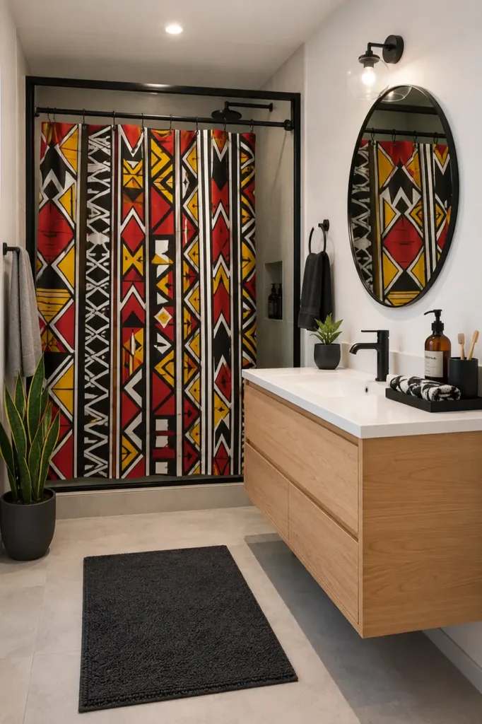
Ndebele patterns are built from sharp triangles and bold color blocks, usually in red, yellow, black, and white. Unlike softer florals, this print has a graphic, almost architectural feel, so it suits bathrooms that already lean modern or minimal.
Before hanging it, take stock of what else is in the room. Sharp geometric prints can clash with equally busy tile, so this idea shines most against plain surfaces.
Check before you hang it
7. Ankara Border Print Style
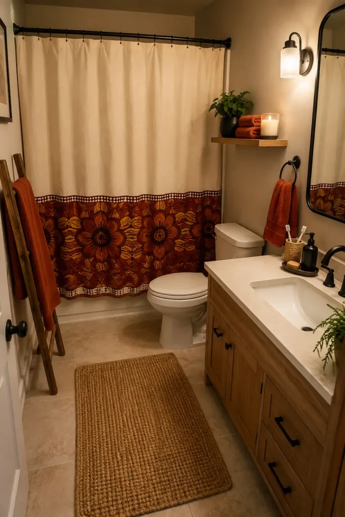
Not every Ankara print needs to be loud from top to bottom. Border style prints keep the main fabric in a solid or muted tone and save the bold pattern for a thick band along the bottom edge.
This is the easiest African print to introduce into a bathroom you are not ready to fully commit to bold color in. It still brings personality, just with more restraint.
8. Bold Stripes Warm Tones
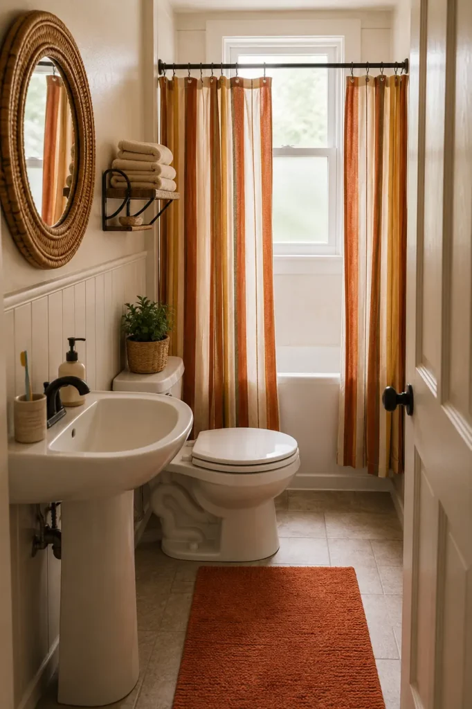
Vertical stripes in rust, mustard, and cream read as African print without needing a busy repeat pattern. It is one of the calmer options on this list, but still far from plain white.
Pick stripes with uneven width, not perfectly even bands, for a more handmade look.
Pair with round or curved decor to balance the straight lines.
Don’t add more striped elements like a striped bath mat, it flattens the effect.
Don’t hang it in a narrow bathroom where vertical lines already feel tight.
9. Layered Curtain With Liner
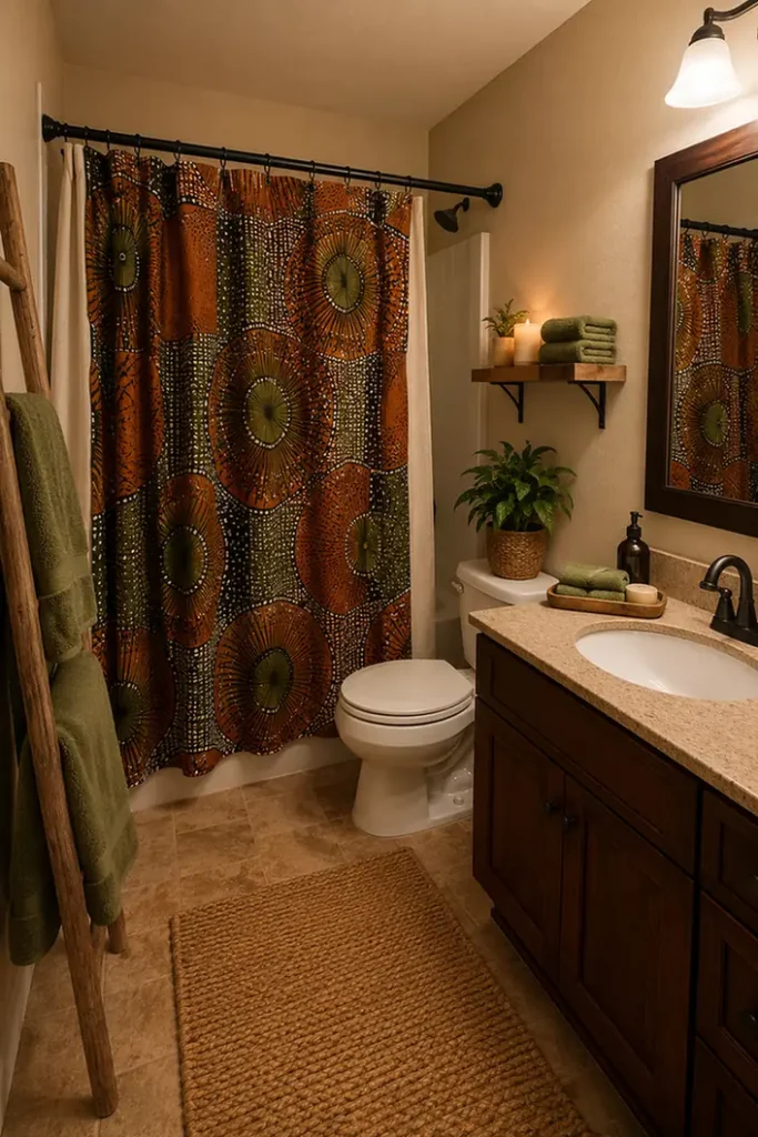
Most African print fabric curtains are not waterproof on their own, so a liner is not optional; it is part of the design.
| Clear Liner | Solid Liner |
|---|---|
| Print shows through fully, feels more open in small bathrooms. | Adds a clean color block behind the print, hides water spots better. |
| Best when the print itself is the whole point of the room. | Best when you want the print to feel more like fabric wallpaper. |
10. Earth Tone Batik Print
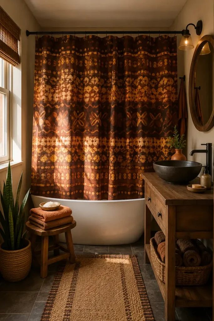
Batik uses a wax resist dyeing process that leaves soft, slightly imperfect edges between colors, usually in deep browns, rust, and muted gold.
Batik’s soft, uneven edges make it the easiest bold print to place next to wood tones without anything clashing.
11. Mix Prints With Solids
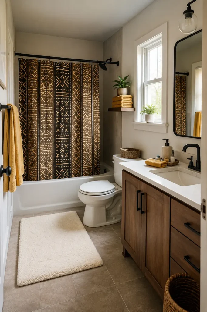
You do not need every towel and mat to match the curtain. In fact, too much matching pattern makes a small bathroom feel busier, not more finished.
💡 Quick Tip
Let the curtain carry the pattern, and keep towels, mats, and walls solid. Pull one color from the print for those solids so it still feels connected.
12. Match Curtain To Bath Mat
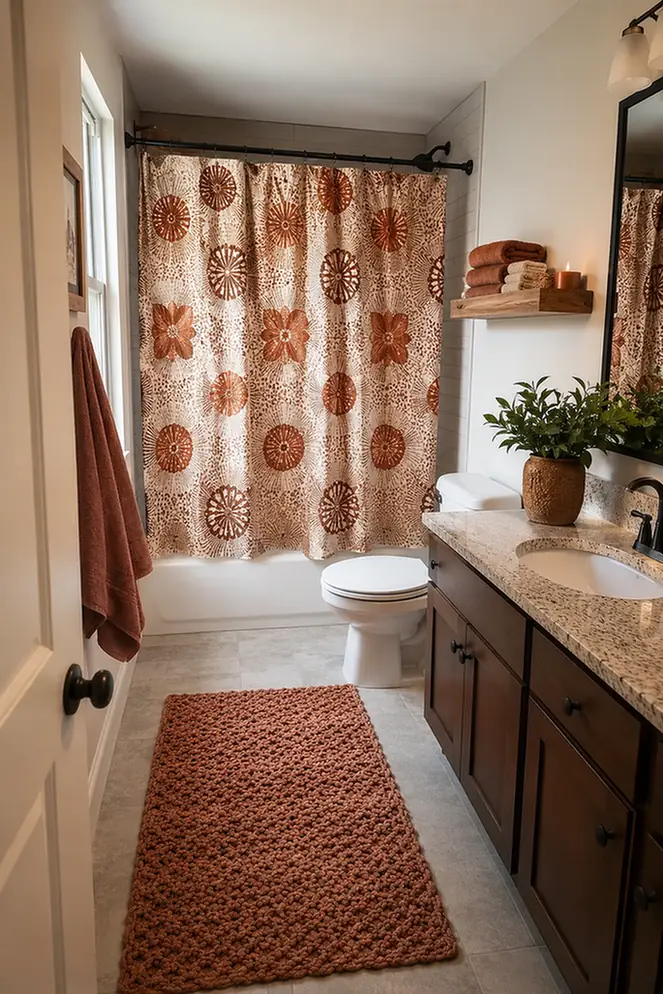
A shower curtain and a bath mat sitting a few feet apart can either look like they belong to the same room or like two separate purchases. Small color and texture choices decide which one happens.
13. Vintage African Textile Print
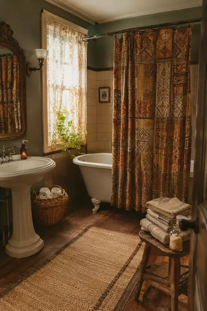
Newer prints often look crisp and saturated. Vintage-inspired textile prints lean toward slightly faded, worn-in tones, which reads as heirloom rather than trend.
A bright, glossy print that looks straight off the shelf, disconnected from the rest of an older home.
A muted, vintage toned print that feels collected over time, not bought last week.
14. Two Tone Rental Friendly Curtain
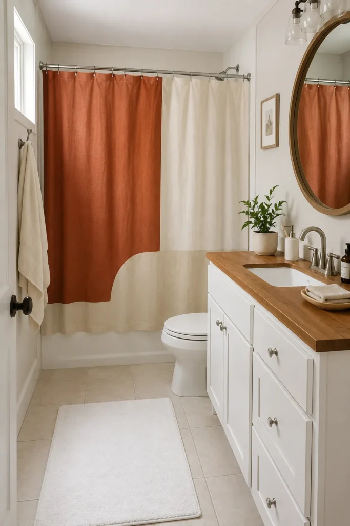
Renters often hesitate before committing to a bold print, worried the next tenant or the landlord will side-eye it. A two-tone African-inspired print, just two colors in a bold geometric layout, solves that hesitation.
Pick two colors that already exist somewhere else in the apartment, so nothing feels like a permanent commitment.
Keep hardware, mat, and towels neutral so the curtain alone can be swapped out later without redoing the room.
Fold it into storage instead of throwing it out when moving, it works in the next bathroom too.
15. Metallic Accent Statement Curtain
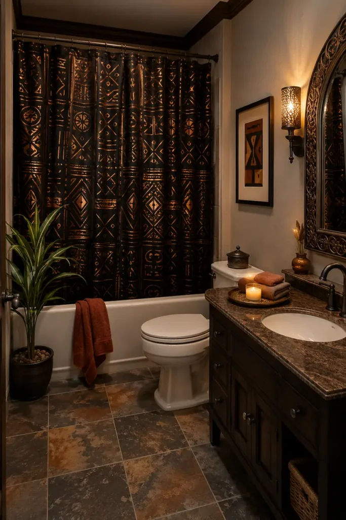
Some African-inspired prints work small metallic gold or copper threads into the pattern itself, catching light differently than flat fabric ever could.
Conclusion
A bold shower curtain is one of the easiest ways to bring warmth and personality into a bathroom without touching a single tile.
Whether it’s the graphic punch of Ndebele geometrics, the quiet texture of mudcloth, or a two-tone print that works for renters, each of these African print shower curtain ideas gives you a starting point without demanding a full remodel.
Pick the one that matches your bathroom’s light and layout, pull one accent color into a towel or mat, and let the curtain carry the rest.
That’s really all it takes for a plain bathroom to start feeling like a room someone actually decorated with intention.
Save this list for the next time your bathroom needs a refresh.