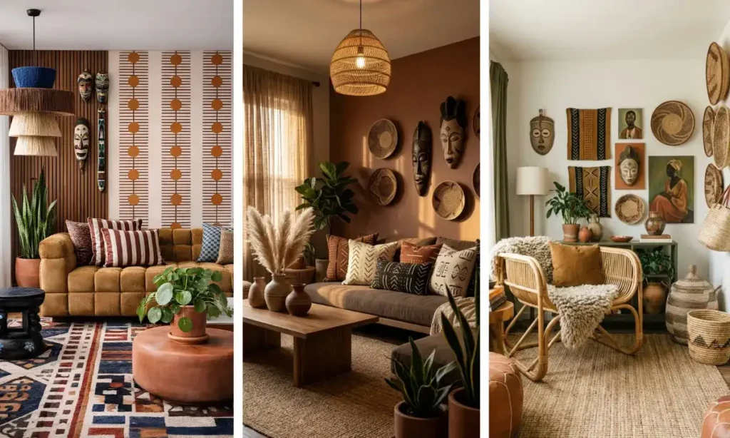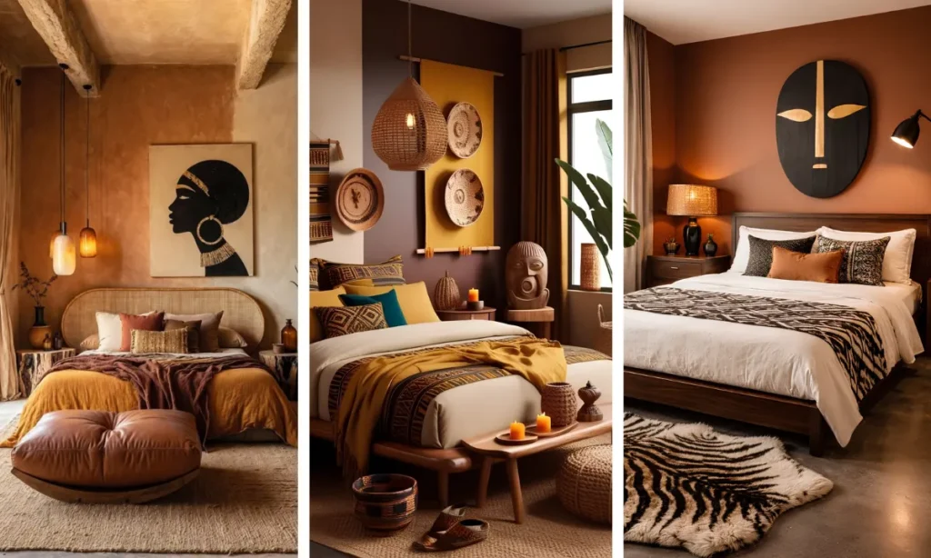
A blank wall behind the sofa is the easiest thing to fix and the easiest thing to get wrong. Too small a piece gets swallowed by the room. Too matchy and it looks like a showroom instead of a home.
The twenty-one rooms in this roundup solve that problem in completely different ways, from a single oversized portrait that anchors an entire wall to a packed gallery of woven baskets and mudcloth panels climbing up to a double-height ceiling.
Some lean into carved masks and sculptural pieces with real texture. Others go flat and graphic, with bold jewel-toned portraits or black and gold canvases lined up in a tight grid.
A few break every rule on purpose, splitting a wall in two colors or hanging a single unexpected turquoise panel against a warm palette.
If you’re searching for African wall art for living room ideas that actually hold up in a real, lived-in space, these examples show the range, from quiet and minimal to loud and layered.
1. One Panel, Two Halves, Two Textures
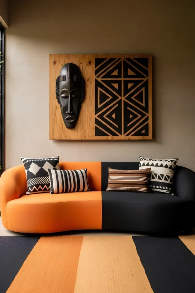
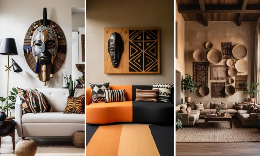
This wall art is actually a single wide wooden panel split into two zones: a carved mask on raw wood on one side, a bold triangle pattern burned into black on the other. Because it’s one continuous piece rather than two separate frames, the wall reads clean and modern even with a very graphic, busy pattern in play.
The furniture below doubles down on the split concept. A color block sofa in orange and black mirrors the panel’s two-toned layout almost exactly, tying wall and seating into a single visual idea.
Attribute check:
2. Woven Baskets Fill Gallery Gaps
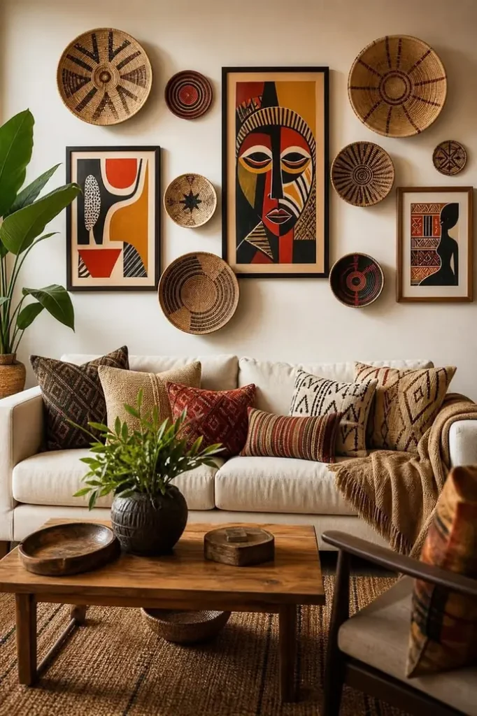
Nine pieces cover this wall, and somehow it never feels cluttered. Flat woven baskets in different sizes tuck into every gap between three framed paintings, creating one dense, layered cluster instead of a single hero piece.
The variety keeps it interesting. Cubist-style faces, an abstract print, and a woman in profile all sit at different heights, while the baskets add texture and break up the hard frame edges.
3. Sculptural Mask With Tassels and Beads
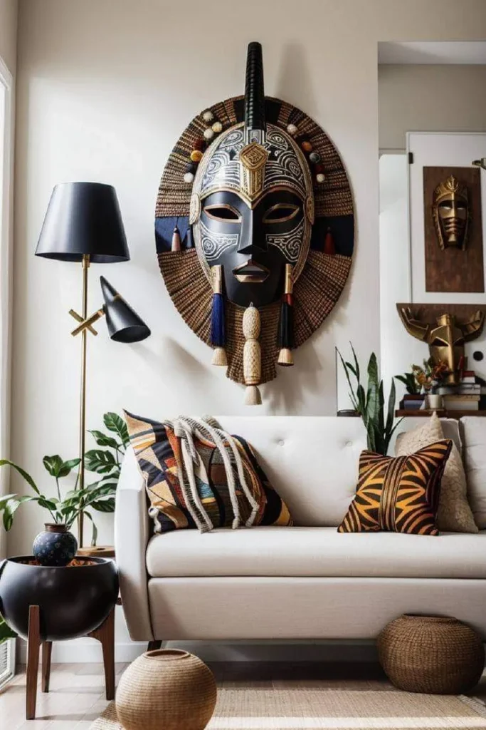
This mask isn’t flat art at all; it’s built with layered raffia, wooden beads, and hanging tassels that give it real physical depth against a plain wall. Set against pale cream walls, every texture reads clearly instead of getting lost the way it might on a busy wall.
A modern black floor lamp and boxy planter sit close by, proving this look isn’t strictly rustic. It works even in a room with clean, contemporary furniture, since the mask carries enough visual weight to hold its own against sleek lines.
4. Woven Macrame in Neutral Earth Tones
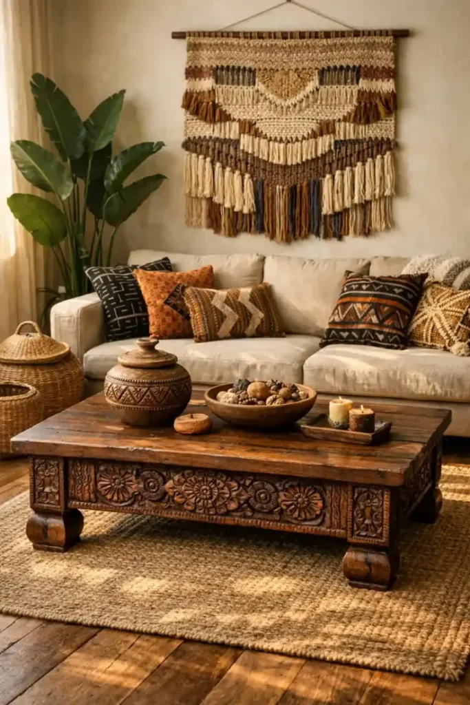
This piece skips bright terracotta almost entirely, sticking to cream, walnut, and charcoal fiber instead. Hung from a simple wooden dowel with visible cord, it feels handmade rather than store-bought, and the long fringe at the bottom nearly touches the sofa cushions.
What ties the whole room together is restraint. Every pillow on the sofa pulls from the same tonal range as the hanging, so nothing fights for attention, and the eye moves easily from wall to seating to the carved coffee table below.
Matching the fiber art tones to the pillow tones makes the whole wall feel intentional, not accidental.
5. Masks Hang From Macrame Straps

Instead of a nail and wire, these two masks hang suspended inside macrame slings, so the piece functions as both wall art and a woven textile at once.
Warm amber lighting from a brass pendant and small table lamps bathes the whole corner in a golden glow that makes the dark wood masks stand out even more.
A framed illustration and a smaller print sit to the right, giving the eye a second stop after the macrame grouping. Kente cloth throws draped over the sofa echo the same warm gold and rust running through the wall.
Recreate this look
6. Double-Height Wall Goes All In on Mudcloth
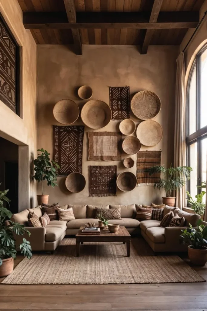
Tall ceilings can leave a wall feeling empty no matter what you hang, so this room fills nearly the entire upper section with a dense mix of woven baskets and mudcloth panels.
Bold black and white geometric patterns alternate with plain woven texture, so the eye never lands on the same shape twice in a row.
The scale is what makes it feel intentional instead of overwhelming. Every basket and panel stays roughly the same earthy tan and brown family, so a wall this packed still reads as calm rather than chaotic.
- ▸Mix mudcloth patterns with plain woven baskets to avoid repetition.
- ▸Keep every piece in the same tonal family across this much wall space.
- ▸Let the arrangement climb high enough to fill tall ceilings properly.
7. Two Round Baskets Keep It Minimal
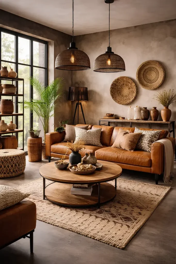
Some walls do more with less. Just two woven baskets, different sizes, mounted directly above a console table, against a raw plaster wall with visible texture and warm gray tones. No frames, no clutter, just the natural fiber shapes standing on their own.
The plaster wall itself acts like a neutral canvas. Its uneven, handmade texture pairs with the woven baskets so well that the whole wall feels like one continuous material story instead of art plus wall as separate things.
📌 Good To Know
Textured plaster or lime wash walls make woven fiber pieces look intentional even without a full gallery arrangement.
8. Round Mask Becomes Solo Statement
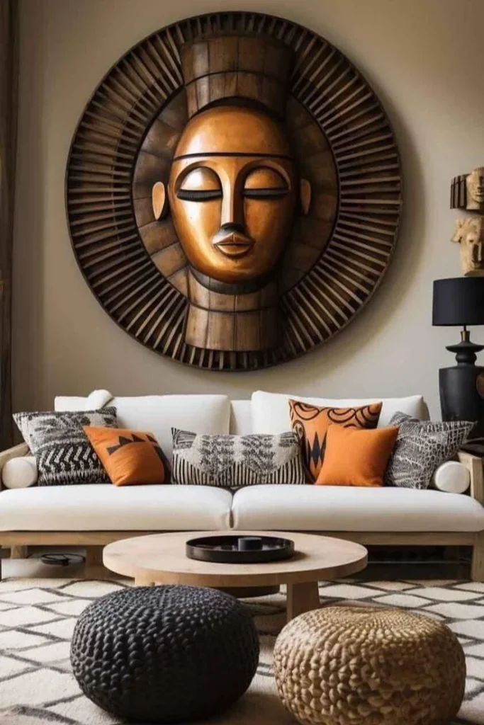
Bronze tones and a circular frame turn this mask into the only wall decoration the room needs. No supporting pieces, no gallery wall, just one oversized round shape floating above a plain sofa.
Round frames rarely get used this big, but scale is what sells it. At roughly the width of the sofa itself, the mask reads more like sculpture than decor.
Leave the wall around it bare so the shape has room to breathe.
Pick a metallic or wood tone that pulls warmth from a neutral room.
Adding smaller frames nearby, it competes with the scale.
Hanging it off center, a piece this bold needs to sit dead center.
9. Two-Tone Wall Splits the Display
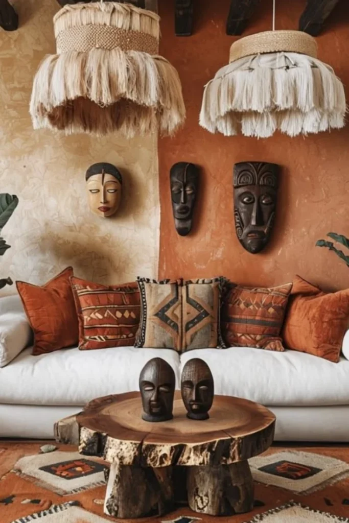
This wall does something clever: it’s painted two different colors, cream on one half, deep terracotta on the other, and the masks are placed to match.
A single lighter mask sits on the cream side, two darker ones cluster together on the terracotta side, so the wall color itself becomes part of the composition.
Fringed pendant lamps hang low enough to almost touch the masks, tying the ceiling and the wall art into one warm, textured moment.
| Cream Side | Terracotta Side |
|---|---|
| One lighter carved mask, set alone. | Two dark masks, grouped side by side. |
| Fringe pendant in natural raw jute tones. | Fringe pendant in soft white tassels. |
10. Framed Textile Panels in a Row
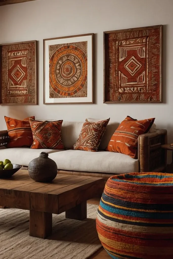
Instead of paintings, this wall uses framed mudcloth-style textiles in matching wood frames. Three pieces, same height, evenly spaced, so the geometric patterns can carry the whole visual weight against a plain cream wall.
What makes it work:
- ▸Same frame color and thickness across all three pieces.
- ▸Center piece is a circular motif, flanked by two diamond patterns.
- ▸Warm cream wall keeps the terracotta tones from feeling too busy.
The pillows below pick up the same patterns, so the wall art and the sofa read as one styled moment instead of two separate decisions.
11. Carved Masks Break Up Flat Canvas
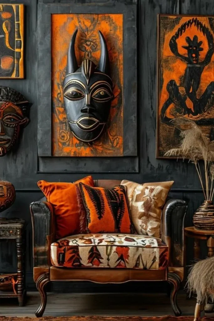
Three large paintings side by side can start to look like a single wide block if nothing interrupts the line. This wall solves it by hanging a carved mask dead center, projecting out past the frames on either side.
The layering does the heavy lifting here.
Hang the flat canvases first, spaced evenly along the wall.
Mount a dimensional piece, like a mask or carving, so it sits proud of the others.
Let a smaller mask or vase nearby echo the same horned or angular shapes.
The result reads as a real collection instead of matching store-bought art.
12. Portrait Art Paired With Warm Lighting
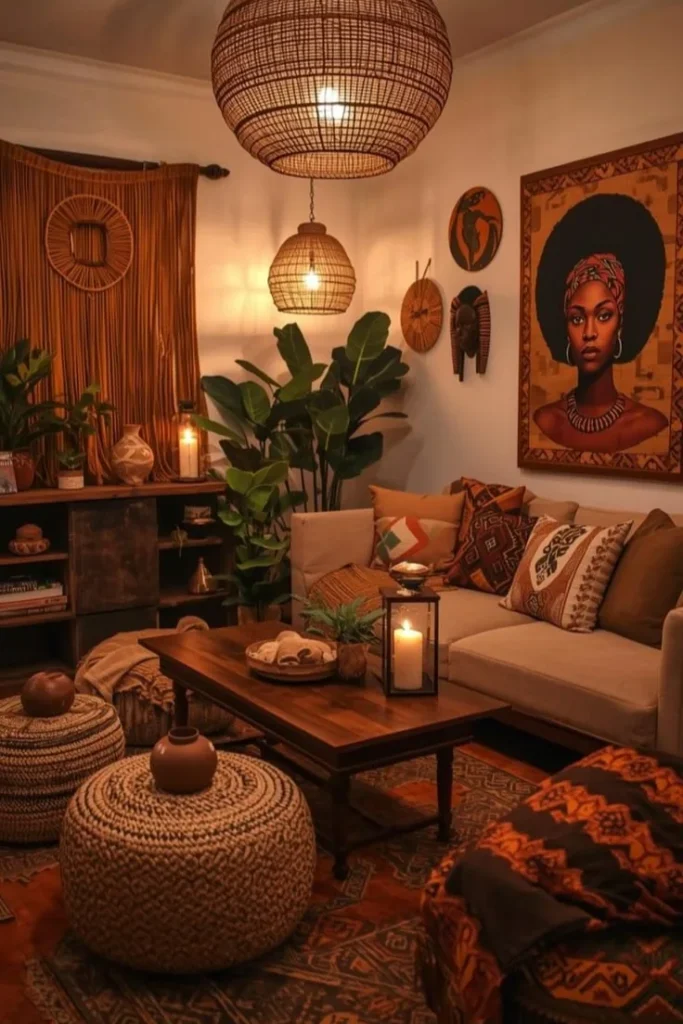
Woven pendant lamps hang low over this room, and a framed portrait glows next to them instead of competing for attention. The soft amber light does something a spotlight never could: it makes the art feel like part of the evening, not a museum piece bolted to the wall.
Small round medallions and a wooden mask sit just beside the main portrait, filling the gap between it and the pendant without crowding either one.
Good to know: Warm bulbs under 3000K bring out the reds and golds in African wall art far better than daylight bulbs, which tend to wash out warm tones.
13. Woven Tapestry Warms a Terracotta Wall
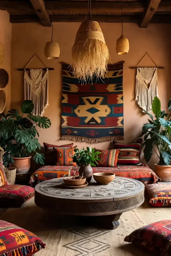
A patterned textile hanging as this reads almost like stained glass color-wise, all deep red, mustard, and navy against a warm clay colored wall. It’s the biggest single element on this wall, but the two macrame hangings flanking it keep things from feeling top-heavy.
Fringe matters more than people think. The tassels along the bottom of the tapestry and the drape of the macrame both add movement, which a flat framed print never gives you.
Recreate this look
14. Track Lighting Spotlights Fringed Panels
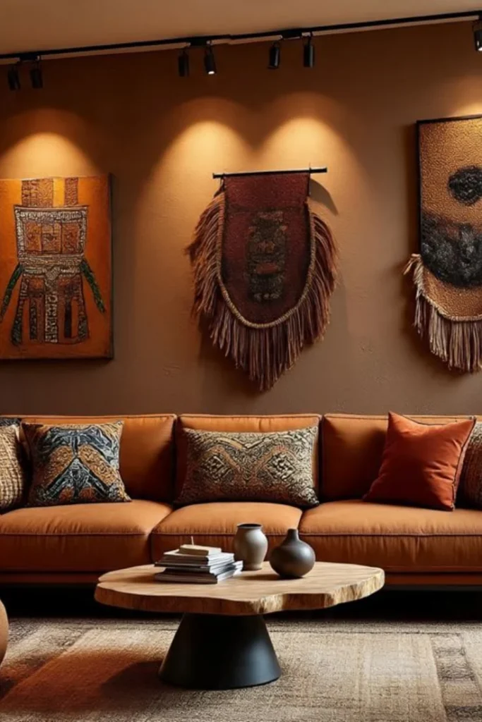
Three different art formats share this wall: a flat painted canvas, a fringed textile hung from a rod, and a mixed fabric and metal panel with a sunset motif.
Track lighting overhead throws a warm pool of light on each one, so even though the pieces don’t match, they read as a curated set.
The rod-hung textile in the middle is the real standout. Hanging it from an actual bar instead of a frame lets the fringe hang loose and move, giving the wall a bit of texture a flat canvas can’t match.
📌 Good To Know
Track lighting with individual heads angled at each piece works better than one flat overhead fixture, since it lets you control brightness per piece.
15. Brick Wall Grounds Geometric Prints
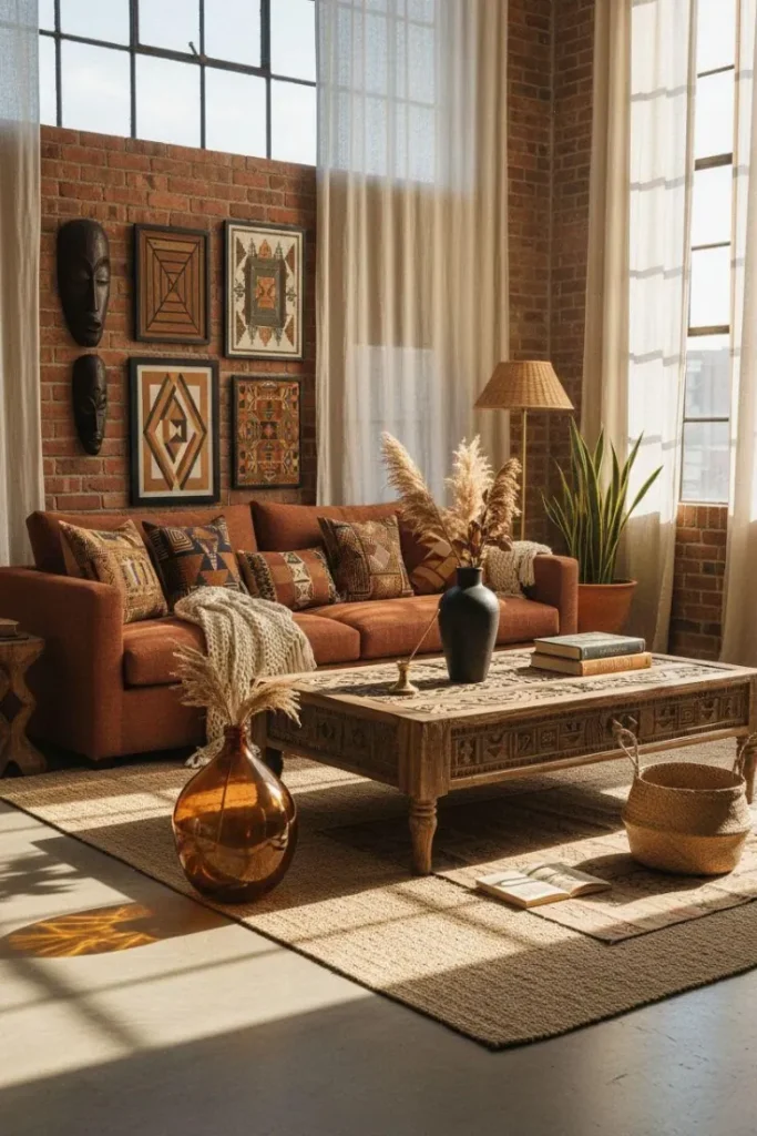
Exposed brick gives this arrangement a totally different backdrop than a painted wall would. Two small dark masks stack vertically on one side, while four framed geometric prints fill a loose grid on the other, letting the rough brick texture show through the gaps between frames.
Big industrial windows flood the space with natural light, which does more for the art here than any staged lighting could. The rust sofa below pulls the same warm brick tones straight into the seating.
- ▸Stack small pieces vertically to balance a wider grid of frames.
- ▸Let exposed brick show between frames instead of covering the whole wall.
- ▸Mix mask silhouettes with flat geometric prints for contrast.
16. Carved Panels Framed by an Embroidered Runner
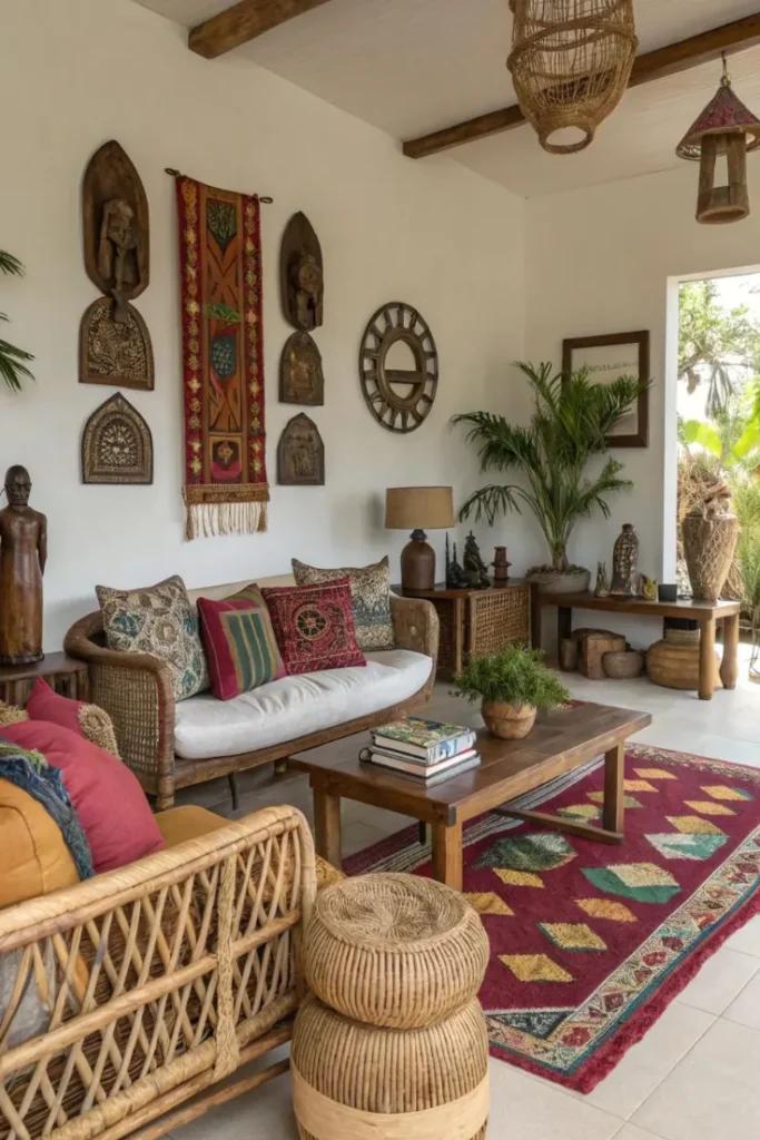
Six small carved wood reliefs arrange themselves in two vertical columns here, split down the middle by a long embroidered textile runner in red and gold. The runner’s fringe drops well below the carvings, giving the whole cluster a finished bottom edge instead of just stopping abruptly.
A round wooden sunburst mirror sits just off to the side, adding a circular shape that breaks up all the rectangular carvings without pulling focus away from them.
At a glance:
17. Oversized Portrait Anchors the Room
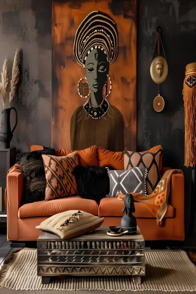
A floor-to-ceiling canvas like this does more work than a whole wall of small frames. The scale is the point. Placed dead center behind the sofa, it pulls every rust and charcoal tone in the room back to one source.
Why it holds up: The portrait style feels personal rather than decorative, almost like a family photo blown up in oil and brass.
The trick worth stealing here: keep the wall around it plain and dark so the piece stays the loudest thing in the room, not competing with patterned pillows or the carved table below.
18. Bold Grid Wall of Painted Face Canvases
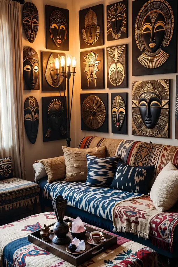
Fourteen mask-style canvases fill this corner in a near-perfect grid, each one a black background with gold detailing that catches the light differently depending on the angle. No two faces look alike, but the shared black and gold treatment keeps the wall from feeling scattered even at this density.
A vintage candelabra lamp mounted right into the grid adds real flame colored light, so the gold accents on the canvases actually flicker and shift throughout the evening instead of sitting flat.
Attribute check:
19. Vivid Portrait Trio in Jewel Tones
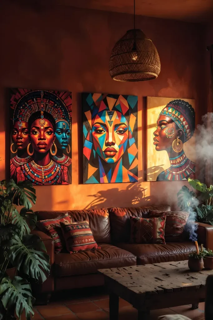
Three canvases here go all in on saturated color instead of earthy neutrals: teal, magenta, and gold painted portraits of women in traditional headdresses and jewelry. Against a burnt orange wall, the jewel tones practically glow, especially with late afternoon light raking across the canvases.
Each portrait uses a different art style: one is realistic with triple faces, the middle one is angular and geometric, the third is a softer profile shot, so the trio feels curated rather than mass-produced. Incense smoke curling up in front adds an almost cinematic quality that photos alone can’t fake.
Recreate this look
20. Turquoise Fabric Panel Breaks the Palette
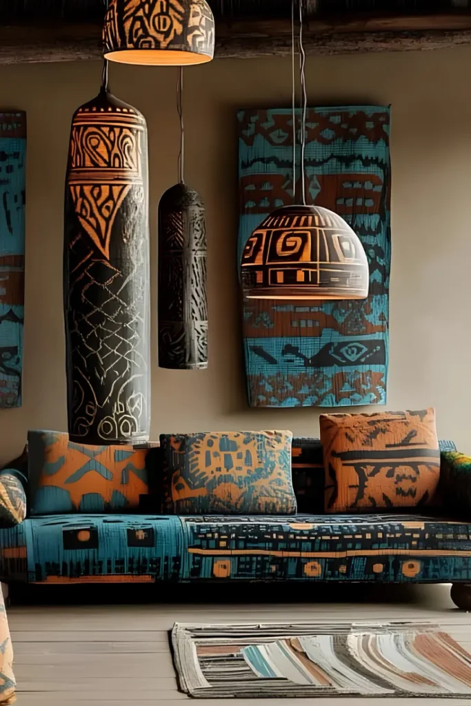
Every article in this roundup has leaned rust, terracotta, and gold, so this panel earns its spot by doing something different. A hanging fabric print in deep turquoise and burnt orange picks up an unexpected color, and it works because the pattern still shares the same tribal geometric language as everything around it.
The panel’s colors even continue into the tall cylindrical pendant lamps and the sofa cushions below, so the whole corner feels like a matched set even though turquoise is a bold departure from the usual warm palette.
A single unexpected color works when the pattern language still matches everything else in the room.
21. Leaning Ledge Layers Framed Art
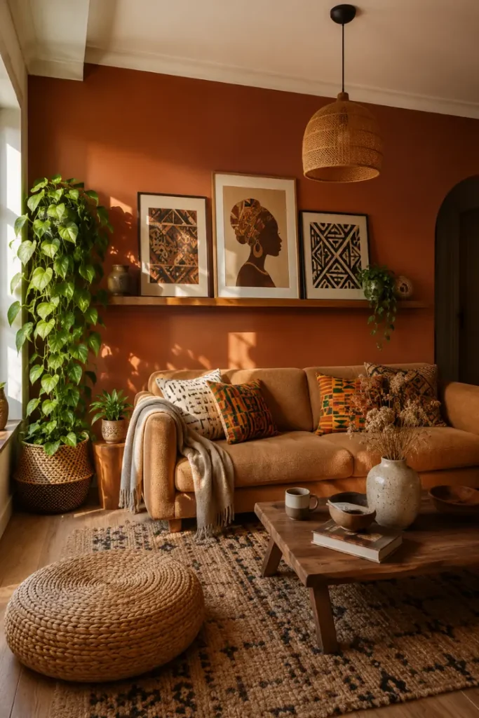
Floating wood ledges let art lean instead of hang, and that small shift changes everything about how a space feels. Three or four framed prints stack loosely against the wall, overlapping just enough that the front piece throws a soft shadow on the one behind it.
Nothing is bolted down here, which means you can swap in a new print on a whim without touching a single nail hole. A slim pothos vine trailing off one end of the ledge softens all those straight wooden edges.
Mount one or two long floating ledges at slightly different heights.
Lean framed prints against the wall in loose, overlapping groups of two or three.
Tuck a small plant or vase at one end to break up the row.
Conclusion:
Twenty-one rooms, twenty-one different answers to the same question: what goes on that wall. The pattern that shows up again and again isn’t a specific piece or color; it’s scale, lighting, and letting one strong element lead instead of trying to fit everything in at once.
Pick whichever mood matches your space, a single bold mask, a gallery wall of baskets, or a full color block moment, and build outward from there.
Save your favorites so you have them ready when it’s time to redo that wall for real.