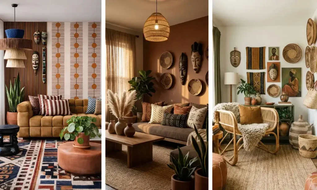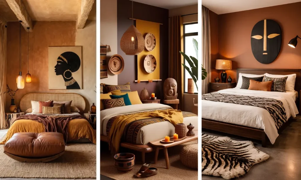
You already own a piece of African print you love. Maybe it is a kente-inspired throw, a mudcloth pillow, or a piece of art you found at a market and could not leave behind.
The problem is not the print itself. It is what happens when you try to add it to a room full of clean-lined modern furniture and the whole thing starts to look like two different rooms fighting for attention.
This guide on how to mix African prints with modern decor gives you a repeatable method instead of a guessing game.
You will choose one print to anchor the room, pull a small color set directly from it, and use that set to guide every other decision from furniture to accessories.
The goal is a room where the print looks intentional next to your modern pieces, not layered on top of them as an afterthought.
Most of the work here is visual sorting, not shopping. You can complete the planning steps in under an hour, though styling the full room takes longer depending on how much you are rearranging.
No design background is needed. You just need one print you already love and a willingness to be a little disciplined about restraint.
- Pick one anchor print first
- Pull three colors from that print
- Choose your modern furniture base
- Test the 30-60-10 print ratio
- Layer prints through textiles, not furniture
- Balance bold patterns with solid textures
- Repeat one print across the room
- Add negative space to let prints breathe
- Mix wood tones with a common undertone
- Step back and edit one piece out
Pick One Anchor Print First
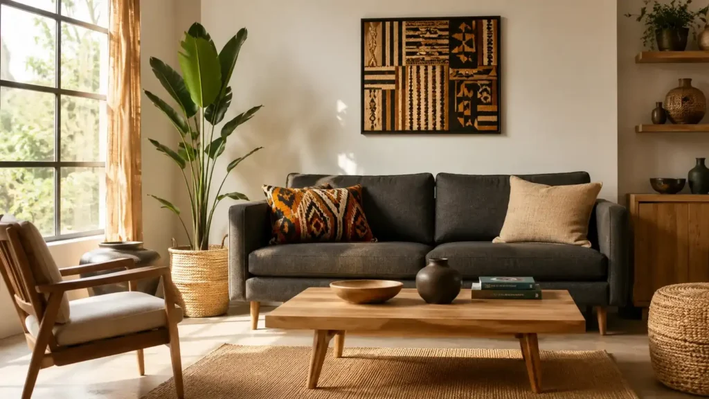
Look around the room you are decorating and find the single print you love most, whether that is a rug, a curtain panel, or a framed textile piece.
This one becomes your anchor. Trying to introduce four or five different African prints at once is the fastest way to make a modern room feel cluttered instead of curated.
One anchor print gives the whole space a clear point of focus before anything else gets added.
Pull Three Colors From That Print
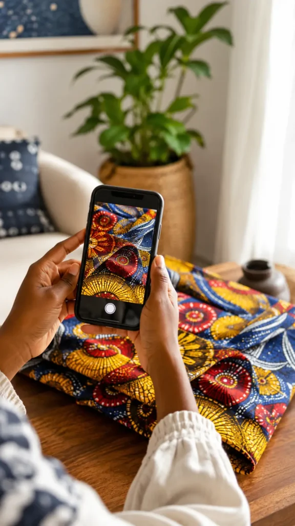
Take a photo of your anchor print and zoom in. Name the three colors that show up most, not every shade in the pattern, just the dominant ones.
These three colors now become your shopping list for everything else in the room, from cushions to candle holders.
Sticking to three keeps the palette readable instead of scattered.
Choose Your Modern Furniture Base
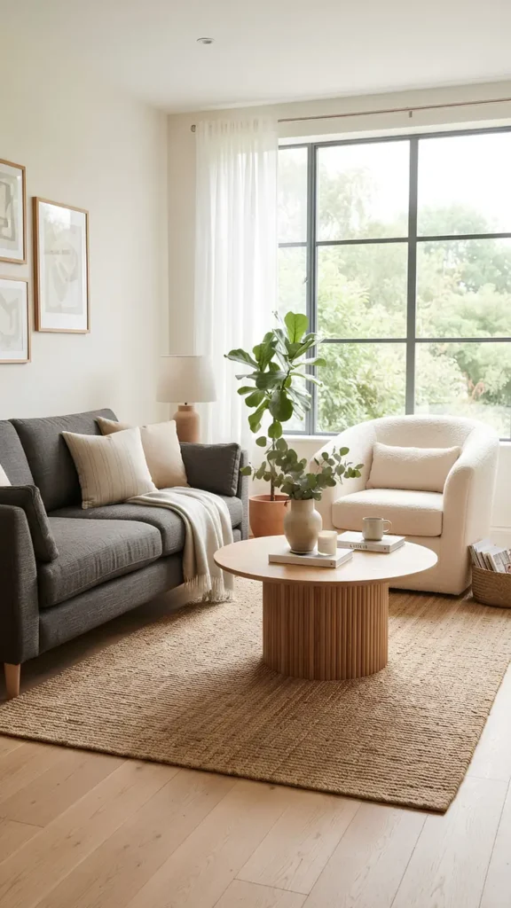
Your modern furniture, sofas, chairs, and coffee tables should stay in solid, neutral tones. Think charcoal, cream, camel, or soft white.
This is not the place for a second pattern. If your furniture already has some texture, like a bouclé sofa or a woven chair, that is fine.
Texture reads as neutral even when a solid color does not feel like enough on its own.
What matters most is that the furniture silhouette stays clean so the eye has somewhere to rest between the bolder print moments in the room.
Test the 30-60-10 Print Ratio
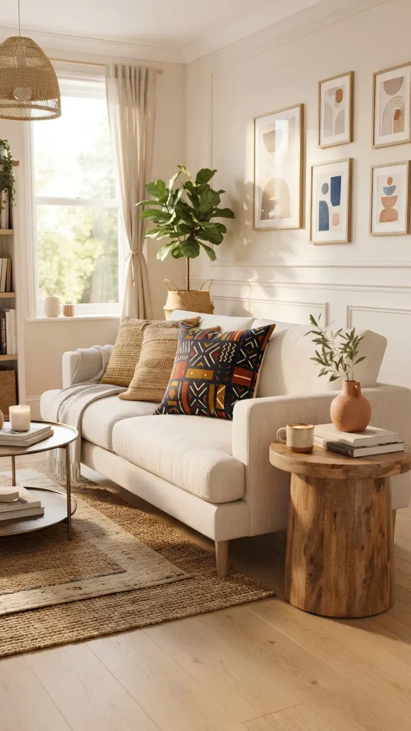
Borrowed from paint theory, this ratio keeps prints from overwhelming a modern space. Your dominant neutral color covers 60% of the room.
Your secondary color, often a wood tone or darker neutral, covers 30%. Your print and its brightest accent color get the remaining 10%. That small 10% is where your African print carries all the visual weight, which is exactly why it needs to stand out instead of blending into a busy background.
Layer Prints Through Textiles, Not Furniture
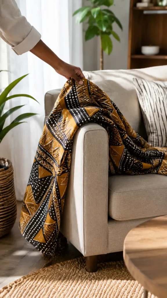
Keep the print itself moving through soft materials you can swap easily.
- Throw pillows in your anchor print or a coordinating pattern
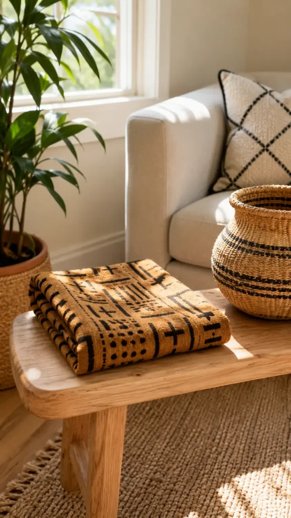
- A folded throw blanket draped over one arm of the sofa
- A small area rug layered under a coffee table
- Curtain panels in a lighter, related pattern
- One framed textile piece on the wall
Textiles are low-commitment. If a print starts to feel like too much once it is in the room, you can remove one pillow or swap the throw without repainting a wall or reupholstering a chair.
Balance Bold Patterns With Solid Textures
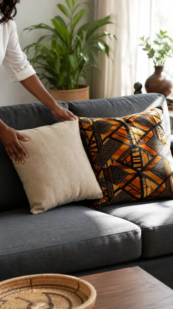
Every bold print needs a quiet neighbor sitting right next to it. Place a solid linen cushion beside a printed one on the same sofa.
Pair a patterned rug with a plain wood coffee table rather than a carved or patterned one.
Three solid textures for every one printed piece is a reliable starting ratio for a beginner room.
Without this balance, the eye never gets a break, and the whole space starts to feel busy rather than styled.
- Stand at the doorway and scan the room in 3 seconds
- Notice where your eye lands first
- If it lands on more than one print at once, add a solid piece between them
Repeat One Print Across the Room
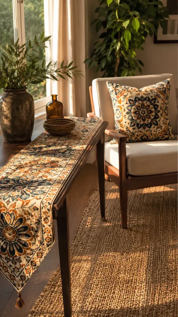
Pick your anchor print, or a close coordinating pattern, and let it show up in at least two separate spots in the room.
This could mean a pillow on the sofa and a runner on a side table, or curtains and a small ottoman.
Repetition tells the eye this pattern is a deliberate design choice, not a random object that wandered in.
One lonely printed pillow in an otherwise plain room often reads as accidental instead of styled.
Add Negative Space to Let Prints Breathe
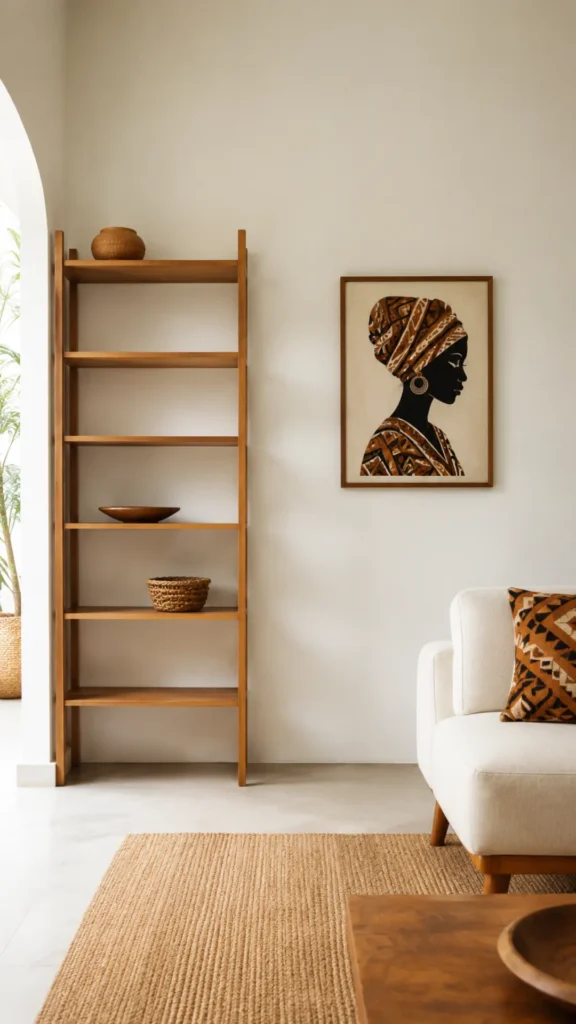
Empty space is doing real work here, even though it feels like nothing is happening.
Leave open wall space around a framed print. Keep at least one surface, a side table or a shelf, mostly bare.
A room with prints on every cushion, every wall, and every shelf leaves the eye nowhere to land, and the boldest print loses its impact because it has to compete with ten other things.
Mix Wood Tones With a Common Undertone
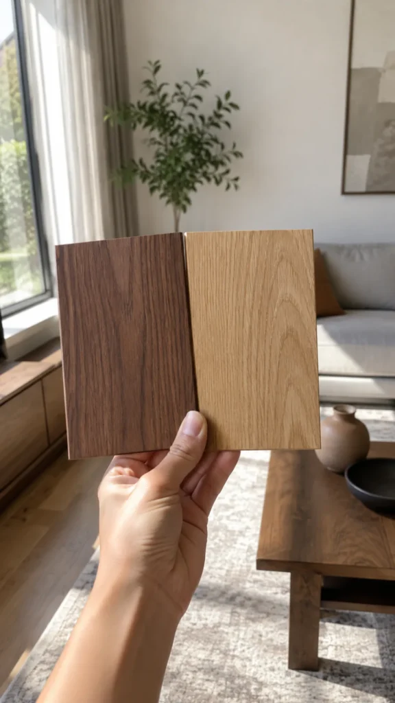
You do not need every wood piece in the room to match exactly, but they do need to share an undertone, either warm or cool.
A honey oak coffee table and a cool gray-toned shelf will fight each other even if both are technically “wood.”
Check the undertone by holding two wood samples side by side in daylight:
- Warm undertones lean orange, red, or yellow
- Cool undertones lean gray or ash
- Pick one lane and stay in it for every wood piece in the room
Mismatched undertones are subtle, but the brain notices something is off even when it cannot name what.
Step Back and Edit One Piece Out
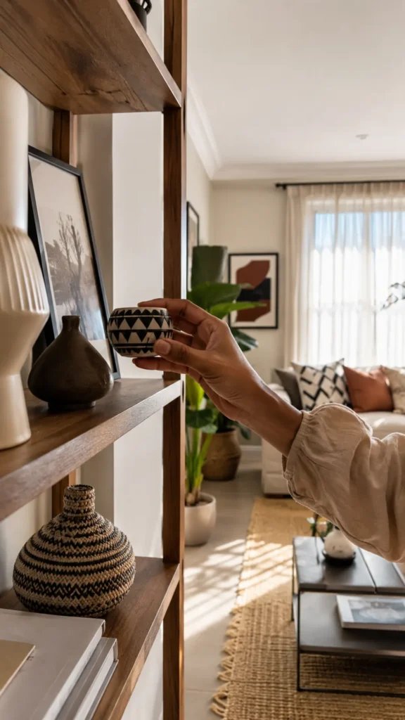
Once the room is styled, walk out and come back in with fresh eyes after a few minutes.
Look for the one item that feels like it is trying too hard, an extra patterned pillow, a second framed print competing with the first, or an accessory that does not connect to your three chosen colors.
Remove it. A room with one fewer item almost always looks more intentional than a room with one too many. This last edit is often what separates a styled space from a cluttered one.
Using too many prints at once
Three or more African prints in one room, without a shared color thread, reads as chaotic instead of curated. Stick to one anchor print and repeat it.
Choosing patterned furniture over patterned textiles
A printed sofa is a permanent commitment. Keep the pattern in pillows, throws, and rugs so you can adjust it as your taste changes.
Ignoring wood undertones
Mixing warm and cool wood tones without noticing creates a subtle clash even when every other choice is correct.
Skipping negative space
Filling every surface with pattern leaves the eye no place to rest, so even a beautiful print loses its impact.
Matching instead of coordinating
Trying to find furniture that matches the print exactly, rather than coordinates with its color family, makes a room feel stiff rather than styled.
Do I need to buy new furniture to do this?
No. Most of this method works with furniture you already own. The main shift is in textiles and accessories, not big purchases.
Can I use more than one African print in the same room?
Yes, as long as they share at least one color from your palette. Two coordinating prints work. Four unrelated ones usually do not.
What if my modern furniture is white instead of neutral?
White works well as your **60%** base. It gives the print even more contrast to stand out against.
How do I know if I have picked the right anchor print?
If you can name three colors from it easily and you still love it after looking at it for a full minute, it is a strong choice.
- ▸Anchor print piece
- ▸2-3 solid throw pillows
- ▸Neutral furniture base
- ▸Paint swatches or color app
- ▸1-2 small print accessories
- Pick one anchor print
- Pull three colors from it
- Choose a neutral furniture base
- Test the 30-60-10 ratio
- Layer prints through textiles
- Balance bold patterns with solids
- Repeat the print twice
- Add negative space
- Match wood undertones
- Edit one piece out
Conclusion
You now have a real method for how to mix African prints with modern decor, not just a Pinterest board full of inspiration photos.
One anchor print, three colors, and a little restraint go a long way toward a room that feels pulled together instead of pieced together.
The next natural step is trying this same approach in a second room once you see how it works in the first.
Pin this guide now so you can walk through it again room by room.