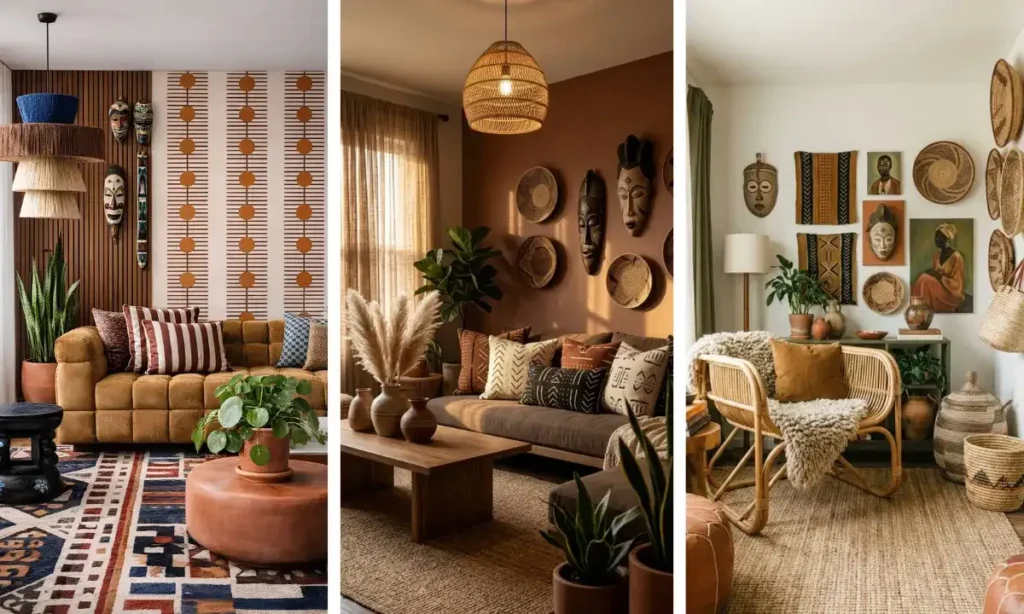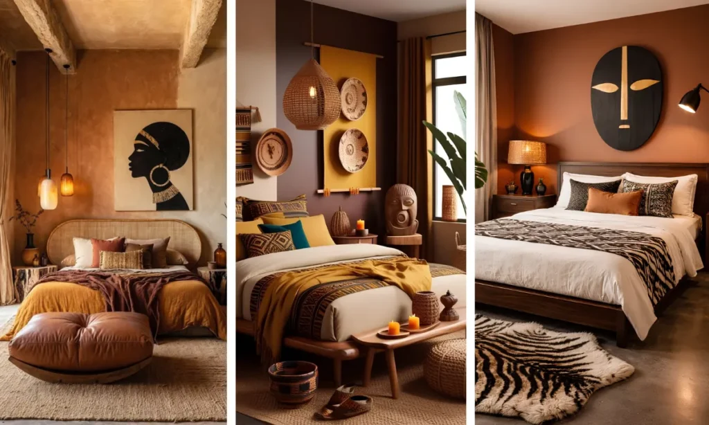
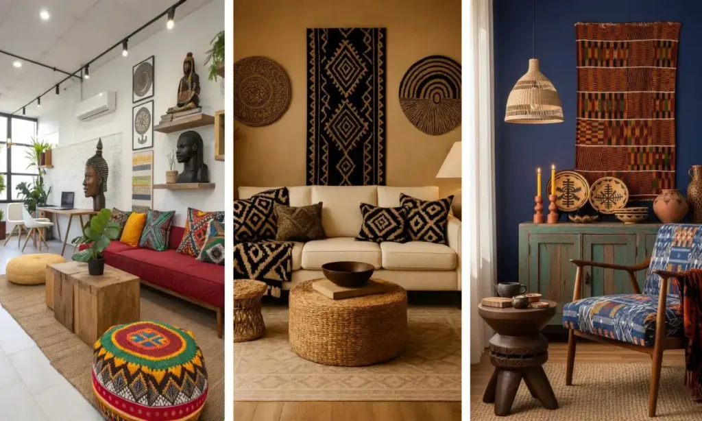
Most rooms feel finished the moment fabric enters the picture.
A plain sofa, a bare headboard, an empty stretch of wall- all of it changes the second a bold woven pattern shows up.
That’s the pull behind these African textile home decor ideas: kente, mudcloth, adire, and Ankara wax prints carry centuries of craft and color into spaces that might otherwise feel like they’re missing something.
This roundup pulls from real rooms and fresh concepts alike, showing twenty ways these textiles show up as pillows, upholstery, wall art, curtains, and even kitchen towels.
Some ideas ask for a full reupholstery job. Others take an afternoon and a staple gun.
What ties them together is restraint alongside boldness, a shared color family, a single repeated print, or one loud piece balanced by plenty of quiet neutrals around it.
Whether you’re working with a full living room or a single corner that needs some life, there’s a version here sized to fit. Scroll through, save what speaks to you, and start with just one piece.
1. Mismatched Prints, One Shared Palette
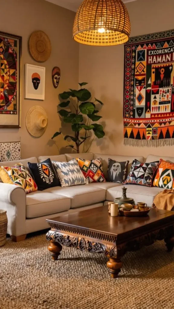
Nobody’s matching pillows here, and that’s exactly the trick.
Look closely, and every fabric plays a different game: geometric diamonds, zigzag stripes, arrow patterns, even a face motif, but they all pull from the same rust, mustard, cream, and charcoal family.
That shared color thread is what keeps a busy mix from turning chaotic.
Start with two or three patterns you love, then check they share at least one color before you buy. Sizes vary too.
A mix of squares and lumbar shapes adds movement without needing a single extra piece of furniture.
2. One Bold Diamond, Repeated Everywhere
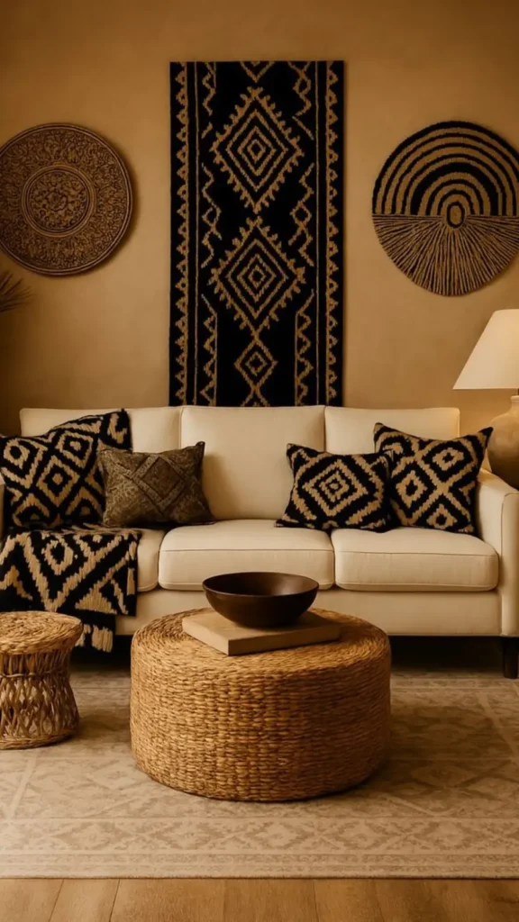
Black and tan diamond ikat shows up three times in this room: as a floor-to-ceiling wall runner, as a folded throw, and echoed in the pillow covers.
Same motif, same two colors, just scaled differently across each piece. That repetition does the heavy lifting instead of a dozen different patterns fighting for attention.
📌 Good To Know
A single strong graphic repeated at different sizes reads as intentional rather than matchy. Pair it with a plain woven texture so the pattern gets room to breathe.
3. Layer Rug Patterns With Pillows
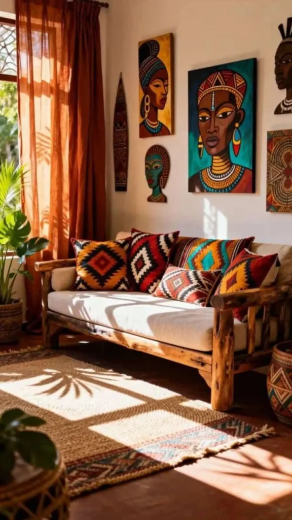
Two textile moments doing double duty in this corner.
The diamond ikat pillows carry the bold color- red, black, mustard, and turquoise stacked side by side- while the jute rug underneath adds its own smaller tribal border pattern in a quieter palette.
Neither competes for the spotlight because the rug stays low contrast and the pillows get to be loud.
Rustic wood furniture and rust colored curtains ground the whole look, so the patterns feel warm instead of overwhelming.
Start with the rug as your neutral base, then let cushions bring the color punch.
4. Frame Fiber Art As A Statement
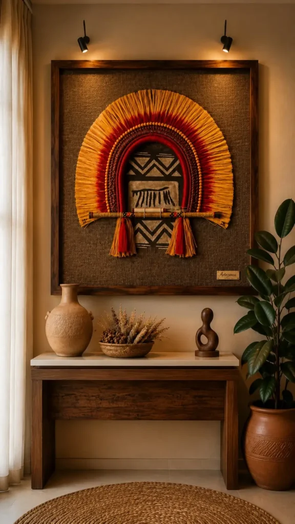
This entryway piece turns raffia and woven fiber into wall art worth lighting like a painting.
The sunburst shape sits over a mudcloth patterned backdrop with a bold zigzag print, and the whole thing gets framed in dark wood behind glass, just like you’d frame a painting.
Two spotlights aimed at the piece do a lot of work here. Without them, the texture and depth of the woven fibers would flatten out.
Pair it with a single earthy clay vessel below instead of a crowd of accessories, so the framed piece stays the clear focal point of the wall.
⚠️ Watch Out
Textured fiber pieces trap dust fast. A soft brush vacuum attachment, used monthly, keeps the piece looking crisp without damaging the raffia.
5. Upholster A Chair In Kente
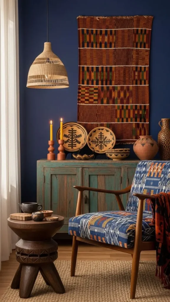
Blue and rust geometric weave covers this mid-century chair, turning a plain wood frame into the loudest piece in the room.
Above it, a genuine kente-style panel hangs flat against a deep navy wall, proof that the same graphic language works both as fabric on furniture and as art on its own.
A distressed teal cabinet and terracotta candlesticks keep the room from feeling like a single color statement.
If reupholstering feels like too much, a kente-print throw draped over an existing chair gets you most of the visual punch for a fraction of the cost.
Pick a chair with clean, simple lines so the pattern gets to be the star.
Match one wall hanging or textile piece nearby in a similar color family.
Break up the deep wall color with one or two warm wood or clay pieces.
6. Solid Sofa, Patterned Everything Else
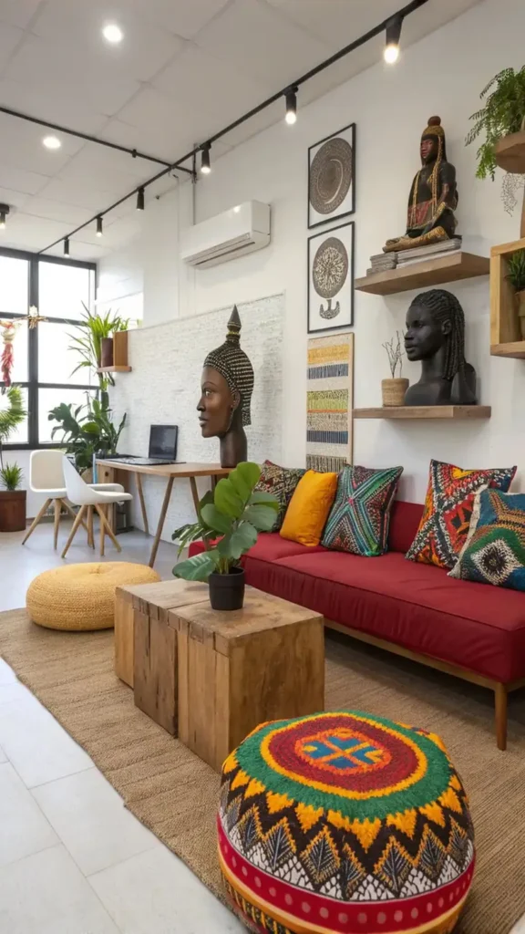
A deep red sofa gives this room’s textiles somewhere to land.
Instead of pattern on pattern, the punch comes from what sits on top: a mustard solid pillow, two graphic prints in green and rust, and a beaded mandala pouf on the floor rug.
The solid color base means you could swap the pillow covers seasonally without ever repainting a wall or reupholstering anything.
The pouf earns its spot as a floor-level accent, not just a footrest.
Its concentric circle pattern pulls in every color already on the sofa, tying the whole seating area together from top to bottom.
A solid color sofa is the easiest way to rotate bold textiles without committing to a full redesign.
7. Frame Textile Fragments As Art
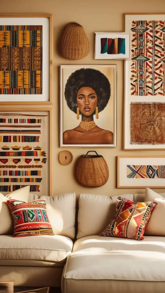
Not every piece of fabric needs to become a pillow or a throw.
Here, framed textile fragments, strip-woven kente cloth, a beaded panel, and a raw indigo swatch hang salon-style alongside a portrait and two woven baskets.
Matching wood frames tie mismatched fabric scraps into one cohesive gallery moment.
Recreate this look
8. Two Prints Break Up Leather
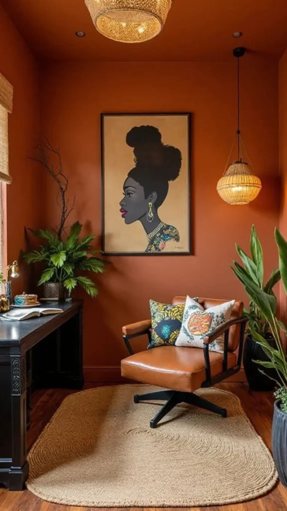
A caramel leather chair gets softened by two contrasting throw pillows, one a floral wax print in mustard and denim blue, the other a graphic print with an angular bird motif in cream and rust.
Neither pillow matches the other, and neither needs to. What holds them together is the room itself, painted floor to ceiling in one burnt orange that makes every other color read as an accent.
This works best when your wall color is already doing the heavy lifting.
Once the backdrop commits to one bold shade, your textiles get permission to be playful and mismatched without the room feeling busy.
| Floral Pillow | Graphic Pillow |
|---|---|
| Mustard and blue wax print florals. | Cream and rust angular bird pattern. |
| Softer, organic shapes. | Bold, geometric lines. |
9. A Bench Scarf Anchors The Bed
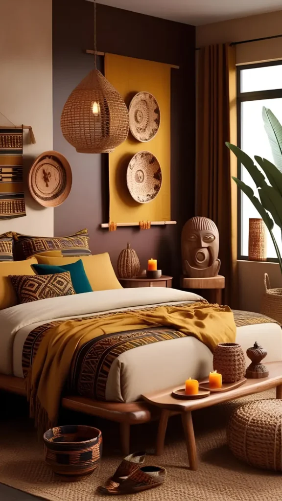
The end-of-bed bench does more than hold candles here.
A mustard textile drapes loosely across it, while a structured mudcloth-patterned runner lines the foot of the bed itself in black, rust, and cream geometric bands.
Two different fabrics, two different jobs: one soft and draped, one flat and tailored.
Solid mustard and teal pillows behind them keep the eye moving without competing for attention.
The trick is contrast in texture, not just color. A loose drape next to a structured print reads as layered, never like it was styled from a single matching set.
📌 Good To Know
Layer a soft draped scarf over a flat structured runner at the foot of the bed. Texture contrast does more visual work than adding a third pattern would.
10. Full Bed Sets In One Print Family
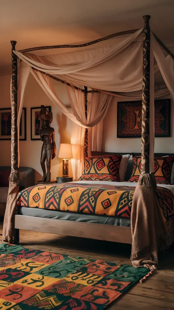
This canopy bed commits fully. The duvet’s bold diamond and chevron print in rust, mustard, and charcoal matches the floor rug’s Adinkra-symbol patchwork almost stitch for stitch, and both echo the tribal carved patterns running up the bed posts.
When one print family repeats across duvet, rug, and frame, the whole room reads as designed rather than assembled piece by piece.
A sheer neutral canopy softens all that graphic weight from above. Without it, the bed would feel heavier than the rest of the room can hold.
Repeat one bold print across duvet, rug, and a structural piece like the bed posts.
Add a sheer neutral canopy to soften the visual weight.
Adding a second competing print elsewhere in the room.
Overdressing the canopy in more pattern instead of keeping it plain.
11. Anchor With A Patchwork Rug
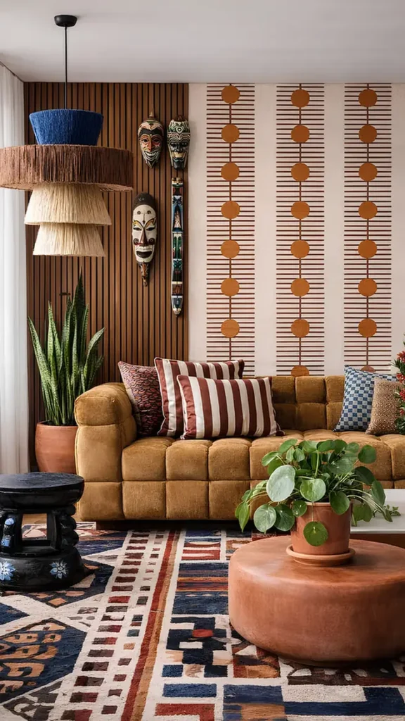
The rug does the heavy lifting in this room, a bold patchwork of navy, rust, cream, and burgundy blocks that reads almost like a quilt made from woven textile scraps.
Everything above it- striped pillows in burgundy and cream, a blue checkerboard cushion- stays simpler by comparison because the floor already carries so much visual weight.
A mustard velvet sofa keeps things grounded in warm neutral tones so the rug’s busier geometry doesn’t clash.
Tribal masks on the wall behind add another layer without pulling focus away from the floor.
- ▸Let a bold patchwork rug set the color palette for the whole room.
- ▸Keep upholstery in one solid warm tone so the floor pattern stays the star.
- ▸Add smaller graphic pillows only after the rug’s palette is locked in.
12. Take The Prints Outdoors
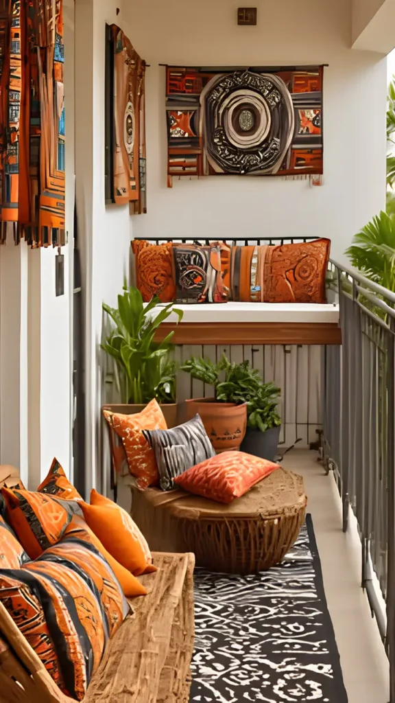
A narrow balcony proves these textiles don’t need to stay inside.
Orange, black, and cream pillows pile onto a jute-wrapped stool and a woven bench, while a bold abstract wall hanging with a circular motif anchors the whole space above the seating.
A black and cream animal-print style rug on the floor pulls the same tonal range down to ground level.
Outdoor fabric versions of these patterns hold up better against sun and moisture than indoor textiles.
Look for solution-dyed or performance fabric prints when shopping specifically for a balcony or patio version of this look.
| Indoor Fabric | Outdoor Fabric |
|---|---|
| Cotton or linen weave. | Solution-dyed acrylic. |
| Fades and mildews outside. | Holds color in sun and rain. |
13. Pair Kente With Mudcloth Prints
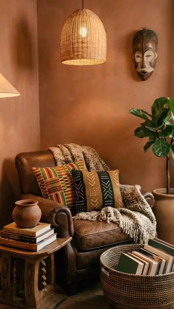
A worn leather armchair holds two textile traditions side by side. On the left, a kente-style pillow in green, orange, and mustard stripes with geometric blocks.
Right next to it, a mudcloth pillow in black and tan, its rows of symbols and chevrons reading almost like a written pattern language. Different weaves, different color stories, same chair.
A chunky cream knit throw softens the transition between them, giving your eye a rest stop between two busy prints instead of jumping straight from one to the other.
📌 Good To Know
Pair one warm bright print with one earthy graphic print, then separate them with a solid neutral throw so each pattern still gets noticed on its own.
14. Dress Dining Chairs In Ankara
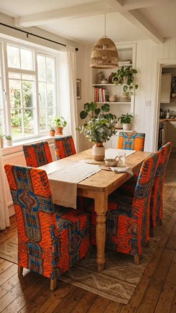
A dining room doesn’t have to stop at pillows and rugs.
Slipcover plain wood dining chairs in bold Ankara wax print, oranges and blues in a repeating geometric pattern, and the whole table setting suddenly feels intentional instead of an afterthought.
Six matching seats turn a simple meal into something worth photographing.
Keep the tabletop itself neutral, wood or a plain linen runner, so the chairs carry all the pattern weight.
This is an easy swap for renters too, since the seat covers slip on and off without touching the chair frame underneath.
Recreate this look
15. Tie-Dye Curtains Frame The Light
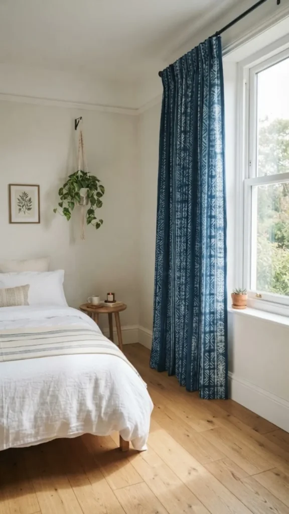
Adire tie-dye fabric, with its signature indigo and white resist patterns, makes a striking curtain panel.
Hung floor to ceiling on either side of a window, the fabric’s irregular circles and lines catch the light differently throughout the day, casting soft shadow patterns across the floor as the sun moves.
Choose a lightweight cotton adire panel so light still filters through.
Hang panels on a simple black or wood rod, nothing ornate.
Let the curtains be the only bold pattern in that corner of the room.
16. Wrap An Ottoman In Kuba Cloth
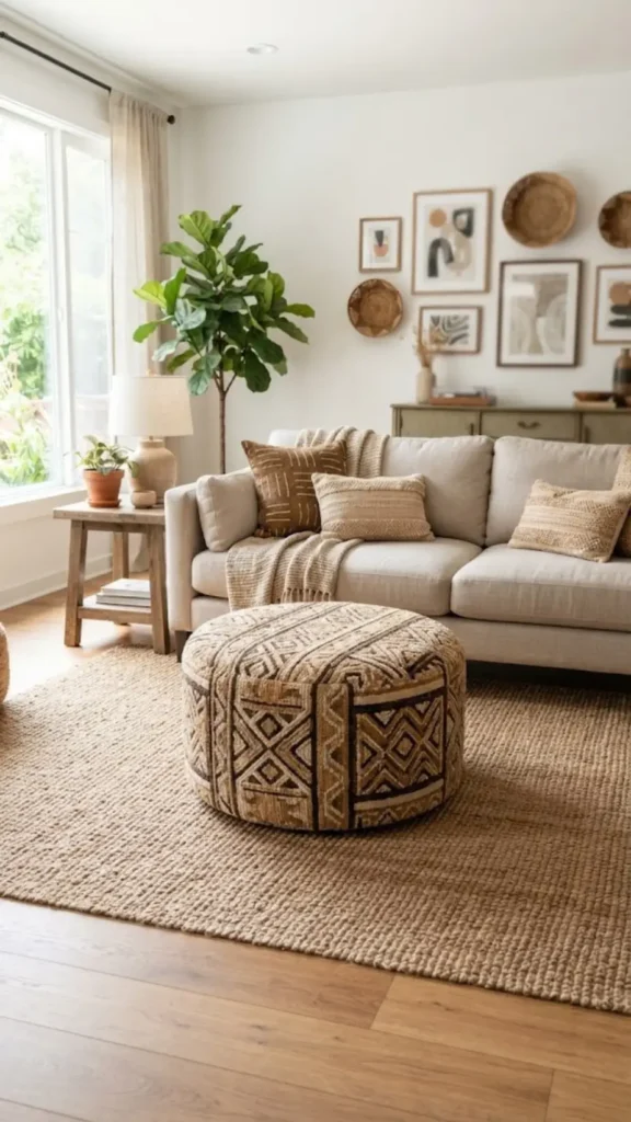
Kuba cloth, hand-woven from raffia fiber into raised geometric squares, usually shows up flat on a wall.
Upholstering a round ottoman in it instead turns a floor piece into sculpture.
The texture alone, slightly raised and nubby against your palm, sets it apart from a smooth printed fabric doing the same job.
| Flat Wall Hanging | Upholstered Ottoman |
|---|---|
| Lives vertically on the wall. | Lives horizontally at floor level. |
| Seen, not touched. | Touched and used daily. |
17. Style A Tablescape In Kente
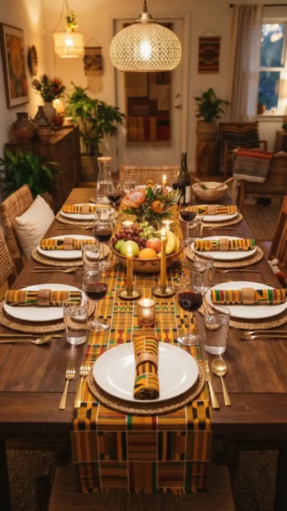
Skip the plain white tablecloth. A kente-striped table runner down the center of a wood dining table, paired with matching cloth napkins tied simply at each place setting, turns an everyday meal into something worth setting the table for.
The gold, red, and green stripes read as celebratory without needing a single extra decoration.
Keep plates and glassware simple and solid colored so the runner and napkins get to carry the color.
A small bowl of fruit or a single vase down the center finishes the look without competing with the fabric.
Solid plates and glassware let a kente runner and napkins carry all the color without a cluttered table.
18. Line The Staircase In Wax Print
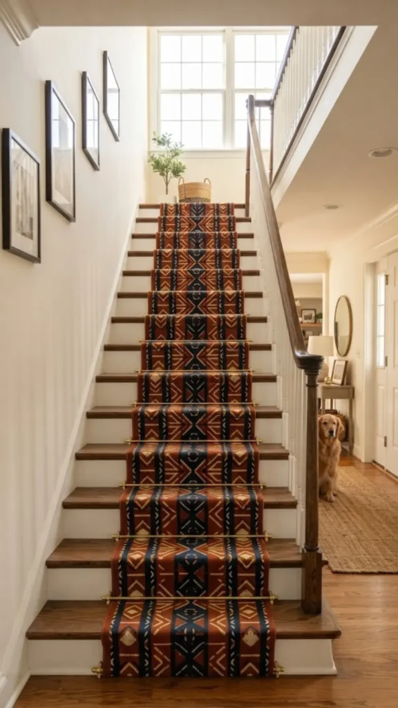
A plain wood staircase gets a full personality shift with a wax print runner fastened down the center of each step.
Bold geometric shapes in rust, navy, and cream repeat step after step, turning a functional walkway into one of the most photographed corners of the house.
Secure the runner with stair rods at the base of each riser rather than adhesive strips, since rods hold up better under daily foot traffic and let you remove the fabric cleanly if you move.
⚠️ Watch Out
Choose a tightly woven, low-pile fabric for stair runners. Loose weaves can snag under shoes and wear through faster than a flat wax print.
19. Upholster A Headboard In Mudcloth
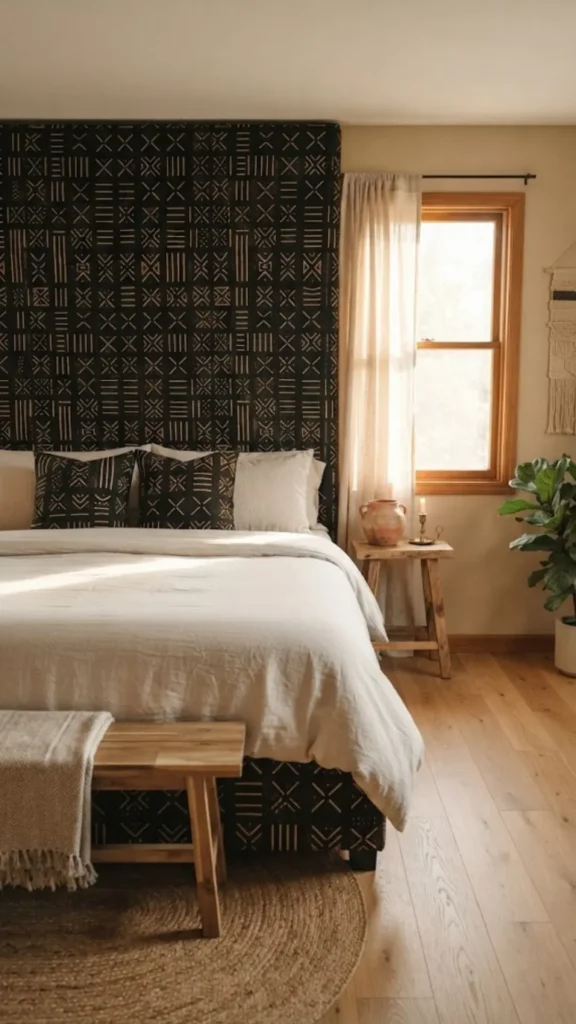
A plain padded headboard becomes the room’s centerpiece once it’s wrapped in mudcloth, its rows of hand-painted symbols and chevrons standing out in black, tan, and cream against a simply dressed bed.
The pattern’s earthy, almost primitive quality reads as grounded rather than busy because the color palette stays so restrained.
Solid bedding in cream or oatmeal keeps the headboard as the only pattern in the room.
Add one small woven basket or clay vessel on a nightstand nearby, and the look stays intentional instead of overdone.
- ▸Choose a mudcloth print in only two or three colors for the calmest effect.
- ▸Keep bedding solid so the headboard stays the only patterned surface.
- ▸Add one small clay or woven accent nearby, nothing more.
20. Hang Wax Print Tea Towels As Decor
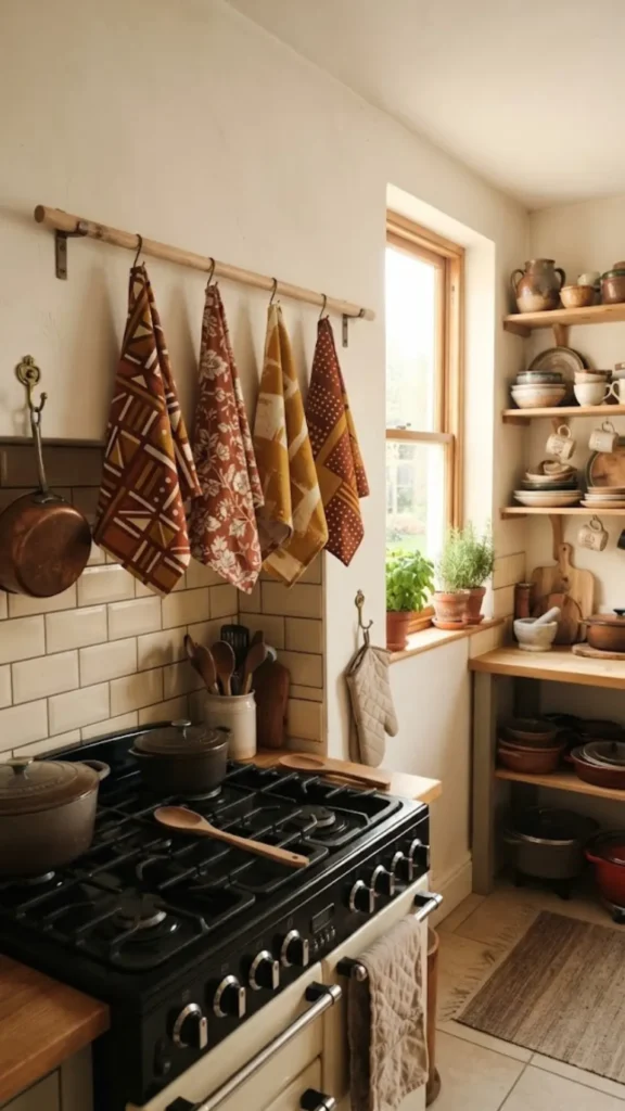
A kitchen wall doesn’t need art when it has fabric this good already.
Three or four wax print tea towels, each a different pattern but sharing the same warm color family, hang from a simple wood dowel rail near the stove.
They’re decorative and genuinely useful, ready to grab the moment something boils over.
Rotate the towels seasonally or whenever they need a wash, and the display refreshes itself without any extra effort.
Group them close together so the rail reads as one intentional collection rather than towels left out to dry.
Conclusion
Twenty ideas, one thread running through all of them: fabric this rich doesn’t need much help to look intentional.
A single kente pillow, a mudcloth headboard, a wax print runner down a staircase, each one earns its place because the color and craft do the talking.
Start small if a full room feels like too much. One textile piece, chosen well, often says more than a dozen scattered accents ever could.
Pin your favorites now so they’re easy to find when you’re ready to shop, and come back for more ideas whenever the next room needs some warmth.